During the lazy days of summer, just give me a deck, a lounge chair, a cool drink and an umbrella, and I'm good to go. Lately, though, I've been considering upgrading my deck desires. Maybe it's time to move up, to have an outdoor space above the ground floor where it's quieter, more private and more restful. What about a perch off the bedroom or a rooftop aerie with a view?
These pictures inspired me. See if you're ready to make the move, too.
This deck is tucked into the second floor of a modern house in Ontario overlooking the tidy rows of a vineyard. The intriguing mix of textures includes an exterior wall of quartzite ledgestone veneer, a cedar plank ceiling and acacia flooring (from Ikea!). Bright green cushions add a spritz of color and match the verdant surroundings.
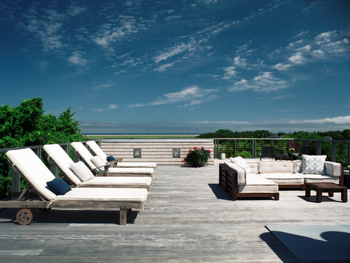
With its endless ocean views and lineup of lounges, this deck is the perfect topper for a Cape Cod summer house. Like the driftwood on the nearby beaches, this ipe flooring is untreated, so it will weather beautifully in the sun. The railing is made of cedar with lengths of stainless steel cable by Feeney.
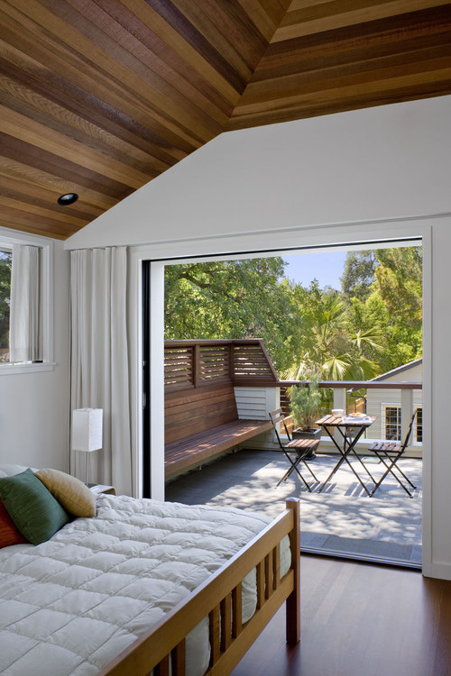
In a small bedroom like this, it's wonderful to have access to the outside via sliding pocket doors that disappear into the wall. (These doors are aluminum and are from Fleetwood.) The deck's flooring is a mortar-set gray basalt tile, and the rail cap is made from western red cedar treated with a clear finish to match the coating on the ipe bench.
This luxe mahogany deck tops a brick row house in Brookline, Massachusetts. The perimeter trellis is designed to frame the sky and treetop views, "neatly defining an open living space while maintaining intimacy," as the architects put it. The snazzy cylindrical light fixtures are from Cooper Lighting (Lumière Westwood 912-2).
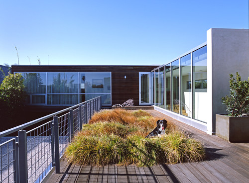
Abutting the second floor of a modern house in Newport Beach, California, is this long, southern-facing deck, which provides abundant sunlight for a low-maintenance patch of ornamental grasses (which the family dog seems to love). The custom-fabricated railing was made with standard steel sections (angles, tubes and flat bar, with welded-wire mesh panels) and painted in Benjamin Moore's Chelsea Gray.
This bedside deck, perched above the trees, has gorgeous views of Lake Wenatchee in Washington state. The deck has a waterproof membrane below. To avoid water damage, "the most important thing is that the membrane is sloped, detailed and installed correctly," counsel the architects. The floor-to-ceiling windows and doors are from Sierra Pacific.
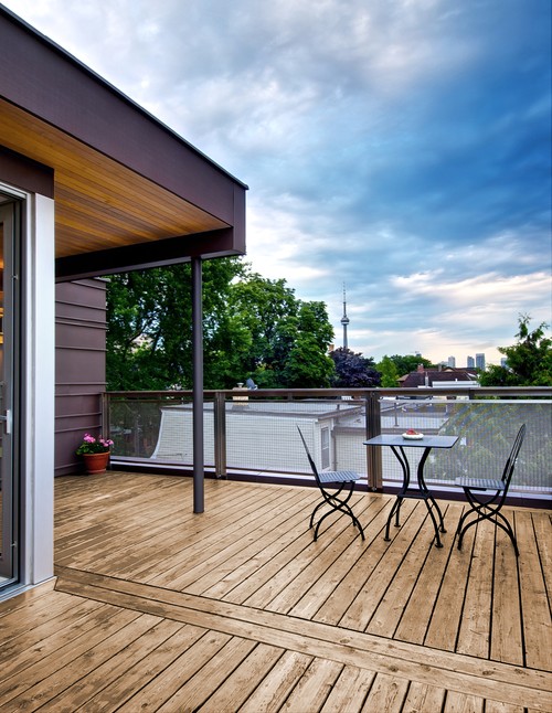
Although it's in a suburb, this rooftop deck boasts skyline views of Toronto. The steel-framed overhang provides a sheltered place for sitting and reading or taking in the view. Note the deck-top enclosure: stainless steel posts with metal mesh (from Tyler Weaving) instead of the more typical cables.
In this midcentury modern house, a NanaWall door system opens up the master bedroom to the petite outdoor patio. Other design pluses: a pair of Bertoia Diamond Chairs and cone-shaped planters that anchor the surrounding wall.
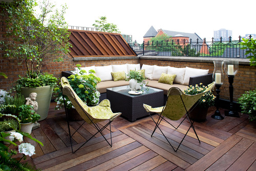
This rooftop getaway really serves as an outdoor room, with its cushioned built-in couch, coffee table and vintage butterfly chairs. The ornamental metal railing is a nice touch, as is the ipe wood floor, laid in alternating squares.
Few could resist this second-story deck with rocking chairs for enjoying the breathtaking views of the North Carolina mountains. The flooring and railing are made with ipe sealed with Penofin oil.
Off the master bedroom and surrounded by leafy trees, this narrow deck is an ideal spot for stargazing - especially when the fire's lit. Tongue and groove Douglas fir extends from the bedroom's ceiling to the outside soffit. The windows and doors are light commercial storefront versions, in which the bottom openings are operable awning windows.
Sheer perfection: a spectacular view and just enough space for a chair from which to enjoy it!
Sure, your cottage is adorable and cozy. But that doesn't mean you have to decorate it in typical cottage style. If your decorating bent is more modern, go for it; your cottage will happily acquiesce. I am reminded of classic pairings: love and marriage, Hepburn and Tracy, red wine and chocolate (yum!), and modern and rustic. This little cottage, with its rustic architectural features, is served so very well by these sculptural and modern Eames chairs.
Cottages are honest and straightforward, and so is modern design, which prefers basic curves and angles, and clean, simple lines.
Modern interior design as we know it today was popularized by the European designers and architects who were members of the Bauhaus. Founded in 1919, this German art school espoused a philosophy that form should combine with function in all interior designs.
Many cottages were originally occupied by poor, hardworking folk who would undoubtedly have approved of this "form and function only" approach to their decor. One of the reasons modern design works so well for cottage dwellers is that its sleek lines and lack of clutter create the illusion of larger spaces. From its onset, modern design has embraced pure color -- black, white and neutrals, accented with vibrant primary colors. Cottages respond very happily to these palettes. Geometric-patterned or plain area rugs can provide accent colors and accentuate the bold but understated look of modern interiors. Adorable as they are, cottages are very accepting of this "no muss, no fuss" attitude.
Art, rather than accessories, has a firm place in modern interiors. Little trinkets or blankets tossed over the furniture are rarely employed. Rather, art pieces provide a single mesmerizing focal point. In a cottage this approach helps keep "stuff" to a minimum.
Modern furniture tends to be streamlined, with exposed legs that float the piece above the floor, so it doesn't appear to take up as much space in the room. Imagine how much more crowded this room would feel if all the seating were skirted or extended to the floor.
Modernism rejoices in the materials used, often keeping them unadorned and in plain view. This spare honesty serves a cottage well.
Contemporary furniture also lends itself well to built-ins, which free up floor space, provide storage and generally make a small space feel larger.
Jane Austen once wrote, "I am excessively fond of a cottage; there is always so much comfort, so much elegance about them. And I protest, if I had any money to spare, I should buy a little land and build one myself, within a short distance of London, where I might ... collect a few friends about me and be happy. I advise everybody who is going to build, to build a cottage."
In her no-nonsense way, I think Jane would have approved of modern design in a classic cottage.
Roger Davies/Architectural DigestThe living room of Maroon 5 frontman Adam Levine caters to the 1940s ranch-style home's expansive views.By Alyssa Bird
These 16 talented performers are as creative at home as they are onstage. Tour the impressive pads behind the legends, culled from AD's archives.
ZillowJack Black and his wife, Tanya Haden, remodeled the home just before they married and started having children.APJack Black and Tanya HadenBy Emily Heffter
Jack Black and his wife, Tanya Haden, began their life together with a major remodel of this modern home in the Hollywood Hills. The comedian, actor and musician and Haden, who is an accomplished cellist, completed the major remodel just before they married in 2006. The couple traded up once they had kids, selling the home for $1.21 million.Now it's back on market, listed by Joe Babajian and Stephen Walton of Rodeo Realty for $2.899 million.
The white-and-black, 3,906-square-foot modern is tucked onto a cul-de-sac off winding Laurel Pass Way, with a large yard and pool in the back. Steel commercial beams, large walls of glass and concrete floors give the home an industrial feel.
Black bought the house at 8538 Eastwood Road in 2002 with his then-girlfriend Laura Kightlinger. After their breakup, Black and Haden remodeled the home in 2005, just before they married and started having children in 2006. Then in 2011, Black and Haden bought a home from Red Hot Chili Peppers bassist Flea in another part of Los Angeles -- the trendy Los Feliz neighborhood -- for nearly $6 million.
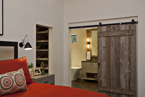
When she was first hired to work on this rustic house in bucolic Woodside, California, interior designer Mary Jo Fiorella helped eliminate some of the rough edges. While she left the home's redwood timbers exposed, she smoothed out clay walls and gave the rest of the home a more orderly and cohesive appearance.
After the owners built an extremely contemporary master suite, Fiorella returned. This time, ironically, to do the reverse: add character and texture to the sleek new rooms so they flowed more naturally with the other spaces in the house.
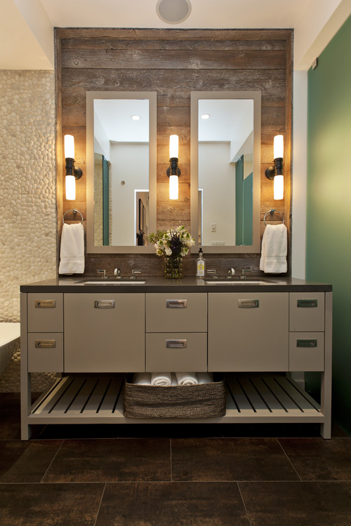
In the new master bathroom, the designer struck a balance between clean, contemporary lines and organic elements inspired by the surroundings. She mixed materials like frosted glass panels with reclaimed barn wood, and sleek hardware with pebbled walls. While we don't typically think of a master bathroom as the heart of the home, Fiorella's design intervention has made the small space a favorite spot for the entire young family of five.
"I needed to carry the materials from the original part of the house through to the addition," Fiorella says. Inspired by the beams and timbers in other rooms, she brought in coarse reclaimed barn wood. A custom barn door hints at what's beyond in the master bathroom and adds primitive character to both rooms. A black iron track punctuates the top of the doorway.
The vanity is modern yet warm. "I custom designed it to look like a piece of furniture; it's open and not a solid piece," Fiorella says. She accentuated the vanity area by paneling the wall behind it with reclaimed barn wood that extends all the way to the ceiling. The wood introduces a warm, rough-hewn texture that contrasts with the vanity's sleek recessed drawer pulls and modern custom mirrors.
To protect the wood, Fiorella sealed it with a matte marine-grade polyurethane that will stand up to splashes and steam. There are also frosted glass panels on either side of the vanity. The one on the left (seen in the next photo) is a little scrim that creates a slash of separation from the open shower and plays off the panel seen here on the right, which includes a hinged frosted glass door that encloses the toilet compartment.
In addition to the mix of textures, she used soft colors such as taupes, tans, browns and metallics to warm up the space. The floor tile has a weathered metal look that includes copper tones; it ties all the parts of the bathroom together.
Vanity: custom design by Mary Jo Fiorella, with Briarwood paint by Benjamin Moore and hardware by Sugastune; countertop: Raven, Caesarstone; lighting: Graydon Bath Light, Visual Comfort
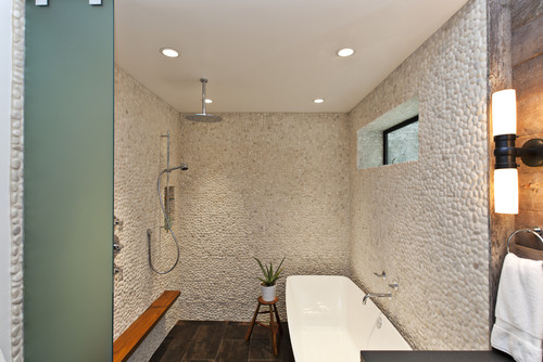
Laying out the bathroom to include a soaking tub and a large shower was no easy feat. Fiorella went through four or five iterations before declaring, "It's OK for a tub to get wet!" Keeping the two together inside a walk-in curbless shower, rather than chopping out a separate shower stall, allowed for a much more open space.
The pebble tile walls connect the space to the surroundings and add a delightful layer of nature-inspired texture. The metallic colors in the tile floor provide a strong contrast to the light-colored pebbles. A teak shelf stands up to the moisture and keeps shampoo, soap and other bath products handy.
A second handheld showerhead makes bathing the kiddos a breeze. In fact, the shower area has become a family favorite; the little ones adore showering here with a parent. "The whole family loves the shower room," says Fiorella. "One year their Christmas card was a photograph of them in here."
Floor tile: Ironworks Steel Metallic Finish Field Tile (12 by 24 inches), Artistic Tile; pebble tile: Zen Garden Timor (12- by 12-inch sheets), Walker-Zanger
There are several ways you can work with an interior designer. We recently looked at full design services and requesting design plans as options, but sometimes those are far more than you need. If you're looking for just a bit of direction to set you on the right track, a design consultation might be ideal for you.
There are two main types of design consultations. The first is a request for something specific, such as paint colors (called a color consultation) or window treatments.
The other type of design consultationis a broader request for input on an entire room or several rooms. In this type of consultation, designers deliver ideas that draw on everything learned from design education and practice that may apply to your project needs. (We call it a brain dump.)
What you get is a lot of information specific to your project, such as furniture layout and retail sourcing suggestions, and thoughts on window coverings, paint colors, artwork, lighting, floors, rugs etc. This meeting is intensive, and you should be ready to take notes. Think of it as a chance to toss ideas around and get professional input before you get out your credit card or start taking down walls.
This is great for the person who is pretty comfortable with style and is handy around the house but would like a professional opinion as guidance. You gain the confidence that will send you off in the right direction.
What will it cost? For a specific consultation (paint or window treatments, for example) you can expect to spend about $150 per hour and up (many designers will do a color consultation on a single room for less), depending on how experienced the designer is.
For the second, more intensive option (the brain dump), the cost is higher. You can expect to pay anywhere from $300 to $750 and up, depending on the designer's experience. What you'll get, though, can help you avoid some costly mistakes and really hone in on where your money will be well spent. Check with designers for rate quotes.
What to expect: Typically a consultation will last an hour or two. Once you have put to good use those suggestions, you can always request more help on an hourly basis. Think of it as a chance to gain access to our experience, our education and our expertise and tap into the tricks of the trade - all packed into one session (or several if you like).
Can you read the undertones of fabric, paint colors and materials like wood, stone and carpet and know whether they'll work together? A design consultation can deliver a big payoff for you if not.
The leading producer of house paint offers 3,500 paint colors (130 in its off-white collection alone). A paint chip can look lovely in the store's lighting but dreadful in your home. (Stores frequently have fluorescent tube lighting.) A small investment in a color consultation can help you get it right the first time, so you save time and money by not having to repaint.
A color consultation is particularly beneficial for exterior paint jobs. Picking colors for outside application is especially tricky because the lighting isn't consistent.
Are you having a hard time finding unique furniture that appeals to you and reflects your and your family's lifestyle? A consultation with a pro can help you source that unique piece.
A designer can give you the confidence to add that wow factor or steer you away from a choice you may regret. You'll get professional help and the personal satisfaction of knowing you did a lot of the work yourself. Maybe you just need a trained eye to help bring your vignette to life or artistry to your special collection.
ZillowFans of the series will recognize details from the television show's first movie spin-off, including the luxurious views.Zillow"Sex and the City's" Samantha Jones, Kim CattrallBy the Zillow Team
Imagine sipping on a cosmopolitan while relaxing on a balcony overlooking the ocean. This summer you can make those "Sex and the City" fantasies come true: the modern Malibu beach abode that character Samantha Jones and her model boyfriend Smith Jerrod canoodled in is available for rent.
Fans of the series will recognize details from the television show's first movie spin-off. During the 2008 film, Samantha took in luxurious views in this nearly 6,000-square-foot glass-front, beachfront home.
Designed by Jay Vanos, the home's arched windows and open floor plan create the illusion of floating over the ocean. The sophisticated abode has 5 bedrooms and 6 bathrooms - plenty of room for a group of friends seeking a chic experience. But the three-story property, available June through September, will cost a pretty penny -- rent is $100,000 a month.
Decorative elements from some of the film's memorable moments are still intact, including the cozy fireplace from the New Year's Eve scene. The home also takes full advantage of the stunning ocean views. Tenants can catch the sunset on one of the five balconies or from an ocean-facing bedroom.
The interior is decorated in a tastefully modern manner, with a neutral color palette and designer touches, such as a calfskin rug. A spacious kitchen features Caesarstone counter tops, travertine floors and high-end appliances.
For the oenophile there is a wine cellar to store your precious bottles during your stay. Enjoy that wine from the soaking tub or entertainment room complete with a pool table.
With plenty of room, unbeatable views and star quality, this house is the perfect setting for your own blockbuster summer. You just might need to bring some friends to help foot the bill!
Transitional Home Office by Alpharetta Interior Designers & Decorators Jennifer Reynolds - Jennifer Reynolds InteriorsBy Becky Harris
This fashionable mom needed a chic command central where she could run her household and keep her family's schedule organized. More important, she wanted a spot where she could spend time with her 2-year-old son, who loves to keep her company while she takes care of business. Knowing her client's keen eye for fashion and unabashed love for animal prints and emerald green, interior designer Jennifer Reynolds set out to create a home office that could double as a playroom, without looking like one. Here's how she incorporated storage solutions, spots for everyone in the family and swank style into this workspace.
Transitional Home Office by Alpharetta Interior Designers & Decorators Jennifer Reynolds - Jennifer Reynolds Interiors
My client really wanted barn doors; the challenge was how to make them superchic," Reynolds says. She found five late-19th-century panels from China's Shanxi Province at the August Avery showroom at ADAC and knew she'd found the right doors for the barn door track. She backed the open parts with seeded glass for privacy. The doors' intricate caved patterns inspired her to repeat a Greek key motif throughout the room, using geometric patterns to balance the animal prints.
Reynolds and her client have plans to transform the remaining pair of panels into a headboard in the guest room.
The room is all about layering," Reynolds says. "We also balanced important splurges with savings." Two rugs cover the floor - on the bottom, an inexpensive and easy-to-clean cut and bound broadloom carpet with a laser-cut Greek key pattern. Layered on top, a cowhide with a zebra print provides a favorite spot where a toddler can play. Reynolds tucked his toys into the baskets and lower cabinets, and put her client's items out of his reach.
The 2-year-old's favorite perch is an elegant ottoman, covered in an emerald green and blue raised-velvet leopard pattern. The customized desk has two pencil drawers that face this side for his drawing tools.
Transitional Spaces by Alpharetta Interior Designers & Decorators Jennifer Reynolds - Jennifer Reynolds Interiors
When it came time to splurge, Reynolds knew where it would count. The ottoman, desk and desk chair are all from Hickory Chair. "These are investment pieces that will become heirlooms," she says. "Plus, they are so well made, they are indestructible -- they can stand up to a 2-year-old."
The desk is tucked into the corner, opening up the view to the rest of the room and out the large windows. The desk has a customized pencil stripe detail around the edges that contrasts with its dark finish.
Reynolds saved big on the wire mesh in the built-in cabinet doors. She priced black wire for the doors and found out that component would run about $2,000. "I went to the home improvement store, picked up white wire mesh and spray painted it instead," she says. "It only cost me about $60."
The desk chair sports a subtle oversize animal-skin pattern in plush cut velvet. It has emerald piping that picks up on the other accents. The desk lamp has a handmade pattern that plays off the Greek key motif.
Faux painting is a huge part of the design, as is a mix of metallic accents. Faux-painting artist Kevin Bruce created a Venetian plaster look in emerald green on the ceiling, with an antique gold Greek key detail around the border. If you look closely, you'll see that the wall on the right has a very subtle metallic stripe. Reynolds had him pull the pewter color from the zebra drapery fabric. Finally, Bruce gave the cabinetry a gray-wash patinated look, painting the back of the cabinets as well.
Transitional Home Office by Alpharetta Interior Designers & Decorators Jennifer Reynolds - Jennifer Reynolds Interiors
The ceiling light that ties in the squares and the antique gold was a big splurge, but Reynolds scooped up the leather chair, the antique panels she used on the door, the side table, the funky green vase and the desk lamp at a sample sale at ADAC. She also scored the fashion paintings for a song at a big-box home store.
"My client's husband is a professional athlete and a big guy, and he needed a big, comfy chair," Reynolds says. "There is a spot for everyone in the family to hang out in here together."
In all of the layering, Reynolds mixed in many patterns, finding a balance between the animal prints and geometric patterns. "Everyone needs a little zigzag somewhere," she says about this petite bombe chest made with bone inlay.
While her client appreciates high fashion, she's no diva - nothing in here is too precious, and it all stands up to a toddler armed with markers and toy hammers.
Now that you've seen the finished space, here is a peek at the 12- by 12-foot room before the makeover.
Play is at the heart of childhood, and an inspiring outdoor play area can give children many hours of enjoyment. But what if your garden is compact? Maybe you would like to avoid having a playset that takes up precious yard space, or you don't want to look at toys year-round from the interior of your home. With some simple strategies, you can still incorporate play into your landscape. Here are some ideas for a range of project budgets.
1. Add child-friendly water features. A stainless steel C-channel (seen at top) pours water into an underground water basin, offering children a safe place in which to interact with water.
2. Camouflage the sandbox. Sand provides a potentially soothing sensory experience and stretches the imagination. Nestling a sandbox within a planting bed not only will help integrate it into the garden, but also will let kids get up close and personal with plants and the butterflies and birds they attract.
3. Keep that fallen log. Most of us love to get out the axe and chainsaw when we spot a dying or fallen tree. However, if a tree in your backyard is dying and must be removed, try to save at least part of it for wildlife. A length of fallen trunk on the ground makes a wonderful wildlife home as well as a playspace and can be attractive in a naturalistic garden. In time it will transform into a new type of habitat.
4. Make use of vertical space. Chalkboards, climbing walls and buckets of toys can be hung from garden walls and fences, making them less visually obtrusive in a small garden.
5. Incorporate a vegetable garden. A bean tepee makes a wonderful hiding place for young children during the summer months. Extra-long bamboo poles would make for an even more dramatic tepee and offer support for the most vigorous pole beans or other vines.
6. Make toys a design feature. Wooden tree swings, teeter-totters and other toys can be an attractive alternative to plastic ones.
7. Build in storage for toys. Let's face it: Kids tend to accumulate stuff. Lots of it. Bench storage is a great alternative to leaving toys in the yard or lugging them inside after playing.
8. Plan for older kids. It can challenging to lure older children and teens outdoors, but gardens can offer teens a fun place in which to relax with friends. Try adding cool seating, a fire pit for roasting marshmallows and a spot for watching movies.
9. Use space efficiently. With its clever level changes and integrated design, this stylish garden packs a slide, rope climber and sandbox into a tiny, steep city lot.
The play area's separation from the adult areas of the house gives the children a sense of their own place. A bench that allows adults to enjoy or supervise the children's play is at the top of the garden, next to the house, at the greatest distance from their world.
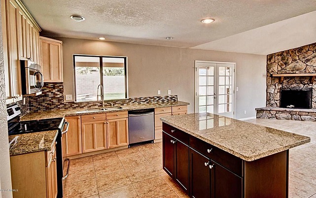
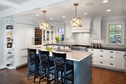
The owners of this stately 1930s colonial in Chevy Chase, Maryland, set out to upgrade their kitchen to better reflect the architectural details of their home. As professionals and the parents of two young children, they also wanted a workhorse kitchen that could stand up to the rigors of daily meals and frequent dinner parties. A better connection with their nearby family room and a designated breakfast area for casual meals were also at the top of their list.
They removed two walls of the existing kitchen and borrowed about 12 feet from an adjacent in-law suite to create enough room for a large center island and good circulation. They also pushed out a sink wall a few feet to make the kitchen flush with the family room. A new half wall/architectural screen now defines the kitchen and breakfast area while making a strong connection between the kitchen and family room. See how it looked then and now below.
KITCHEN AT A GLANCE Location: Chevy Chase, Maryland Architect and general contractor:Gilday Renovations Size: 200 square feet (18½ square meters)
BEFORE: Previously remodeled in the 1990s, the old L-shaped kitchen had no island and only a small peninsula that didn't offer the workspace or storage the homeowners desired. By removing the wall where the range was and pushing into the in-law unit, they gained the space they needed for the upgraded kitchen.
"The challenge of this project was how to give intimacy for the kitchen while retaining the open feel we wanted for the kitchen, breakfast space and family room," says project architect Dan Morales of Gilday Renovations.
AFTER: This is basically the same angle as the previous photo, only now you can see how the kitchen got pushed back to the wall that was originally in the in-law unit. By doing this, the team was able to add new operable casement windows on each side of the cooking zone that offer views of the side yard outside. "They provide light, make it a friendlier space and anchor the range," notes Morales.
The new layout allowed room for an impressive custom center island with a large stainless steel Julien sink, two stainless KitchenAid dishwashers and a polished statuario white marble top from 3Cm. The couple painted the base of the island a blue-gray color (Web Gray by Sherwin-Williams) that provides contrast for the kitchen's white cabinetry and the perimeter stone counters in Kodiak Brown with an antique finish from 3Cm.
A roomy 48 inches separates the island from the surrounding counters and appliances. "We did this so two people can work comfortably in there at the same time," explains Morales. The crackle tile backsplash with a custom gray grout along the range wall keeps with the classic look and feel of the home.
Since the couple loves to entertain, they included a Sub-Zero wine refrigerator along with their large Sub-Zero refrigerator with panel fronts. "We went back and forth about doing stainless or paneling the refrigerator, and I'm glad we went with the panel fronts, because the kids get their fingerprints on it all the time," says the wife. Below the main refrigerator sit two refrigerator drawers for milk and juice cartons for the kids and two easy-access freezer drawers.
Corners are always an issue in kitchens. Because the homeowners wanted to take advantage of every inch of space, they included a corner lazy Susan for storage of various bowls. A pullout cabinet for additional baking supplies is located in another corner of the kitchen. The range wall has extra-deep and extra-wide drawers for storage of pots and pans.
An integrated spice drawer to the right of the Viking range was a handy addition. The kitchen also includes long and lean pullouts for tray storage.
The homeowners wanted attractive but sturdy appliances that would be suited for both daily meals and large parties. In addition to the Viking range, the kitchen now includes a microwave oven and wall oven from KitchenAid.
Pulling together the classic architectural details and elements of the home, the base of the island has legs on each side that mimic nearby columns used to separate the breakfast area from the family room.
Coffered ceilings in the family room and adjacent breakfast area add architectural interest and help visually connect the spaces. A custom cabinet in the architectural screen/half wall was designed for media storage. "I think overall we gave them a beautiful, spacious and calm space," says Morales.
This floor plan shows the limitations of the previous kitchen layout:
Caitlin McCarthy and her design partner, Caitlin Murray, spend their days designing stylish interiors for their clients through their firm, Caitlin + Caitlin Design Co. So when McCarthy bought a 725-square-foot, ninth-floor Los Angeles loft in a historic converted office building downtown, she knew just what she wanted. "I've always wanted to live in New York and have the 'Sex and the City' lifestyle," says McCarthy. "I purchased a home in Los Angeles and really wanted to create something that felt SoHo and had that Carrie Bradshaw kind of feel."
When McCarthy started brainstorming for the design of her 17-foot by 13-foot loft living room, she decided she wanted to go with a navy and mint color palette with touches of aqua and celadon - and fell in love with a soft mint daybed that serves as the centerpiece of the space. "A lot of times, people believe furniture needs to be against the wall, but placing it more in the middle helps break up the space and creates two sitting areas," she says.
She placed a pair of comfortable teal leather chairs on one side of the daybed and two vintage chrome chairs she reupolstered in blue velvet on the other. For storage she included a white bar cabinet under her flat-screen TV and an imperial-green tray table under one of the living room's large windows for small plants and accessories. The tray table sits low and adds a key punch of color.
Coffee table: Jayson Home (no longer available), throw blanket: Hermès
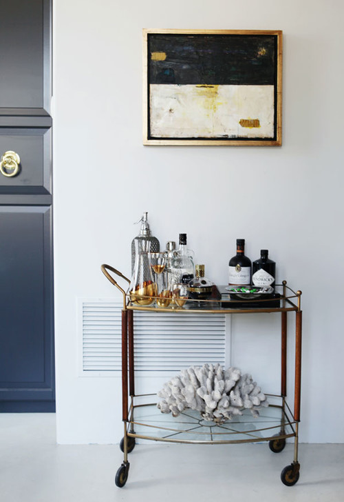
A vintage midcentury brass, glass and wood bar cart with a masculine feel sits under a painting by McCarthy's mother, artist Jan McCarthy. "This painting is one of my personal favorites, and it's technically on loan," says McCarthy. "It really complements the bar cart."
Walls painted a custom gray (a color similar to Benjamin Moore's Gray Owl) provide a pleasing backdrop for the chic living room furnishings, and contrast the unit's exposed brick walls. "Because my loft overlooks an alley, it would have felt too moody with a dark color," notes McCarthy. "I'm the queen of dramatic walls and think they're so rich, but in this case it made sense to go with a light gray."
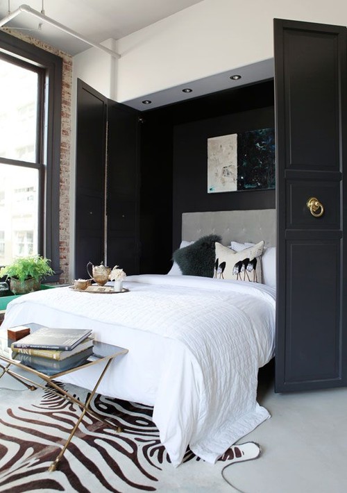
A nook, original to the home, holds one of the great features of McCarthy's flexible living room: a hidden queen-size Murphy bed behind an Ikea cabinet customized and factory sprayed the same color as her window frames (Cracked Pepper by Behr in a satin finish).
Large brass knockers from Restoration Hardware echo other brass accents in the room and give the cabinet that holds the bed a finished look.
A tufted gray headboard added for looks and comfort is clipped onto the bed by hooks and removed when McCarthy closes the cabinet. Another painting by McCarthy's mother, chosen for its dramatic composition and colors, completes the impressive reveal when the cabinet is opened.
The hidden bed gives overnight guests a stylish and comfortable sleeping spot, and also represents McCarthy's high-low decorating approach.
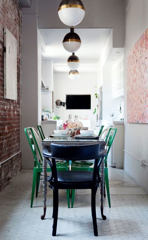
The living room (in the distance in this photo) is open to the kitchen and the dining area. "I love the idea of having a salon, if you will," says McCarthy.
Since the designated rooms share space, McCarthy places a black accordion screen between the dining area and her bedroom when she is hosting a party in the living room or a dinner in the dining area.
Her living room and the entire loft reflect her design philosophy. "You want to try and layer different textures and materials and sizes and shapes," advises McCarthy, "so your rooms have a collected feel, and give people a reason to explore them each time they come to your home."
ZillowThe countertops, backsplash and appliances are brand new, while the original cabinets got new paint and hardware.
By Erinn Valencich/Zillow Team
Even with a limited budget and time frame, a major overhaul can be done on a dated kitchen. For example, this 1950s kitchen in Oxnard, Calif., is in bad need of an update. Walking into it was like a blast from the past: The knotty pine cabinetry had funky details, the linoleum floor was still intact from its original installation and overall, the space was cramped and dark.
With a little ingenuity, a dark cramped space was transformed into a bright and functional contemporary kitchen. Barring ripping out all the cabinetry, there were easy ways to give this room a complete "facelift" in a matter of weeks. Here are a few tactics from this kitchen update that can work in any space.
Erinn Valencich is known for redefining casual elegance with a modern touch. She recently appeared on NBC's American Dream Builders, hosted by Nate Berkus. Valencich has designed for numerous celebrities and clients around the country through her Los Angeles based firm, Erinn V Design Group. She launched her furniture line and store, Erinn V, on Robertson Blvd in Los Angeles in 2011. Erinn's work has been featured in Elle Décor, Architectural Digest, Town & Country, House Beautiful, Traditional Home, Robb Report, USA Today, Los Angeles Times and more. In addition to her residential work, EVDG recently completed a 650-room hotel and casino in Las Vegas, The Downtown Grand.
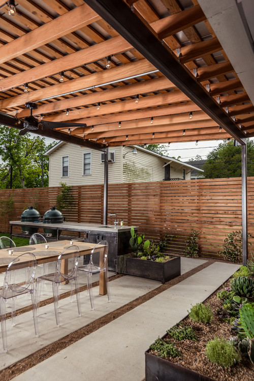
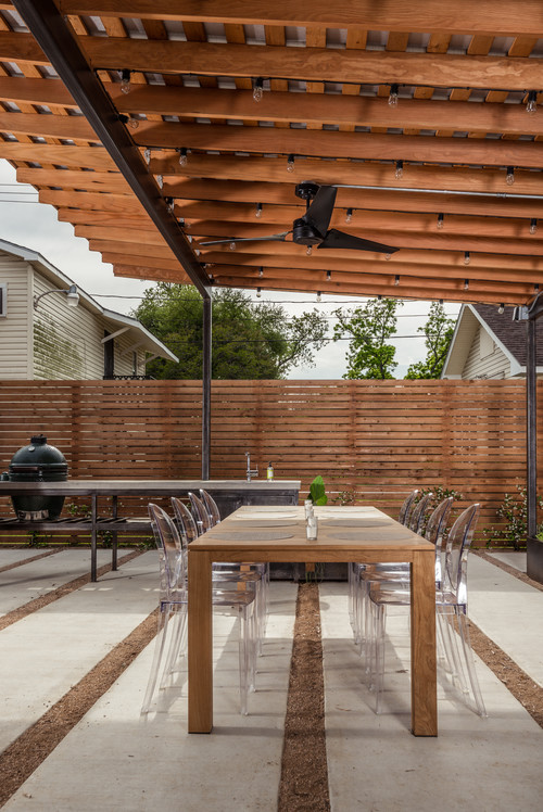
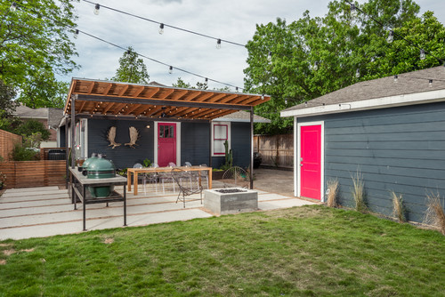
What a bungalow may lack in square footage, it makes up for in efficiency, functionality and simplicity. For the backyard renovation of a 1927 Houston bungalow, designer Brett Zamore channeled these traits, incorporating the homeowners' modern preferences to build an outdoor space to enhance their everyday lives -- nearly doubling their living space in the process.
Backyard at a Glance Location: Houston Size: About 1,150 square feet (107 square meters)
The renovation transformed the 1,300-square-foot home's exterior, but Brett Zamore Design focused most on creating a year-round backyard retreat that could handle Houston's hot, humid summers. "The intent of the design was to create shaded areas, yet allow for a good amount of airflow and a feeling of lightness throughout the backyard," says Zamore.
A custom steel and wood pergola projects off the house, angling up as it extends into the backyard. A continuous gutter attaches to both the roof of the house and the pergola and drains into crushed gravel on the side yard. The pergola's structure is independent of the house. From inside the view opens out onto the patio and invites the homeowners outside. "It's their outdoor living room," says Zamore.
The couple, who are in their late 20s, met at summer camp. Campfires played a big role in the beginning of their relationship, so they wanted the fire pit to be a very central and accessible feature in the backyard.
Zamore built the concrete fire pit right where the hardscape met the softscape to heighten the juxtaposition. It's open on all sides, and friends gather round on cold nights. (It's also far enough away from the house to prevent unwanted heating.)
The outdoor kitchen includes two Green Egg grills. It runs perpendicular to the patio.
A concrete counter tops rough steel cabinets. "We wanted to show the texture of the fabrication," says Zamore.
The moose antlers were a gift from the homeowners' parents.
Steel raised beds sit next to the open-air kitchen and along the bungalow's foundation. Zamore maintained a minimal material palette, to focus the space and create a cohesive experience. He estimates the cost for the steel and fabrication of the kitchen, planters and pergola to be around $8,700. All of the cutting and welding of the steel tubing and sheeting was done onsite.
Succulents and cacti add green to the patio area and need little maintenance. The homeowners say the steel beds under the shade structure warm the soil and create a perfect growing environment for their plants.
A new cedar fence surrounds the property. "I use this type of fence quite a bit with many of my homes," says Zamore. "I like the horizontal feel versus the typical vertical picket fence." It gives the wood fence a modern twist and matches the design's rhythm. Wood balances the amount of steel and concrete, warming the look of the space.
Crushed granite gravel and black star gravel alternate between concrete pavers. The projecting lines of the pergola, wood fence and hardscape keep the eye moving throughout the 650-square-foot patio area, providing visual interest without trying too hard.
A hefty wood dining table from Janus et Cie anchors the space, giving the eyes and feet a place to rest.
The scale and lines of the hardscape, pergola and wood fence complement the home's siding and simplicity, with just a hint of playful modernism (also seen in the back door's pop of pink). Though the yard is modern, it ties in well with the bungalow and perpetuates the neighborhood's eclectic aesthetic.
The patio now allows the house to interact with the detached garage. Zamore left a 500-square-foot lawn portion behind the patio. In contrast to the patio's geometry, this loose area promotes free play. With dogs and perhaps kids on the way, the homeowners wanted a yard that would welcome all family members, present and future.
Whether you're a new home buyer or longtime homeowner you're likely familiar with the lackluster ambiance of an outdated room. It's challenging to determine which interior design element causes that undesirable feeling. Is the space insufficiently lit, overwhelmed by hardwood accents, flooded by a dusty odor or cloaked in an old-fashioned color scheme?
We asked design bloggers for their best do-it-yourself advice to refresh drab interiors. Here are their recommendations.
Commonly used as the family dumping ground, the garage is undergoing a revival as a functional workplace. Installing a garage storage system that frees up some of this space can have the same effect as adding a room, and it's a good way to increase your home's value. Here are three tips to make the most of your garage:
Bob Vila is the home improvement expert widely known as host of TV's This Old House, Bob Vila's Home Again, and Bob Vila. Today, Bob continues his mission to help people upgrade their homes and improve their lives with advice online at BobVila.com. His video-rich site offers a full range of fresh, authoritative content -- practical tips, inspirational ideas, and more than 1,000 videos from Bob Vila television.
Note: The views and opinions expressed in this article are those of the author and do not necessarily reflect the opinion or position of Zillow or AOL.
It was a farm and a dairy, to be precise, on Martha's Vineyard. Having vacationed on the island for several summers, the family knew they liked it there. "And we're really interested in food and where it comes from," Molly says. "So we thought we'd buy a farm and make cheese, and 'The Sound of Music' would play in the background. We had no idea what we were getting into."
Raising livestock and overseeing a dairy takes enormous effort, and the couple added to their work by making the Grey Barn and Farm, as they named the homestead, certified organic. Their cattle are 100 percent grass-fed, and their heritage-breed pigs and several varieties of chickens forage in the property's fields and woods for food. (The pigs also eat the whey that's left over after cheese is made.) The Glasgows sell their products, including raw milk, cheese, eggs, beef and pork, from an on-site farm stand that's open daily.
Before they could get the dairy up and running-it hadn't been active since 1961-serious upgrades were needed. Only one of the structures, the largest barn, was serviceable, and it had to be overhauled to accommodate the affinage caves for the cheese. It was also equipped with solar paneling, as were other outbuildings (including the one housing the milking parlor and creamery), most of which were designed by the Glasgows' architect, Massachusetts-based Mark Hutker.
Likewise, the old wood residence on the property wasn't suitable for the family of four, so Hutker was tasked with conceiving living quarters as well. "We had this fantasy of a modern Belgian farmhouse," Molly explains. "I just love that rustic European look-the colors, the weather, the sense of design. That was the real inspiration."
Hutker proposed a long, low dwelling that would mirror the contours of some of the new buildings. As a result, the home's profile resembles an old barn retrofitted as a residence. The great steel-and-glass entrance appears wide enough to drive a tractor through, and at the south end, a vast picture window looks like a passageway for the Glasgows' herd of 30 Dutch Belted cows.
"I was steadfast about wanting the house to have a structural timber frame-not a fake one," says Molly, who studied sculpture at Pratt Institute in New York City. "We built it using old timbers from a barn in North Carolina." Hutker employed as many salvaged and locally sourced components as possible, like the reclaimed-wood floors, and the ceilings and pantry counters fashioned from trees on the farm. "They are materials that will wear in a very traditional and time-honored way," the architect says.
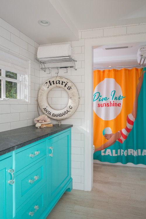
Most people have a positive association with the beach, whether it came from a single family vacation long ago or comes from a wave-crashing view that greets you every morning. Either way, it's a good feeling to evoke in your home. Bathrooms in particular are good spaces in which to inject a nod to the beach. Water; durable, natural materials; a sense of travel and casualness -- all elements linked to a sandy-shore lifestyle -- form a solid combination for a welcoming bathroom.
Here are eight elements that will help you get the style in your home.
Shutterstock 1. A sense of place. First, decide which beach will be your inspiration. The beaches of New England are way different than the ones in Florida, in the Caribbean or up and down California's coast. "There are beaches that are rocky and moody with huge surf and dark brown sand, or ones with light sand with light blue water," says Shannon Ggem, an interior designer in Malibu, California. "Some beaches are very green with reeds and dark gray water and taupe-y sand."
Look at photos of the beach you have in mind and note the color of the water, sand and surrounding vegetation, and the moodiness of the climate. Then determine what natural elements are present. Are there rocks? Shells? Dunes? Lots of driftwood? Wooden piers and fences? Seaweed? Also try to get a good sense of the culture of the beach. Is it all swim trunks and surfboards? Or is it windbreakers and campfires? Ggem suggests looking at historical buildings in the area of the beach you choose, too. "You can tour a historical sea captain's mansion in New England for $6 and walk away with a pocketful of details," she says.
All this will help inform your (and your designer's, if you will be using one) choices of colors, materials and accessories.
Beach Style Bathroom by Los Angeles Interior Designers & Decorators Shannon Ggem ASID
For inspiration in this particular project, Ggem's client was thinking not only of a very specific beach in Santa Barbara, California, but a specific time period too.
"She was thinking of vintage Santa Barbara, a time from before she was born," Ggem says. "So I pulled vintage advertisements from Catalina and Santa Barbara to see how they sold beaches as fun, wide and sandy. So that's how this bathroom ended up."
2. Durable finishes and a sense of service. A fully tiled wall gives the space a beach-changing-room vibe, which hits on a number of related elements. "Beach bathrooms need a service feel," she says. "They're hardy and easy to maintain."
Ggem likes to use fake wood tile (seen here) in her beach-themed bathrooms, because actually being near the beach means the inevitable presence of sand inside her clients' homes.
"Sand will scratch the crap out of wood floors," she says. "So the long-plank fake-wood tile has been a godsend."
Durable finishes lend a sense of casualness, which is also largely associated with beach lifestyles.
Beach Style Bathroom by New York Architects & Building Designers Rosenberg Kolb Architects
3. A sandy, watery, woody color palette. Once you have your beach in mind, that should give you a color palette. Architect Michele Kolb of Rosenberg Kolb Architects suggests starting with the floor or walls to anchor the scheme. "I think of sand, beige and gray tones of sand, so I might do a tile floor in that color palette," she says. She pulls from watery tones as well, like the crystal blue or light aqua of the Turks and Caicos' water, where she's had many clients.
She also pulls color from driftwood, as seen here in a New York bathroom she designed. "It's a wood color but with a grayer tone, just like wood left on the beach to gray naturally," she says. The variegated glass tiles, meanwhile, feel like the "undulation of waves in water," she says.
If you're still stuck on figuring out a color palette, Ggem recommends starting with sea glass -- shards of broken glass rounded and frosted over time. It includes many muted blues and greens.
4. Unpolished finishes. Just like sea glass has that timeworn frosted quality to it, so should finishes in a beach-theme bathroom. "Nothing high gloss or slick," Kolb says. This means shiny chrome finishes are out, and satin and matte ones are in.
Bathroom by Los Angeles Interior Designers & Decorators Shannon Ggem ASID
5. Raw wood and other natural materials. Driftwood and weathered wood fencing populate most beaches, so it makes sense to introduce the material if you're re-creating the style. Natural stone countertops, like the ones seen here, are recommended, too. These offer the movement of nature, which help connect the space to a beach environment. "You can see that water made those lines in the stone," she says. "You'd be hard-pressed to find a man-made stone countertop in a vintage beach bathroom."
For this space, Ggem says, she looked to the wooden slat fences on dunes in New England and the grayness of the Atlantic for inspiration. "Everything gets dialed a little bit darker and moodier when thinking of East Coast beaches," she says.
Beach Style Powder Room by London Furniture & Accessories Cabbages & Roses Ltd
6. Canopy stripes. Looking to bring in some pattern? Fabric in yellow and white, blue and white, or red and white stripes "just says lawn chair and umbrella," says Ggem.
Here a small blue and white striped pillow and door curtain do the job. Also note the other elements here: raw wood, a service feel and muted sea colors. It's a look befitting the shores of the English Channel, where this bathroom is located.
7. The right accessories. "Accessories sell the whole situation," says Ggem, who recommends picking one focal point and having that be the one thing that "sells" the beach theme. "If you're going to do a starfish, it better be in a pretty prominent spot," she says. "Not just three framed starfish prints from a big-box store. It has to be a moment."
Beach Style Bathroom by Biddeford Photographers Irvin Serrano
Kolb agrees. "Accessories are critical," she says. Found beach objects, natural pieces of wood and dune grass are all good candidates for inclusion. "Even vessels that are reminiscent of found antique bottles that might have been in the water," Kolb suggests.
Not into the whole shell thing? No worries. (Not every beach has shells anyway.) Rope and driftwood are great for punctuating the look without being so obvious.
Paintings and other kinds of artwork reminiscent of seascapes will add to the feel of being near water versus being in an urban environment, but many designers will recommend not overdoing the kitsch. "Life preservers push the limits for me, and anchors and sea horses," says Ggem. "I get it, but I think it's better to think in terms of natural materials you see at the beach."
8. Natural light. Just like with a day at the beach, abundant, natural sunlight is important, says architect Eric Rosenberg of Rosenberg Kolb Architects. "Because when you're at the beach, there's so much light, even if it's diffused by haze."
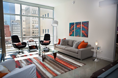
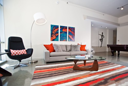
When a young bachelor purchased his downtown Dallas loft, he wanted a space different from his main townhouse in the suburbs. This loft would be a place where he could relax, hang with his friends and enjoy the nightlife of the city. He asked designer Abbe Fenimore of Studio Ten 25 to give him a contemporary and bold living room -- and give it to him fast.
Contemporary Spaces by Dallas Interior Designers & Decorators Abbe Fenimore Studio Ten 25Sofa: Room & Board (no longer available; see a similar choice here); accent chairs: replicas of DWR Metropolitan Chair; wall paint: Chantilly Lace, Benjamin Moore
"We furnished the entire unit in under three weeks," says Fenimore, who used floor models and replicas of out-of-stock items to get the place ready for when her client returned from an extended business trip. "With this living room, we wanted to create a place where he could entertain and enjoy the downtown views. We had to choose furniture that could be moved around easily, depending on how he was using the room. He didn't want anything fussy, and it had to be functional."
Contemporary Spaces by Dallas Interior Designers & Decorators
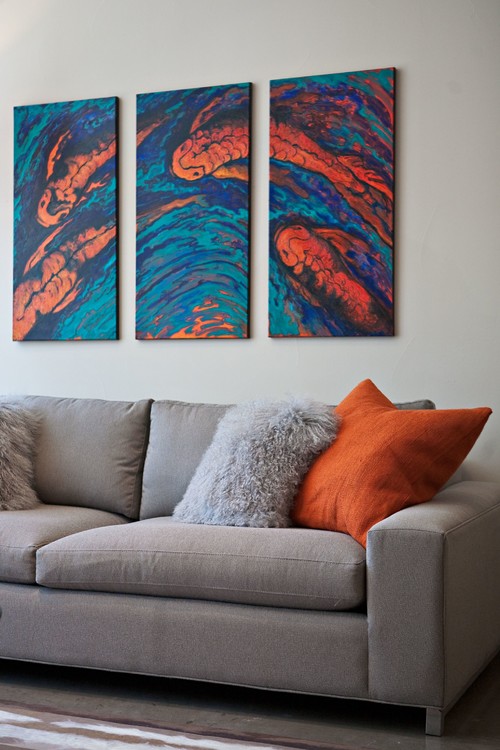
Abbe Fenimore Studio Ten 25Mongolian fur pillow: West Elm; large orange pillow: CB2
The warm orange, deep teal and royal blue colors in a contemporary painting of swimming koi fish that the homeowner purchased at a charity event served as the color inspiration. And since the living room offers dramatic views of the city outside, Fenimore and her client wanted the space to have a definite downtown vibe.
A clean and contemporary heather-gray sofa is extra long, so the 6-foot, 6-inch-tall homeowner could enjoy a nap in comfort and have a place for friends to sit while they watch TV or play video games. "I talked him out of going with a sectional," says Fenimore. "It would take away from the view and be too chunky in this space."
To anchor the room, Fenimore choose a bold striped rug that picks up the orange tones in the painting and adds warmth to the concrete floors. "I love the striped design here, because it immediately draws your eye out to the view," she says.
Because of the time crunch of this project, the designer went with the floor model of a modern glass coffee table with a walnut base. Fenimore feels this particular coffee table works because it keeps the space open and doesn't distract from the rug.
Contemporary Spaces by Dallas Interior Designers & Decorators Abbe Fenimore Studio Ten 25
While the homeowner didn't want a sofa full of pillows, Fenimore persuaded him to add two on each side for comfort and to add another layer of color and texture.
"Understanding how to layer a color on its own is important," she says. "The gray fur pillow has cooler blue tones, while the sofa is a warmer gray. Instead of bringing in another pattern, you can use a neutral with texture."
This loft was designed for entertaining and fun, so the homeowner wanted a pool table nearby that could also be used for dining. "It actually worked out well, because it has a gray felt top that goes with our color palette," says Fenimore.
Contemporary Spaces by Dallas Interior Designers & Decorators Abbe Fenimore Studio Ten 25
The living room is right between the master bedroom and the guest bedroom. Fenimore took color cues from the living room to the master bedroom, combining orange with purple to give the softer bedroom a personality of its own.
A flapper-dancer decal on the wall off the entrance to the living room was the designer's way of bringing a club vibe to the space. "He wanted an actual stripper's pole," recalls Fenimore, "and this decal was the compromise. He ended up loving it and thought it was genius."
Contemporary Spaces by Dallas Interior Designers & Decorators Abbe Fenimore Studio Ten 25Arching lamp: floor model from a local store; a similar design is available from YLighting
Located off the loft's front entry, the living room is illuminated at night by recessed and track lighting and a large arching floor lamp with a white cotton and linen drum shade.
While the living room is open and airy, Fenimore doesn't consider it a minimalist space. "It's really a place where he can relax, entertain and just feel like himself."
Transitional Living Room by Durham Interior
Designers & Decorators Heather Garrett Design
By Becky Harris
When a young couple moved into this Tudor-style house in Chapel Hill, North Carolina, he was really happy with the rustic finishes, but she was looking to glam them up a bit. They also needed items that could stand up to their 1-year-old and their three dogs, and to getting a little rowdy with their friends when relaxing and having beers together.
I find so many clients with young kids and pets want cool stuff, but they can't figure out to do it without worrying that they'll ruin everything," says interior designer Heather Garrett. In this case her solutions included upholstering with rustic leather and outdoor fabrics. The results are a balance of rough-hewn and sophisticated styles, a harmonious compromise that pleases both partners.
The existing architecture brought in plenty of the rustic, with a large stone fireplace and a rough-hewn mantel and beams.
Garrett balanced rustic and glamorous items all around the room by adding lots of layers of texture, including a Calvin Klein area rug on top of a large custom wool one, polished plaster walls and floor-to-ceiling draperies.
Transitional Living Room by Durham Interior
Designers & Decorators Heather Garrett Design
Individual items and pairings balance rustic and glam -- a tufted leather ottoman floats on top of Lucite legs, for instance. The only "taxidermy" items are silver fake stag horns. There's an antique brass mirror above the mantel.
The room has a pleasing symmetry without going full-on mirror image. For example, Garrett used two different sofas. "As long as the heights are about the same, you can play a little with depth, length and style, because the eye rests evenly on both sides," Garrett says.
We used a really rustic leather on the wingback chairs in a manly color, but then added metallic saddle stitching for contrast," Garrett says. Elegant embroidered pillows add a glamorous touch.
There are handy side tables throughout the room for those aforementioned beers. They have a mix of finishes and textures, including honed marble, galvanized steel, antiqued mirror and metal.
Garrett used to be rigid about sticking with one finish throughout a room but has loosened up now that there are so many different finishes available. "The metals are distressed, antiqued and vintage; the patina can tie them all together," she says.
Transitional Living Room by Durham Interior
Designers & Decorators Heather Garrett Design
The chaise is the largest piece covered in a pattern. "It's kind of a tribal Eastern pattern in raised velvet," she says. This fabric was treated with a fabric protector so that it can stand up to pets, kids and drinks.
A painting by Tyler Huntzinger plays with the eye depending on the light and the angle from which it is viewed.
"It's a winterscape of a forest, but then he used a silver-leaf oil wash over it," Garrett says. From some angles you see the northern woods; from others the silver looks like a natural pattern.
Accessories like geodes add some jewelry to the room.
The family room is completely open to the kitchen. Originally the kitchen had more of a country look, but again, Garrett glammed it up while leaving plenty of durable materials and masculine elements.