With the days getting longer, now is the perfect time to build a backyard treehouse for your kids - or for yourself. Treehouses are no longer just play spaces for children; they're also places for adults to unwind, pursue their hobbies and even make their primary residence.
Today, about 15 companies are in the "treehouse business," with specialized teams of engineers and interior designers building custom-designed backyard escapes and providing kits and tools for homeowners looking to construct their own.
Here's a look at the growing trend and some tips for building a dream treehouse:
Function
Fall City, Washington-based Nelson Treehouse and Supply, featured on Animal Planet's "Treehouse Masters," has built everything from breweries and recording studios to spas with steam showers -- all suspended in trees.
"A lot of people think of treehouses and children, but 9 out of 10 treehouses we build are for adults," said Daryl McDonald, the team's foreman. "People want an escape pod -- a way to get out of the busyness of being in a home."
Pete Nelson, owner of Nelson Treehouse and Supply, poses by a Ohio brewery he designed on Animal Planet's "Treehouse Masters." New episodes of the popular TV show begin on May 30.
CeeLo Green stopped by a recording studio built by Nelson's team in Woodinville, WA to lay down a track.
Tory Jones, the TV show's interior designer, says the sky is the limit when it comes to designing a treehouse. But first you must think about what you need that extra space to be and how you want it to function.
"Design follows function," she said. "I've literally done everything from midcentury modern to contemporary and Mission-Craftsman style."
Design
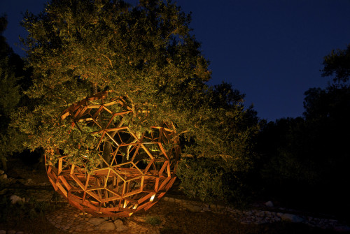
O2 Treehouse, a California-based company that will be appearing in an upcoming episode of "Treehouse Masters," is experimenting with not only function but design.
"I've gotten into more complex forms in the geodesic family," said Justin Feider, the company's owner and lead builder. "One of my favorites is the honeysphere with 200 openings."
The Honey Sphere by O2 Treehouse in Beverly Hills, California, features a geodesic design.
Feider says the geodesic shape makes sense for a treehouse because of its strength. The design is also a reflection of architecture and nature, he says.
"People's consciousness of the green movement and their inherent responsibility in that story has been on the rise," Feider explained. "Treehouses are part of that. They're the poster child for living sustainably in a natural structure -- a symbiotic relationship with a tree."
Construction
This Austin, Texas, treehouse designed by Nelson's team has a spa inside.
Both Nelson and O2 provide treehouse consultations, construction and installation in the U.S. and abroad. The process typically takes between two days and nine months, depending on the size and complexity of the project.
"If you want installation, we quote on a custom basis because every tree is different," Feider explained. His custom structures normally cost between $35,000 and $100,000. Treehouses built by Nelson Treehouse and Supply typically fall in the $80,000-$200,000 range, but their prices also vary depending on the project.
"We do a lot of little ones. A 'kid deck' up in a tree would take us two to three days," McDonald said. "The finished product is big enough so you could pitch a tent but nice enough so you could just sleep under the stars. It's fun because of the immediate gratification."
At the other end of the spectrum, the biggest project McDonald completed was a 1,000-square-foot treehouse with a 500-square-foot deck. "It had a clawfoot tub," he said. "It was the most extreme one I've worked on."
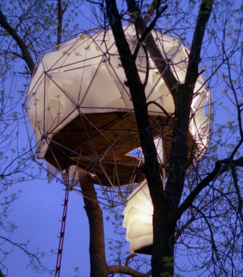
O2 Treehouse's Leaf House in Pewaukee, Wisconsin, is known as the "floating lantern" because of its striking silhouette against the night sky.
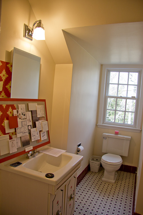
ZillowThe kitchen of the 1920s house had linoleum floors and a cramped space.APJanuary JonesBy Emily Heffter
As Betty Draper on "Mad Men," January Jones seems at home in the midcentury suburbs. But the remodel of her Los Feliz Mediterranean home, now listed for $1.495 million, shows her personal style is more formal and contemporary.
Since buying the home for just over $1 million in 2009, the actress had a son, filmed several seasons of the hit AMC show and found time to completely remodel the kitchen in her 1920s gated home. And there is not a retro appliance or rotary telephone in sight.
Jones added a Carrara marble island and a big stainless steel sink. She also updated the wood-burning fireplace and redecorated in a black-and-white palette. The formal, elegant three-bedroom, three-bath home is 2,200 square feet, with a pool table, hardwood floors and lots of windows.
ZillowThis home in the Pacific Northwest is in the classic Queen Anne style but was built in 1997.By Catherine Sherman
Victorians have a little something for everyone -- formal living areas for special occasions, space for a growing family and ornate architectural details like icing on a gingerbread house. They also present challenges for a contemporary lifestyle. Nooks and built-ins, while full of character, can become dead space in a home where families like to gather. Partition walls between rooms and decorative chandeliers can obstruct walkways.
On this week's episode of NBC's "American Dream Builders," the final four designers opened up the floor plan, knocked down walls and took out a wetbar to make to a Chatsworth, California, Victorian more family-friendly. As a result, the Zestimate(R) home value increased by 42 percent -- the biggest jump in value seen on the show thus far. While the Zestimate is not a substitute for an appraisal, it's a great starting point for determining how much a home is worth.
To see Victorians currently for sale, we've gathered a few standouts below. Click on the links for interior photos, Zestimates and other home facts.
ZillowThe designers embraced the ornate style of a traditional Victorian house in the dining room makeover.By Erika Riggs
With one episode to left go, the playing field on "American Dream Builders" has narrowed quite a bit. Just four designers remained for the latest project: a stately Victorian home in need of a major makeover. Designer Nina converted a messy office into a nursery, transforming the plain, unadorned space into an elegant room that will work for a child for years to come.
LOOK NO. 1
"A little glamour -- maybe a chandelier -- is fun in a girl's room. Frilly can be beautiful if it's done correctly," she explained. "That said, there are benefits to sticking to major design elements that are gender neutral so you can use the same nursery for a second child."
LOOK NO. 2
Victorian homes are not often simple spaces. Designed in an era of gold and glamour, Victorians have ornate detailing inside and out. The designers embraced the ornate style, creating an entertaining space featuring gold, damask wallpaper and elegant drapery.
Zillow/Room design by Blackband Home & Design.Don't be afraid to mix and match prints!By Erika Riggs
For the "American Dream Builders" season finale, the two remaining contestants, Lukas Machnik and Jay Riordan, were each given a beachfront home to rehab and redesign. The beach houses suffered from significant wear and tear -- rundown decks and windows and old interiors. Jay took a more traditional approach to the challenge and Lukas went for a minimalist look. Here are some tips for replicating their designs.
Look No. 1: Jay's choices for the draperies, fabrics and wood in the guest bedroom helped to create a warm and airy space. The builder created a statement wall behind the bed with standard 1-by-6 polar boards. "I white washed [the wood] to give it a beachy, rustic feel. The wash made it look like it had been there for 50 or 60 years -- instant character," Jay explained.
Look No. 2: Lukas stuck with his trademark style to create a simple and chic beachside retreat. By opening the living space up and keeping accessories to a minimum, the designer let the home's surroundings shine.
Suzman Design AssociatesTropical plants and palm trees fit the climate and architecture of this Hawaii home.By Larry Bilotti for BobVila.com
Your front yard, regardless of its size, plays an important role in your home's overall curb appeal. Your landscaping, however, goes well beyond just a beautiful lawn. It should take into account the style and size of your house, how it's sited on the property, the amount of sunlight the yard receives and how to best enhance it with plantings, bushes, shrubs and trees. It should also include hardscaping features, from walkways and driveways to raised beds, planters and decorative containers.
What are the best practices for front-yard landscaping? To learn more, we reached out to Dorian Winslow, a certified landscape designer and the owner and president of Womanswork, an online retailer of gardening apparel and supplies. Here are her 12 tips for successful front yard landscaping.
1. Find your focus.
Every view in your landscape should have a focal point. "For your front yard, the focal point is the front door, so be sure you don't hide it," advises Winslow. If you are considering major plantings such as trees, think about how they will frame the front door as you approach your house.
2. Use ground covers.
Ground covers are a low-maintenance alternative -- and complement -- to grass. "Because they're low to the ground and dense, they give a neat appearance with very little maintenance," says Winslow. "They also allow you to introduce spring bulbs to your landscape because the ground cover hides the dead leaves after the bulbs bloom." Be sure you research what ground covers work (culturally) with the trees in your yard.
Eduardo MendozaThe path is curved, but not meandering.
3. Set the right path.
When considering the pathway from the driveway to your front door, Winslow says to "remember that our natural instinct is to take the most direct route to where we're going." A curved path to the front door is nice, but a meandering path may not be. "If you want to take your visitors on a circuitous route, be sure you plant densely along each side of your path," she adds. "Otherwise, your guests will cut their own path across your grass to get to the front door."
4. Rethink foundation plants.
"Avoid treating foundation plants as if they were little soldiers pressed up along the perimeter of your house," advises Winslow. "For a two-story house, foundation plantings should extend at least 8 feet out from the house." And remember, a curved garden bed can soften the lines of your house in a pleasing way. Be sure the shrubs that are placed closest to your house are not taller than the windows, or they will block the light coming into your house and the view from inside looking out. When you're planting shrubs, think about how they will look in three to five years. "You don't want to select varieties that will block your windows," she adds.
5. Add some privacy.
If you are looking to add some privacy in your yard, consider a buffer of shrubs, suggests Winslow. "A buffer that includes multiple plants at varying heights can accomplish the same thing as a solid hedge or a fence but is far more welcoming," says Winslow. Alternatively, if you are just trying to block the view from a particular room -- or a part of your yard from your neighbors -- plant a couple of trees or shrubs with strategic precision.
6. Deter the deer.
If deer are an issue, select shrubs that are deciduous (lose their leaves in the winter) but retain their form even when their leaves are gone. This will help preserve the structure of your garden in all seasons.
7. Consider the light.
"Your house is a large object that will block the sun for part of every day," notes Winslow. If your house faces north, the front yard is never going to get great light. If it faces east or west, it may get searing sun for part of the day and then no sun for the remainder. Make your plant choices with that in mind, advises Winslow.
All Oregon LandscapingPavers dress up the edges of this driveway.
8. Think long-term.
If you're planting trees in front of your house, plan 12 to 15 years out. They are considered a permanent fixture of the landscape, so you want to be sure they are not too close to the house. "If you are thinking of selling your house, a tree can be an asset -- unless it is one that prospective owners think they will have to remove; then it's a liability," cautions Winslow.
9. Dress up the drive.
If you have a standard asphalt driveway that you want to enhance, install a border of Belgian blocks (more expensive) or cement pavers (less expensive) along the edges of your driveway. A border gives the driveway a more finished and rich look.
10. Create an entrance.
"If your driveway is a straight line from the street to the house," says Winslow, "soften the line with a curved planting bed where the driveway meets the front corner of your yard." This will create a pleasing, sweeping effect as you approach the house.
11. Add a flowering tree.
A flowering tree provides wonderful curb appeal and is welcoming for those few weeks in spring when it's in bloom. Flowering varieties provide fragrance and usually don't block the house, because they tend to be smaller trees.
12. Keep it simple.
Don't crowd your front yard with lots of objects or plants. Have a clear structure to the design and a focal point.
Bob Vila is the home improvement expert widely known as host of TV's This Old House, Bob Vila's Home Again, and Bob Vila. Today, Bob continues his mission to help people upgrade their homes and improve their lives with advice online at BobVila.com. His video-rich site offers a full range of fresh, authoritative content - practical tips, inspirational ideas, and more than 1,000 videos from Bob Vila television.
Note: The views and opinions expressed in this article are those of the author and do not necessarily reflect the opinion or position of Zillow or AOL.
Pieter EstersohnSuzanne Tucker of Tucker & Marks refurbished a formal living room and decorated it with shades of yellow, brown, and peach.Interviews by Melissa Feldman
Today's great design minds reveal their chic, clever tips for remodeling, from small jobs to total makeovers.
Suzanne Tucker, Interior Designer
"The warm tones of butter-yellow are always flattering-to art, antiques, and us!"
William Sofield,Interior Designer
"Imagine all the surfaces of a room simply as reflectors of light and then choose paint values, tones, and colors that will accentuate or minimize differences. I often paint each surface a different color in order to achieve the right balance."
Robert Couturier,Architect/Designer
"To soundproof a room, upholster the walls and use thick carpets. I also put Green Glue behind the drywall-it's a very effective noiseproofing compound."
Lee Ledbetter,Architect/Designer
"Paonazzetto is my current favorite marble for baths because it has graining reminiscent of a Franz Kline painting. It's difficult to find the really beautiful slabs with a lot of contrast, but the hunt is worth the trouble."
Sandra Nunnerley, Interior Designer
"Rooms with high ceilings need generous baseboards. I have them made ten inches tall when necessary."
Baccarat's shower fitting for THG.
Tony Ingrao,Interior Designer
"My new favorite bath fixtures are Baccarat's Pétale de Cristal collection for THG-they have crystal handles in a variety of colors and chrome or gold components."
Steven Gambrel, Interior Designer
"Hardware is something you touch every day, so purchase the best. My splurge for the bath is the Henry line of faucets and hooks by Waterworks."
Penny Drue Baird, Interior Designer
"Polished nickel marries well with Carrara marble and other white stones, but brass and bronze can be a better fit with warm stones such as Botticino or limestone."
Alexander Gorlin, Architect
"When you're trying to make a small space seem larger, clever use of mirrors helps do the job. Sir John Soane, the most fascinating architect of the late-Georgian era, used them to great effect in the breakfast room of his London house, now a museum."
Richard Mishaan,Interior Designer
"Ebonizing kitchen cabinets is very chic, particularly when combined with chrome-plated or stainless-steel hardware. Then I like painting the rest of the room pure white to create great contrast and a sense of modernity."
Scott FrancesBook-matched Burma-teak marble lines a bath devised by William Sofield.
William Sofield
"Powder rooms have always afforded a great opportunity for self-expression. They should be dramatic, exotic, or, at the very minimum, noteworthy."
Thomas Pheasant, Interior Designer
"There are three must-haves in the bath: Toto's Neorest toilet, music in the shower, and a floor warmed by radiant heat."
Dirk Denison,Architect
"Quartzite wears like iron. I've had bright-white quartzite counters in my kitchen for years, and they still look brand-new."
Shawn Henderson,Interior Designer
"Liebherr's 30-inch, semi-built-in stainless-steel refrigerator is eco-friendly, compact, and slimmer than most."
David Mann, Architect/Designer
"My preferred palette is black and white. I live and work in New York and see that combination as urban sophistication.
Pieter EstersohnDecorator Amelia T. Handegan's beach house features a graphic guest room.
Amelia T. Handegan,Interior Designer
"To enliven a quiet room, use fabrics with varied textures and tones. Combine patterns of different scales to create a more layered look."
Scott Sanders,Interior Designer
"Indirect lighting can make a small space seem larger. For example, cove lighting recessed in soffits seems to dissolve the ceiling, creating the illusion that the walls extend much higher."
Robin Standefer of Roman and Williams,Interior Designer
"S9000-N, a high-gloss black from Fine Paints of Europe, makes kitchen cabinets look like they've been dipped in liquid licorice. We're crazy about colors that remind us of food: butter, cream, oyster."
Barry Dixon,Interior Designer
"Invisible speaker systems have just the opposite virtues ascribed to Victorian children- they're heard and not seen!"
Suzanne Tucker
"A brilliant color painted on the inside of glass-front cabinets will give some va-va-voom to a tired-looking kitchen."
Mandy Sammons says good things rarely happen to her family. When one car breaks down, so does the other. When one of her kids falls ill, the other soon follows. "Bad luck seems to hit us in sixes, not threes," she says. "It's always a downward spiral for us."
Recently her husband, Kevin, took a maintenance management job in North Carolina, moving the family of four from Florida. They purchased a foreclosed-on manufactured home without seeing it because of the hectic move and other constraints. When they pulled the moving truck up and stepped inside, Mandy was shocked. The floors were bare, there were holes in the walls, and the kitchen looked "atrocious," she says.
They had to stay in a hotel for a few days while she and Kevin bought and installed carpet themselves and fixed the place up a bit. "We got it into just good enough shape to bring the kids home to it," she says. Over time they added new pieces: some new counters here, a new backsplash there, just to breathe some life into the home. They started a remodeling plan and figured they would spend six months buying one piece of kitchen cabinetry at a time and store it away until they had saved up enough pieces. "With a single-income family, there are priorities," she says. "We couldn't just go full hog into it."
So when Mandy got a voicemail saying she'd won a $50,000 kitchen makeover from Houzz and Lowe's, she couldn't believe it. "I thought it was a scam," she says. "I had to call my husband at work. Things like that just don't happen to us. If anybody has bad luck, it's us."
The Sammons used $10,000 to cover taxes on the prize; they received $20,000 in gift cards to Lowe's for materials and finishes and another $20,000 from Houzz for labor, construction and design fees.
Houzz helped narrow down the search for local professionals, and the Sammons interviewed and picked their team: designer Laura Vlaming of Arkiteriors and general contractor Brian Macuga from Arbor Construction Group.
The previous kitchen lacked countertop space. So much that Mandy had taken to using a dining table in the middle of the room as a prep surface. On top of that, the appliances were old, the linoleum floor was peeling, and Vlaming believes a previous homeowner had tried to refinish the plywood cabinets, but the surface didn't take the stain evenly.
AFTER: New cabinets, appliances, floors and paint transformed the room. Instead of a dining table, the team added a large peninsula that increased the countertop area and created room for the family of four to eat dinner together.
Mandy bought all the materials and finishes at Lowe's. At $12,000, the expansive new cabinets took up a good portion of the budget. But Vlaming credits Mandy with making smart choices that kept her within budget. "It's so easy to see something and want champagne taste with a beer budget," Vlaming says. "Mandy did a good job of restraining and watching the numbers to stay within that $20,000."
Mandy can now do all the things she loves to do in the kitchen: bake birthday cakes and cookies, make candies and make dinner from scratch every night. "I have a lot more space to spread everything out now," she says. "I even have storage to store away all my appliances, so they're not sitting on the countertop."
Cabinets: Deveron by KraftMaid in maple with Canvas paint, Lowe's
Mandy and Kevin had previously done small updates themselves. They had replaced the peeling white laminate countertops and added a backsplash for a little visual interest. Mandy had Kevin install recessed can lights to brighten the room, but then gasped at the cabinets and asked him to install a dimmer. "I thought I wanted light in there, but not with all that ugliness showing," she says.
And they still lacked adequate storage. In fact, they had been storing pantry items in their main bedroom closet, located on the other side of the wall shown here.
But that gave Mandy a brilliant idea. Vlaming wanted to put the refrigerator on this wall, but Mandy felt it stuck out too much. So she suggested they recess the fridge a foot and a half into the wall, cutting into their closet space.
AFTER: That helped open things up on the opposite side. Vlaming then surrounded the fridge with two tall dark-finish cabinets to create something akin to a furniture piece. Coupled with the dark cabinets under and above the peninsula, this helped establish a connection with the living room while delineating the white cabinets behind as the kitchen space. "That way the kitchen doesn't feel like it's in your living room," Vlaming says.
Coming from Florida, the Sammons wanted a touch of beachiness. They got that in the light green backsplash, the brownish-blue floor tile and the countertop, which has bits of sparkly blue and green.
Mandy was able to manage the budget in a way that allowed her to have the popcorn ceiling scraped, skimmed smooth and painted. They were also able to paint the living room and extend wall cabinets and tile into the attached laundry room.
But perhaps her favorite move was knocking down a small load-bearing wall, which freed up space for the large peninsula, which allowed her the thing she wanted most: a place where her family could all hang out and talk. Mandy's 15-year-old daughter, Marcy, used to hang out mostly in her room. Now she's at that peninsula every day after school chatting with her mom about her day and helping prep dinner. "That's just what I wanted," Mandy says.
ShutterstockLandscaping certainly ups a home's curb appeal, but a cheery and colorful front gate will make any passerby smile.By Wendy Manwarren Generes
There are lots of things you can do to add a bit of curb appeal to your home (learn lots of our favorite tricks in our Ultimate Guide to Curb Appeal!), but you'll find that one of the simplest and most impactful changes you can make is with a touch of color.
Jenni Radosevich, author of I Spy DIY, spotted this vivid gate and loved the unexpected pop of color. The sunny shade and bold contrasting rectangle design make this front gate way less forbidding than one constructed of wrought iron, and way more fun than the traditional white picket models. Plus, the colorfully painted gate spruces up the simple stucco exterior of the home without the owners having to spend a lot of money (read: it's less expensive than adding plants and trees).
Here's how to really make an entrance by painting your wooden front gate an unexpected color:
1. Remove the gate from the hinges, take off existing hardware, and clean the surface with warm soapy water. Let dry completely.
2. Repair any cracks or gashes in the gate using a quick-drying wood filler, let dry, then sand so the surface is smooth. Use an old paint brush or tack cloth to remove the dust from sanding.
3. Prime both sides of the gate and all edges. Priming the wood prevents the gate from absorbing moisture. Let dry completely, then sand away any drips with 180-grit sandpaper.
4. Roll on a high-quality, semi-gloss paint specifically made for exterior surfaces, pushing your roller with the grain of the wood. Let dry, then add at least one more coat of paint. You'll need several coats if you've chosen a dark color.
6. Replace the hardware, or add something more modern, such as the long handle on this gate, and rehang.
Truth: This room is about real life for real people. The owners of this space (located in a San Gabriel, California, ranch house) are one of those families for whom entertaining happens more often on the patio by the grill than around a linen-covered table. Their dining room wasn't that kind of space anyway; located just off the kitchen, it was and is used for daily family meals. The dilemma was that the work-at-home mom in the clan needed an office. Their interior designer, Amy Peltier of A. Peltier Interiors, saw one option: make the dining room work harder.
The designer decided to outfit the dining room as an office as well as an eating area. "The biggest challenge was making everything fit in a small room," she says.
To improve flow, Peltier revived a round table and chairs. The legs and apron of the table, which was being used under a covered patio, were refinished with black paint. The top was coated with chalkboard paint - a kid-pleasing option. Vintage chairs were jazzed up with a white seat and back plus black legs.
Key to making the room work was the chandelier - because the table was shifted to one side of the room to make way for a desk, the chandelier was moved over as well. "Of course, moving the light fixture added to the budget," says Peltier. "But it was absolutely essential to having the room look right."
Most offices require storage. For this one, rows of tidy shelves (some of them equipped with wicker bins to hide smaller items) do the trick.
The other side of the room is home to the desk. "She is a graphic designer, and she needs to have a lot of things right at hand," says Peltier. "We installed a horizontal row of wall-mounted file folders. She can easily reach everything, and it keeps the narrow desktop clean." An acrylic office chair all but disappears.
Having many stylish file folders helps give some artistry to the workhorse feature. "I searched everywhere for folders with great patterns," says Peltier. "I found these at Target."
Surrounding the rows of files with more decorative items - an art ledge, a chevron-patterned lamp and a fabric-covered corkboard - also dressed down the office aspect of the space.
"Whenever you purchase something utilitarian, you can also make a style choice," says Peltier. "There's no reason why something that works well shouldn't also be great-looking."
The builder of this home in Holmby Hills is used to high-end clientele. He designed the fashion district in Milan. In fact, most of the work done by Estate Four is high-end commercial, which makes this project particularly special. As if a $48 million spec house isn't special on its own. The home was designed by Quinn Architects of London.
The most striking thing about the 16,000-square-foot home, which has seven bedrooms and 8.5 bathrooms, may be its scale. The entryway has 20-foot ceilings. Walls of glass and sliding doors give each space a grand, luxurious feel.
Some large homes have a well-appointed library. This home has two. Some sumptuous master suites include a walk-in closet or two. This home has three.
All that, and an Italian-influenced, European modern feel that makes it unique in the Platinum Triangle of Los Angeles, where huge, beautiful estates are the norm.
"It's just the whole package. It really is," said David Parnes of The Agency, who holds the listing along with Mauricio Umansky and James Harris. "It's an experience to go into the house."
Source: Scott Campbell via Zillow"Yellow living rooms can be welcoming, embracing, and even sophisticated for both formal and family-style settings." By Marie Proeller Hueston at BobVila.com
Choosing the best color for your living room -- the most public space in your home -- can be daunting, but it doesn't have to be. To offer some inspiration, we reached out to five experts who know a thing or two about paint colors to discover some of their favorite hues.
Bob Vila is the home improvement expert widely known as host of TV's This Old House, Bob Vila's Home Again, and Bob Vila. Today, Bob continues his mission to help people upgrade their homes and improve their lives with advice online at BobVila.com. His video-rich site offers a full range of fresh, authoritative content - practical tips, inspirational ideas, and more than 1,000 videos from Bob Vila television.
Note: The views and opinions expressed in this article are those of the author and do not necessarily reflect the opinion or position of Zillow or AOL.
William WaldronThe entertainer and urban-garden activist cultivates a verdant and stylishly cozy world in the New York home she shares with her husband, Martin von Haselberg.Mitchell Owens | William Waldron | Carlos Mota
Bette Midler, the showbiz force of nature also known as the Divine Miss M, is spellbound by artisanal footnotes, those subtle details that are testaments to the human touch. Finely spaced stitches that secure a delicately ruffled lampshade to its metal skeleton. Fingerprints that bear witness to the intimate relationship between a potter and his clay. The poignant imperfections-smudges, saturations, overlaps-that occur when fabrics and wallpapers are stenciled or blocked one motif at a time.
"My mother was a great seamstress, really brilliant," Midler recalls on a spring afternoon at her Manhattan residence, an airy Fifth Avenue penthouse overlooking Central Park's sun-sparkled reservoir. "Because of her I've been crazy about textiles all my life. And my father painted houses for a living. I grew up around people who worked with their hands, so I love how you can see the care and affection that craftsmen pour into their creations." Her husband, Martin von Haselberg, an investor, performance artist, and collector, concurs, explaining that he is drawn to "really juicy paintings" with gutsy brushstrokes or rugged impastos, by somewhat-under-the-radar talents such as Roger Herman, Charles Karubian, and Hubert Schmalix. "We don't have any big names," he adds, in a tone that's anything but rueful. "We almost got a Francis Bacon but didn't have the stomach to go all the way at the auction."
Engaging textures are one reason the triplex apartment-where the couple raised their actress daughter, Sophie von Haselberg-has the coziness of a well-loved country house. Another is its Edenic wraparound terraces, conceived by Brian Sawyer of the New York architecture, interiors, and landscape firm Sawyer|Berson. Shell-pink 'Alchemist' roses and aubergine clematises clamber up brick walls, and foxgloves sway above emerald hostas. No peonies, though they are Midler's favorite: Their tendency to collapse in brisk winds makes them "the worst flowers to grow on a roof terrace," Sawyer says.
Glorious greenery has long been of the utmost importance to the Hawaii-born Midler, an ardent advocate for Mother Nature's beneficial effects on mind and body. The New York Restoration Project, or NYRP, which she founded, is a dynamic nonprofit whose volunteers revitalize forlorn parks and foster community gardens. (The NYRP has also planted, with the city's Department of Parks and Recreation, some 834,000 trees, well on its way to the goal of one million by 2015, the group's 20th anniversary.)
"If you live in the kind of apartment that most people do, you'd want to go sit on a park bench too," Midler says, plainly impassioned. "I lived that way for years when I moved to New York." Now perhaps the lifelong go-getter could also work her magic on the city's architecture? "People suffer from the lack of light in this town," the entertainer professes, warming to the idea. "There aren't enough windows!"
That's not the case at Midler and Von Haselberg's penthouse, a mellow spot (it was once two apartments) that was remodeled by Los Angeles architect Frederick Fisher and furnished with decorator Fernando Santangelo. Sunlight streams over a chipper jumble of periods and styles, thoughtfully acquired yet casually deployed. "I don't make a study of anything -- if I fall in love with something, I want it. For me, working in many media, it's hard to just do one thing," says Midler, whose latest triumph was a 2013 Broadway run as the notorious talent agent Sue Mengers in the play "I'll Eat You Last."
I suppose some people actually park in their garages. We have been in our house for 15 years and have never once used it for its intended purpose. Which is why I dream of converting it into a family room one day soon.
The best thing about converting a garage into living space is that the structure already exists. In most cases all you need is a little imagination to transform the interior into a comfy, pretty, livable space. (An architect can be very handy when it comes to creating space where you thought there was none).
These five examples - a studio, two living rooms, a mini house and guest quarters - have interpreted the humble garage in vastly different but equally inspiring ways.
This is an exterior shot of a lovely little studio that used to be a not-so-lovely garage.
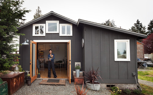
AFTER: Here is the same space reinvented as a bright studio apartment with a view to the pool. A key for a successful garage transformation is light, light, light. Because most garages start out small with relatively short ceilings, natural light makes all the difference in how the space feels.
AFTER: This is one of my favorite renovations. It's light and modern, with incredibly clever uses of space. The architect managed to get a bright, architecturally interesting living room into that dreary garage.
Big windows and half walls increase the sense of space and openness, but also separate the entry hall from the living room. See more of this renovation
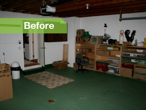
You can imagine what's in here: a broken lawn mower and a lot of spiders.
AFTER: Artist, welder and designer Michelle de la Vega's entire home is in this 250-square-foot former garage in Seattle. Except for the addition of a bathroom, the footprint did not change.
AFTER: Susan Jay Design transformed the garage of a ranch-style California home into a swinging midcentury living room. It's still recognizable as the same structure because the architect maintained that open, gorgeous ceiling.
BEFORE and AFTER:Rossington Architecture in San Francisco transformed this dark, under-the-house garage typical of the area into a bright playroom and guest quarters. Natural light comes from one wall only, but light colors and lots of pot lights help brighten the space.
Always dreamed of a walk-in closet, extra bathroom, or dedicated crafting space? Get inspired with these ideas of what your child's old bedroom could be now that the house is all yours.
I recently wrote an article for Houzz in which I acknowledged the dumbest decorating decisions I'd ever made. More than 300 of you responded with your own tales of woe. Most of them fell into four categories:
1. Painting anything yellow.
2. Furniture that wouldn't fit through doorways.
3. Leaving town while someone worked on your home.
4. Painting anything yellow.
Because it can take a while to read 300 comments, I collected some of the most memorable tales from fellow Houzzers to share with you. Schadenfreude alert: Some of the following stories may cause involuntary laughter. Don't resist.
Note: Photos are for illustration purposes only and do not portray the actual disasters described.
Color Trouble ojmcneff
Once my color-blind husband picked the color to paint our traditional home. He said it was tan. I came home to a lavender house.
joslyn2315
I love the color purple, so I wanted one room in purple. Well, it looks like Barney puked all over the walls.
baiwenli
When building our first house I painted the whole house what seemed to be gray with a purple undertone. My first mistake was in not understanding how tough it is to get gray right. My second mistake was not getting a test pot and trying it out in the space. My third mistake was being out of town when the painters did the job. "Slight purple undertone" was Barney purple. My entire home. Needless to say, my husband was less than pleased having to repaint it. All I can say is test pots, test pots, test pots.
anitabruch I painted a two-story Florida room a Pepto-Bismol pink called "Rose." Then paid the painters to come back and repaint the room Bennington Grey. Only my husband was so mad at me he only let them paint one coat! The results actually turned out interesting - a mauve that shifts around in color from morning to evening. I can't tell you how many people have asked me the paint color. ("Well, it's complicated ...")
wildrosa
A few days prior to a huge Thanksgiving gathering I noticed how dingy our living/dining room looked and decided to paint it a cheerful and bright color. Went and picked out something called "English Rose." When I tested it on a small area of the wall, it looked quite nice, so I painted the whole room. Once finished, I stepped back to look. To my horror, my "English Rose" room looked as if it had been painted in Pepto-Bismol - not the look I wanted just prior to Thanksgiving ... or anytime, actually!
comfy by design
When I was in design school I decided to paint my kitchen yellow. "Wow" is all I can say. I felt like I had been swallowed by Big Bird!
spanishmedigal
I once painted my kitchen a lemongrass green. Everyone, no matter the skin tone, looked ill or jaundiced under the cast of this awful color I put up with for six years.
maryo5
I trusted my husband to pick yellow paint for the exterior of our home. The salesperson convinced him the paint would fade. It was neon yellow. People passing by would stop and laugh. I had to have it repainted.
Gemma McLuckie
Picking fabric to reupholster chairs while nine months pregnant. Went to hospital to have baby. A few weeks later, newly covered chairs arrived. Yikes! Pumpkin - in indestructible 1970s Naugahyde. Those chairs haunted me for years and are probably putting out radioactive orange rays to this day. Luckily, I made a much better choice with the baby. She's still quite lovely.
Brown Thumbs whiskeys_girl
Whenever I place an indoor plant in my shopping cart, I try to resist the urge to yell, "Dead plant rolling!" on my way to the checkout counter.
Karen Robinson
I killed two fig trees, a couple dozen African violets, uncounted ferns and cacti, and a devil's ivy, before I finally accepted that I cannot be trusted with a living plant. If North Carolina (where I live) put me in charge of keeping all the kudzu alive, the entire state would be kudzu-free within the year.
Size Matters
jenn61
My master bedroom furniture looks like I shopped at the Shaquille O'Neal Design Institute. The headboard alone is so big, three burly deliverymen struggled to haul it upstairs.
Shelley Ferguson
I searched for the perfect cool-looking sofa at a consignment store. Found it! Bought it! Didn't measure to see if it would fit through any door of my house! It sits in my garage still six months later.
Becky Blackburn
Bought this beautiful four-poster bed for a steal at an estate sale. I had always wanted one and could not pass this up. Brought it home (paid a ridiculous delivery charge plus tip), put the bed in the master bedroom, then the box spring and mattress did not fit by ½ inch on either side! I then began my research on the Internet. My new bed frame was made in Mexico, and Mexico's standard queen is 59 inches, when the U.S. standard queen is 60 inches!
quisum
Tried for years to have children: expensive medical bills, no responses from adoption agencies. Bought a very attractive white sofa. That did the trick - two little boys in less than one year.
susanintoronto
Buying a giant glass-topped table. It was really way too big for our dining room, plus it was really only practical when we had 8 or 10 people sitting there; the table was just way too wide. My husband told me that if I wanted to get rid of it, I'd have to carry the glass out to the curb myself. We kept it for several years, then ... offered the table for free on Craigslist and Kijiji. Someone did pick it up - so now it's their problem!
jenberry72
I bought a custom sofa over the Internet without ever sitting on it. Down cushions, extra slipcover - the works. It was so uncomfortable! I lived with it for two years, then sold it to a friend for 50 bucks.
spondulux
Having a larger glass top made with beveled edges for a coffee table base. The corners weren't rounded, and it seemed that everyone who came to visit gashed their leg on it, even when warned. Still I kept it, until the family started calling it "the table of death."
Charmean Neithart Interiors, LLC
Beautiful antique trunk with gorgeous hardware, patina'd leather and ... beetles! Aack! Straight to the exterminator!
bonnieinflorida
I saw one of those strange-looking ergonomic wheeled chairs on clearance at the office supply store - the kind where you have to look at it a couple of times to figure out which of your body parts go where. I took it home and when I went to sit on it, it scooted across the floor with me halfway on and halfway off. No wonder it was so inexpensive. I was afraid I'd get hurt, so I put it out at the curb and one of my neighbors scarfed it up. It was out at the curb in front of her house a couple of days later.
forest
I listened to the tile installer who said I should go with a light-colored grout with the dark brown textured tiles, when I had originally chosen a grout that matched. Now my shower looks like a prison cell.
e design
Dumbest decorating decisions? Buying anything "temporary." There is nothing more permanent than something temporary.
Seller Beware
libby68
I was turning 40 and had spent a lifetime assembling a collection of really fun, eclectic furniture, artwork and accessories. Somehow I got it into my head that "grown-ups" have furniture that actually matches, so I went out one day and bought brand-new furniture for the entire apartment. I put ads on Craigslist and basically ended up giving [the old furniture] away. As much as I love my lovely mission-style cherry furniture, five years later I still regret letting go of all those colorful, unique pieces that actually reflected my history and true personality.
judarb
Spent decades accruing things I love: 2D and 3D. Now, getting them to live "peaceably" with the couches and chairs can be a challenge. I cannot imagine selling them to strangers. Every time I cough, my daughters look at each other worriedly.
jill clothier
My biggest decorating mistake was the black and white checkerboard floor in the bathroom. I thought it was going to look so classy and elegant. And it does - for about 10 seconds after I clean it. Solid black and solid white show everything: dog hair, cat hair, people hair, dirt, lint etc. That floor doesn't hide a thing. And did I mention it's the only bathroom in the house? I could mop that floor every day and it would still look dirty 95 percent of the time.
makaloco
Rustic Mexican Talavera tiles with white grout on the kitchen counters. What the $#^@&*% was I thinking? I loved the look for the first month or so, then liquids started invading the grout lines, despite sealing. Someone who doesn't know me well suggested scrubbing the grout lines regularly with an old toothbrush. Like that's going to happen. Then the edges started wearing off the uneven tile surfaces from sliding plates, glasses and so on, and hairline cracks appeared in the glaze. Yuck. After seven years, I'm remodeling the kitchen again, and this time it will be dark Formica.
lacable
I bought lined curtains (four pairs) for my living room. When they needed cleaning I had them dry cleaned to the tune of over $200! The next time they needed cleaning, I decided to do it myself. Huge mistake! The curtains shrank but the lining didn't! The lining hung down 4 inches below the curtains.
bmontano
Do not "puddle" drapes with cats. They brought the original meaning of the word to the bottom of the drapes.
Rue-It-Yourself
Apartment 46 for the Home
I moved into a rental and hated all the plastic blinds on the windows. I spent my own money on beautiful woven roll-up blinds. Love! I noticed, though, that all the cords were too long. I cut them all to a more manageable length ... then I tried to roll the blinds down. The too-short cords disappeared up into the blind, never to be seen again. My husband came in and asked me why I didn't cut them with the blinds already down. Well, no s**t, Sherlock! There they stayed in their crooked, diagonal, half-up/half-down state while I:
1. Cried
2. Developed a swearing problem
3. Went broke replacing my replacement blinds.
Sauve
I gold-leafed the ceiling once. When one of my friends came to see it, after warning me not to do that, she just nodded and said, "Just like I expected - it looks like a whorehouse." After that, anytime I had guests over they would focus on the ceiling. I just knew they were thinking what my friend had said.
David Kramer
I was painting shutters for my son using a spray painter. I set the sprayer down, stepped back to admire my work, caught my foot on the hose and ended up spray-painting half the contents of his garage, the driveway and myself. Haven't used a sprayer since!
dmann3268
Hanging a lightweight tapestry on a rod supported by "no damage" strips just before company arrives. Ten minutes into conversation and crash. Well, now we have a new topic of conversation.
Pauline Lorincz
In the '70s, when the boys were little, I papered one wall of their bedroom with a cute and very child-friendly wallpaper. Shortly afterward one of them caught a cold. I filled up a vaporizer, turned it on and shut the door to keep the steam in. In the morning I walked into the room to find the paper had peeled off all the walls.
ZillowThis charming former schoolhouse in Wisconsin is now a stately and roomy three-bedroom, four-bathroom home.By Emily Heffter
Government buildings that have outlived their public use sometimes hit the open market. The private homes they turn into carry a hint of the past -- or a lot more. Check out these former government buildings that have been converted into private homes.
Eclectic Bathroom by Washington Architects & Designers, Christopher Patrick Interiors "I wanted to keep the charm of the period," says designer Christopher Patrick of this bathroom, "but bring it up to date." By Mary Jo Bowling
In 2012, designer Christopher Patrick was assigned a small, out-of-the-way bathroom in the DC Design House, the foremost decorator showcase home in Washington D.C. After the remodel, it was among the most memorable of the home's rooms. In the absence of an actual client, Patrick made the bathroom as he would like it. "I imagined that I lived in the house," he says. "I added the things I would put in myself."
AFTER: Patrick added Ranelagh, a vibrant Farrow & Ball wallpaper with a re-created neoclassical design, in a brilliant red. A new vanity, done in a midcentury style, adds storage and a modernist note. "In this bathroom I blended the old and the new," says Patrick. "I wanted to keep the charm of the period but to bring it up to date."
To avoid moving plumbing pipes and to give the sink area a larger uninterrupted countertop, Patrick made the vanity asymmetrical, with the sink and mirror shifted to the right. Anyone who has struggled to get ready for work while juggling a sea of toiletries, hair dryer attachments and flat irons can immediately see the benefit of a countertop surface that's not divided into small portions by a sink.
The wall-mounted sconce -- whose jointed neck follows the unusual ceiling plane -- gives the person using the mirrors the ability to adjust the light. But it has a style purpose as well. "We've seen a million bathroom designs," says Patrick. "I wanted to do something different and something that would make it look more like a living room than a bathroom."
Creating the anti-bathroom was on Patrick's mind when he designed its open medicine cabinet. ("I wanted it to feel like shelves," he explains.) The fixture keeps items that are used every day close at hand.
The burgundy and white floor stayed for budget reasons. But with the red wallpaper, its plummy tones read more brown. "I thought it would be fun to embrace that floor and turn it into a design element," Patrick says. "A lot of homes in this area have floors just like this, and I thought it would be interesting for people to see what you can do with it."
Patrick's choice of a toilet paper holder (a tall apothecary jar from Pottery Barn) had visitors talking.
"Everyone noticed it and commented on it," he says. "I saw the idea online and liked the way it looked."
The old aluminum-framed, rippled-glass shower doors were ready for an overhaul.Patrick remade the shower by using a period material (subway tile) in a novel installation that mixes in modern materials. The subway tile runs both horizontally and vertically, divided by a channel of accent tile. The original floor is there, but screened by teak planks.
Patrick says he had no hesitation about installing the spirited wallpaper in such a small room. "I'm not sure if that is a testament to skill or ignorance," he says. "In my mind it's more fun to be bold and daring. It makes a petite space feel more like a jewel box."
Zillow"This buyer comes to the beach to shed their shell, all the tension, to relax and be themselves."
After years in the entertainment industry, Janus Cercone and Michael Manheim are finding a way to make stories come to life offscreen -- in high-end home renovations designed for celebrity customers who want luxury and great taste, even if it costs 8 digits. Cercone and Manheim bring luxe tastes and inspiration drawn from hotels and restaurants -- havens of moneyed celebrities. When they choose a property, they first imagine the characters that might live there. Then they thoughtfully construct a backdrop like the set for a movie.
The couple's 11th property, The Stone House at 27222 Escondido Beach Road in Malibu, just hit the market for $10.25 million. (View the slideshow below.) The home, which the couple lived in during parts of the year-long renovation,
The thoughtfully designed Stone House was a pink stucco beach house when Jaman Properties bought it. Cercone and Manheim added a stone exterior and designed it to resemble an old French estate.
was outdated when they bought it. They have imagined the buyer very specifically, as they always do: Someone with a busy life in the city who wants a private retreat on the beach to get away from it all but who occasionally will want to entertain in the home, too.
"We build what is essentially a set that we hope will allow the character to live their fullest movie," Cercone says, sitting on the home's deck with a glass of sparkling rose. "This buyer comes to the beach to shed their shell, all the tension, to relax and be themselves."
Cercone is a musician and screenwriter. She wrote "Leap of Faith," a movie starring Steve Martin. Manheim, her husband, is an Emmy and Golden Globe-winning movie and theater producer. Those who have bought from the couple's Jaman Properties include late-night host Conan O'Brien, who purchased a Brentwood mansion they designed, and actress-comedian Fran Drescher, who bought a beach house the couple fixed up to sell in Malibu.
Entertainment industry alumni crafting homes for the rich and famous is a bit of a trend. Former "Melrose Place" and "Baywatch" star David Charvet and his wife, TV personality Brooke Burke-Charvet, have done the same in Malibu. Rapper Vanilla Ice started a career in real estate, building something of a second act for himself on reality cable TV.
The thoughtfully designed Stone House was a pink stucco beach house when Jaman Properties bought it. Cercone and Manheim added a stone exterior and designed it to resemble an old French estate. The raised oceanview deck is high enough to hide residents from passers-by on the beach, and the couple added other celebrity-friendly amenities: a screening room and temperature-controlled wine storage. They kept the old spiral staircase and mail-ordered a 200-year-old metal door from Argentina.
To list the home, the couple chose PE-teacher-turned-agent to the stars Ellen Francisco, whose clients have included Brad Pitt and other huge names in show business. In the kitchen, a mirror ensures the cook doesn't miss the ocean view while turned away from it. And everything is top-of-the-line, from copper fixtures to a La Cornue stove to a microwave that pulls out neatly like a drawer. In the bathroom, a backlit aquarium is hidden behind the toilet that you can't see until you're in there with the lights out.
The inside of the home is just 3,000 square feet, about average for a high-end beach house but small enough to convert the entire second floor into a master suite, with an oceanview tub with and a steam shower capable of playing music through a Bluetooth connection. Finally, one last amenity you don't find everywhere: a tiny pinot noir vineyard outside the home's gated courtyard.
Cercone calls it the "mini-vinny" and hired a winemaker to design it. It will make three barrels a year, a novelty that would not occur to just anyone. But then again, the home wasn't designed for just anyone. It is someone's perfect retreat.
Las Vegas Architects & Designers BUNNYFiSH studio The redone midcentury kitchen by Las Vegas Architects & Designers BUNNYFiSH studio replaces a formal dining room.
Before furniture dealer Ian Anderson decided to buy a burned-down 1960s Las Vegas house, he broke into it with his architect, Craig Sean Palacios. You know, just to check things out.
Palacios was skeptical. For one, he wasn't keen on dealing with "a crazy burned-down house," he says. And second, he felt that the compartmentalized nature of homes built during that era wouldn't give his client the kind of home he was looking for. But after pulling a panel off a window and dropping down inside the scorched remains, Palacios immediately changed his mind. The fire had completely gutted the inside, removing three corridor walls and showing him exactly how the home could become the open-concept layout Anderson wanted.
BEFORE: "I could see through the entire house," Palacios says. "I was able to visualize what this house could look like, and it was a no-brainer."
Houzz at a Glance Location: McNeil neighborhood of Las Vegas Who lives here: Ian and Shanna Anderson, their 2 kids and 2 dogs Builder: Trinity Haven Development Size: 2,800 square feet (260 square meters); 4 bedrooms, 3 bathrooms
AFTER: Palacios kept the H-shaped house pretty much as it was -- one arm of the H holds the bedrooms and a small informal living room; the other arm is the kitchen, dining and living room. But he essentially added another wing in the form of a new garage and guest room. A honed brick-concrete masonry unit adds strength and texture to the exterior. The Brazilian walnut fence blocks views from the street into the now-mostly-glass entryway.
Palacios wanted to be bold with the exterior paint color "but not funky," he says. "A lot of people in Vegas are confused on what color these midcentury modern homes were, which were dark, strong grays, browns and blues, and instead paint them yellow, green or purple. We went through a lot of color schemes to find tones it would have been painted without being goofy."
The original fireplace was still standing when the Andersons bought the house. They added four feet to bring it up to current code, then put on a new hearth and enclosure. The pool was still intact too. "It's a giant midcentury pool that's 10 feet deep. They don't build them like that anymore," Palacios says.
Palacios had never worked on a home that had been burned down before and was initially overwhelmed, but soon relaxed when he realized the fire was on his side. "Most of the intervention had already been done by the fire," he says. "I just took what used to be walls and made them into giant windows and doors."
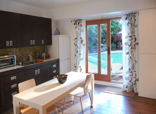
This was the view from the entry. Originally this part of the house was completely covered in drywall.
AFTER: The new all-glass foyer connects the two wings. Sliding glass doors and windows provide views to the front and back courtyards as well as through to each wing.
With two dogs and two children, the family needed a durable floor. Palacios chose a large-format charcoal tile.
He spent six months persuading the homeowners to use white appliances. "I was so over stainless steel," he says. "It's so hard to maintain and so overdone." Eventually the homeowners agreed.
Instead of a formal dining room, Palacios designed an extra-long kitchen island table, which Ian's dad, a sculptor, built. "Nobody goes to a formal dining room," Palacios says. "The solution was to have everyone cook and eat in the same place, because that's where people end up anyway."
Originally the home didn't have an HVAC system, so Palacios cranked up the ceiling to accommodate ductwork. This created the opportunity to bring light in with clerestory windows.
Ian owns a local Herman Miller furniture store. Wife Shanna works as a territory manager for Shaw Industries, and spent nearly a decade as the vice president of sales for Leland International, the furniture company. Needless to say, their taste in interiors and furnishings recalls the impeccable showrooms they've managed.
This more formal living room features pieces from their furniture and local-art collections. A smaller, more casual living room with a TV and kids' toys is in the opposite wing.