Pieter Estersohn/Architectural Digest The New York home blends what the architect calls "simple, honest materials" in accordance with the local vernacular.By Dan Shaw
Decorator Thom Filicia has designed lake houses before, but the Manhattan talent had never worked on an Adirondack great camp. Those palatial yet rustic compounds, which had their heyday a century ago, were private havens in upstate New York where the families and friends of Gilded Age tycoons could swim, canoe, hike, fish, play tennis, and share three hearty meals a day without ever leaving the property.
"It's an all-embracing, old-fashioned way of vacationing," says Filicia, who collaborated with architect Arthur Hanlon of the Connecticut firm Shope Reno Wharton on a new great camp on Upper Saranac Lake in the six-million-acre Adirondack Park. The clients, a California couple with two children, envisioned the place as a summer escape that would be the antithesis of their go-go West Coast lives. "They wanted to be in their own bubble," the designer explains of the getaway, known as Big Rock.
Located on a peninsula that once hosted the Wawbeek resort, a modest lodge with several cabins, the compound incorporates established view corridors because New York State's Adirondack Park Agency discourages shoreline tree removal. The master-suite wing, therefore, is angled off the porte cochere of the graceful shingle-and-stone main house, making it appear to be a separate cottage; opposite it, on the other side of a curving drive, stands a three-car garage/guesthouse. "Each building has its own distinct orientation and vistas," Hanlon says, noting that the two-story main house's generously windowed protrusions (they contain stairwells) were inspired by the park's fire-lookout towers.
After the site plan was created, Filicia began working with Hanlon on the interiors. The home blends what the architect calls "simple, honest materials" in accordance with the local vernacular: cedar shingles for the exteriors, fieldstone for the fireplaces, and birch logs for the balusters. Says Filicia, "The clients wanted the look to be authentic but with a twist, and I wanted to make sure the architecture popped." So he painted some walls and ceilings blue, green, or dark brown. "The oak beams seem to float against these colorful backdrops," the decorator says.
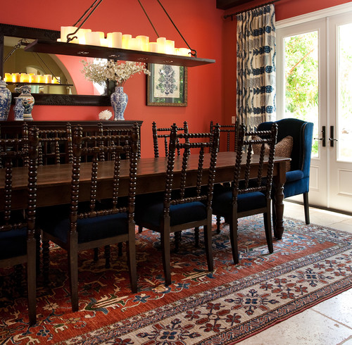
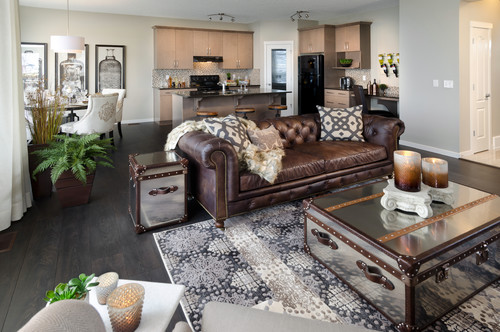
Since Filicia has lived in two lakeside residences over the years, he understood how to furnish the vaulted multipurpose great room for maximum enjoyment. "It needed to be layered, but not haphazard or random," he says. At one end is the living area, with a Knole sofa and button-tufted velvet daybeds. In the center is a games area, where low-slung furniture allows for unobstructed views of the lake. The other end of the room is for dining and features a twig-clad sideboard commissioned from Barney Bellinger, an acclaimed regional furnituremaker. "It was important to have a connection with local craftsmanship," says Filicia, adding that many classic great camps possessed an eclectic, well-traveled air, hence Big Rock's judicious sprinkling of Indonesian side chairs and Moroccan and Turkish carpets.
A recent featured ideabook on white kitchens garnered a ton of comments from readers, most of which contained concerns about how to keep those beautiful kitchens clean. One Houzzer bemoaned such hard-to-maintain materials, saying that "real cooks" would question someone's sanity for using such fussy finishes.
The truth is, you don't need to be nuts to own an all-white kitchen. Just a little diligent, and armed with the tips below.
Lauren RubinsteinSuburban kitchen remodel for a crisp urban farmhouse look by Lisa Gabrielson Design.
This is the perfect white kitchen because it looks like no one ever cooks here. And that is, of course, the very best way to keep that white kitchen sparkling. If, however, you insist on actually using your kitchen, you are likely to encounter yellowing cabinets, accumulations of grease, and stained and marred sinks and countertops. What fun.
Why do those sparkling white cabinets start to yellow? The first culprit is exposure to direct sunlight, which tends to jaundice or fade painted wood (and laminated surfaces). You should consider draperies, blinds or window film to shield your cabinets from direct sunlight. (I'll be addressing protection from sun damage further in an upcoming ideabook, so stay tuned.)
The second culprit is actually using your cooktop. As soon as you start cooking, those mouthwatering aromas rise into the air in the form of microscopic food or grease particles, and since they have to land somewhere, why not on your white cabinets? The result? Cabinets that turn yellow.
To prevent this, you can't let grease accumulate on your cabinets. As soon as you begin boiling, broiling or deep-frying, turn on the exhaust fan or range hood to filter out at least some of those minuscule bits before they reach the surrounding surfaces.
Writer Lorna Hordos suggests removing a yellow tinge this way: Wash your cupboards with a fizzy mixture of 1 cup vinegar, 2 cups warm water and 1 tablespoon baking soda. To keep cabinets white, give them a monthly "bath" with a solution of warm water and a grease-busting dish soap.
Smith & Vansant Architects PCTraditional Kitchen by Norwich Architects & Building Designers Smith & Vansant Architects PC
Then there is the inevitable muck and grime that accumulate from oil and grease splatters, and food and beverage spills. The folks at Kemper Distinctive Cabinetry remind you to not use abrasive cleansers or scouring pads on painted cabinets, as they can scratch or dull the finish. A soft cotton cloth dampened with warm water is usually sufficient to clean your cabinets looking white.
If more thorough cleansing is required, use a solution of mild dishwashing liquid mixed with warm water. After cleaning, wipe all surfaces with a clean, damp cloth. Dry immediately using another soft, clean cloth.
Remember not to let those stains linger. Prolonged exposure to spills can cause permanent discoloration or damage to your cabinets' finish.
I would die for this sink. Until it started to look like I actually used it, that is. The white sinks in my home take approximately five minutes to look yucky. You can brighten them and remove stains with common household bleach. Experts suggest laying paper towels flat across the bottom of the sink and wetting them with bleach. This prevents the bleach from running straight down the drain. Leave the paper towels in place for half an hour to allow the bleach to do its job, then remove them and rinse the sink thoroughly with warm water.
For a more natural solution, fill the sink with club soda and lemon juice and let this mixture lift the stains as it soaks in. After you empty the sink, apply straight lemon juice directly to any stubborn stains. You may have to repeat this process several times.
If this sounds like way too much work, adopt my husband's favorite tool: Bar Keepers Friend. If you use it on your sink every day, no other upkeep will be required. (I use it on way more than my sink; it keeps pots and pans looking like new as well.)
Rebekah Zaveloff | KitchenLabTraditional Kitchen by Chicago Kitchen & Bath Designers Rebekah Zaveloff | KitchenLab
White tiles with white grout? Really? I officially nominate you for the Glutton for Punishment award. Here's the deal: The cleaner your white tiles, the grubbier the grout will appear, so this is an important part of cleaning your white kitchen. Writer Tami Mason offers this remedy: Combine baking soda and vinegar with water to create a paste. Pour a little vinegar into a spray bottle. Apply the paste to the grout and then spray a light coat of vinegar onto the paste. Scrub with a scouring pad or toothbrush and rinse thoroughly.
Honestly, I consider sealing the grout an absolute no-brainer. Don't even contemplate living with unsealed grout.
Plastic laminate has gone from being the poor stepchild of kitchen design to a great and economical choice. (You can even dress it up with a bullnose edge, as with the example shown here, from Formica.) But it can still stain, especially if it is white. Hordos suggests this process to clean laminate stains:
Formica GroupKitchen by Cincinnati Kitchen & Bath Designers Formica Group
1. Mix a mild household detergent with baking soda to create a firm paste. You should be able to achieve the right consistency with approximately 1 part detergent per 3 parts baking soda.
2. Apply the baking soda solution directly to the stain and scrub with a firm-bristled nylon brush. Stop after about 20 strong brushstrokes, because excess brushing may weaken the laminate finish (not to mention what all that brisk labor will do to your shoulders).
3. If you are still able to move, rinse the countertop with a damp cloth. Laminate is particularly sensitive to excess moisture, so make sure not to soak the cloth. Use just enough water to wipe away the baking soda and stain residue, and then buff the counter dry.
Andrew Snow PhotographyContemporary Kitchen by Toronto Photographers Andrew Snow Photography
Stains show up easily on white marble or granite counters. Prevention is the best cure, so blot spills immediately, before they penetrate or dry on the surface. If that is not convenient, you can make stains disappear with a solution of hydrogen peroxide with a few scant drops of ammonia added. Natural stone will etch when cleaned with acids or abrasives, but the naturally occurring chemicals in peroxide and ammonia will safely remove even tough stains.
Or use my favorite granite cleaner from Weiman, which is way less work. When we had granite countertops, my last job at night before collapsing into my recliner was always to spray them until they shone.
OK, people, here is the dirty little secret about kitchens, whether white or dark: They all have the same issues when it comes to cleanliness! White kitchens are simply less forgiving. I am reminded of the times when decorating clients would ask me to make sure all their upholstery was covered in a dark fabric, "so it wouldn't show the dirt."
This always puzzled me and made me grimace. I imagined eons of dirt and dust being ground into the fabric, until it was as stiff as cardboard.
So if you love the look of a white kitchen, but are avoiding it because it will be a cleaning nightmare, look at it this way: Any kitchen is a cleaning nightmare. So prepare to roll up your sleeves, and pick the kitchen you really want.
Photo courtesy of Chris NelmsThe Simblist House at Serenbe, outside of Atlanta, was built to high standards for efficiency and sustainability.
Many people still think of prefab homes as "ticky-tacky" little boxes. But think again! There are many incredibly beautiful and interesting houses built with a variety of prefab methods. Prefab homes are now indistinguishable from site-built ones.
The term prefab is often confused with "double-wides" or trailers, which are also built in a factory. But these houses are often called manufactured houses and are compliant with the HUD code. These houses are delivered on their own wheels, which can never be removed. Although these houses serve many very well, these are not the houses that I refer to here. The prefab houses I write about are compliant with the local codes, are shipped on flatbed trucks and sometimes barges and are permanent structures, as are all site-built homes.
Prefabricated houses are growing in popularity in this country and around the world for a variety of reasons. They are faster to build, are built in a controlled environment, protecting the materials from the elements, are closely supervised, are environmentally more friendly and present many fewer surprises than occur on site-built houses, such as change orders. In some cases there is also a savings in cost. The advantages are numerous and when homebuilders become aware of all the advantages they often opt to take that route to building their new home.
With the expansion of methods to build prefab, so have the styles that are now available. While researching my latest book -- Prefabulous World: Energy-Efficient and Sustainable Homes Around the Globe -- I found incredibly interesting houses being built in the United States and in all corners of the world. Many were built to adapt to the local environment -- such as the Archway Studios in England, Casa Isemi in Costa Rica and Eddi's House in Japan. Other houses were built with unique design and material esthetics -- such as the WorldFlex Home in Denmark.
All of these houses wowed me as I hope they will you.
Looking at this luxe and comfortable room, I cannot help but think, "Hmmm ... Professor Plum, in the library, with the ... snake?" The most important, challenging and educational part of tackling this room for the designers at Laura U was providing a proper habitat for Princess, the homeowners' beloved pet snake.
The second part of the challenge was integrating said habitat into a cohesive design in the Craftsman home in Houston Heights, Texas. In terms of non-reptilian functionality, the couple wanted to incorporate a chic way to display their favorite objects and provide comfy seating for guests.
Just in case the snake wasn't enough of a design statement, they also wanted to incorporate one of their favorite colors, aubergine. I'm not sure how comfortable we ophiophobics would be in here, but the furniture and fabrics are sumptuous and inviting, and we could rest easy knowing there is a lock on Princess' habitat, just in case.
Challenge 1: A proper snake habitat. The biggest challenge was designing the snake habitat. "We had to learn quickly the equipment that would need to be included in the millwork design, such as proper heating lamps and space for ventilation," says Laura Umansky, principal designer. "Also, the habitat had to be easy for the homeowners to manage -- it needed to have an easy-to-open top for cleaning and for feeding the snake ... it also needed locks in certain places, just in case."
Working with Aquarium Design Group, the designers received an education in the proper size and elements required for a good habitat, and were able to create a wonderful warm environment where Princess could spread out and relax. It is fully integrated into the custom shelves. A lockable grille is secured atop the snake enclosure. Overhead there is a custom-designed ventilation grille for the heat lamps; it is easy to open for access to the habitat.
Challenge 2: Public and private comfort. As for the people habitat, the room connects to the foyer, has large pocket doors that connect to the great room and has access to the front porch. All of this means that the room needed to be able to transform from an intimate space for curling up with the latest issue of Snake Fancy magazine to an inviting spot for entertaining guests.
The room is also one of the first people see as they enter the house, and the luscious color palette makes a powerful first impression. "We took the aubergine up a notch by selecting a medium chinchilla color for the walls and a deep eggplant for the cabinetry," Umansky says.
Challenge 3: Integrating the cabinetry in a pleasing, functional way. The custom cabinetry and millwork were key parts of the design. Umansky kept the original Craftsman style of the home in mind, nestling the cabinets in beneath the crown molding and wrapping them in matching molding. In addition to creating glass-front cabinets that provide room for displaying books, family treasures, collectibles and, of course, Princess, the designers also created a niche between them that fits the sofa to a T and lets in the light from the windows.
Challenge 4: Making the space elegant and comfortable. With the millwork complete, they added layers of sumptuous textures, including velvet, dark wood and hides. A rug that incorporates plum-frost hues defines the seating area and lightens up the space; a copper side table adds some shine. The window treatments include custom linen Roman shades and drapes composed of tone-on-tone embroidered linen fabric with custom linen banding.
Challenge 5: Balancing light and saturated hues. While the paint colors are deep and the furniture legs are dark wood, most of the seating and window treatments are light colored. The chinchilla wall color navigates the middle between light and dark. "We wanted to create a room that was rich in depth and details, and creating a contrasting color scheme was the key to making this room special," Umansky explains.
"Since these are natural hide ottomans, they are very easy to keep clean," she says. It's a good thing, because in addition to Princess, the animal-loving homeowners have two dogs, a cat and a guinea pig.
"The room was a blast to design, because we were able to incorporate the custom snake habitat into the space; this was a first for us," Umansky says.
Designers: What interesting firsts can you tell us about?
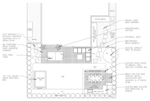
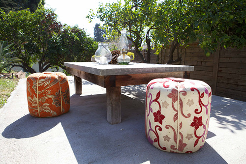
Concrete patios are often found in older homes, especially those built in the '70s. But by now they've cracked and crumbled, leaving many homeowners wondering how to replace them, or even hoping to reclaim some of the green space lost by a particularly large patio.
If you count yourself in this group, here you'll learn how to improve your outdoor space by removing or shrinking your concrete patio, or replacing an old cracked patio with a fresh new one that better suits your style today.
Getting rid of a concrete patio enables you to replace it with a more attractive option -- like pavers, stone or a modern combination, as with this patio by Falling Waters Landscape, featuring a grid of concrete rectangles divided by permeable plantings. It can also allow you to create more lawn or garden space.
Best time to do it: When the weather is dry and temperate enough to permit heavy-duty work outdoors.
Who to hire: This project requires heavy machinery and can have hidden pitfalls (like rebar lurking in your concrete), so it's only a DIY if you earn your bread and butter in home improvement. If that doesn't sound like you, it's best to hire a licensed contractor.
Tip: Dennis warns that many contractors won't take the project if they aren't installing a replacement patio or garden, so have a plan in place when you start interviewing professionals.
Cost range: Between $800 and $1,000 for demolition alone. The total cost of your project will depend on what you decide to put in the patio's place.
Typical project length: One day.
Permit required: None for the project, although some municipalities require a permit for dumping concrete, so call ahead.
Project considerations: While your contractor will check with utility companies to make sure there aren't any gas lines lurking beneath your patio's surface, that doesn't mean there's nothing under there. If the crew discovers rebar or an unexpected gas line, the project may be slightly delayed or cost more.
Your contractor will also likely use a jackhammer to remove the concrete, so it might be a good idea to plan to be gone for the day so you aren't disturbed by the noise. Give your neighbors due consideration as well.
First steps: Your contractor will protect your windows with plywood, as concrete chunks can spray up and crack or break the glass or cause pits.
Your contractor may also take some "before" photos to record the way the elevations worked for when it's time to install the new materials.
Then it's time to remove your concrete. If you're simply reducing the size of your patio, the contractor will start by using a concrete cutting saw to cut the concrete joints out. "If you don't cut it, then you're going to start jackhammering, and the rest of the patio is just going to crack," Dennis explains.
If you're removing the entire patio, the contractor will use both the saw and jackhammer to break the patio into chunks that crews can then comfortably remove.
After that the only thing left to do is haul out the concrete chunks -- or recycle them as pavers or a stacked garden wall -- and start work on whatever you have planned to replace it.
Have you done it? Please tell us how you got rid of your old concrete patio -- and what you put in its place.
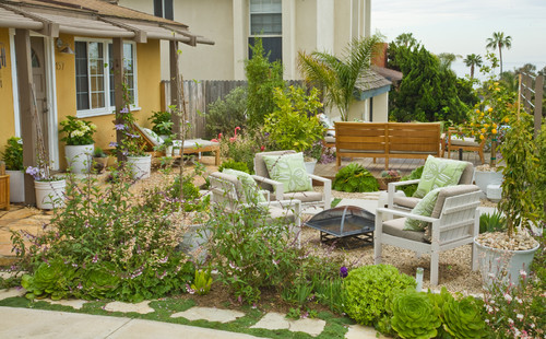
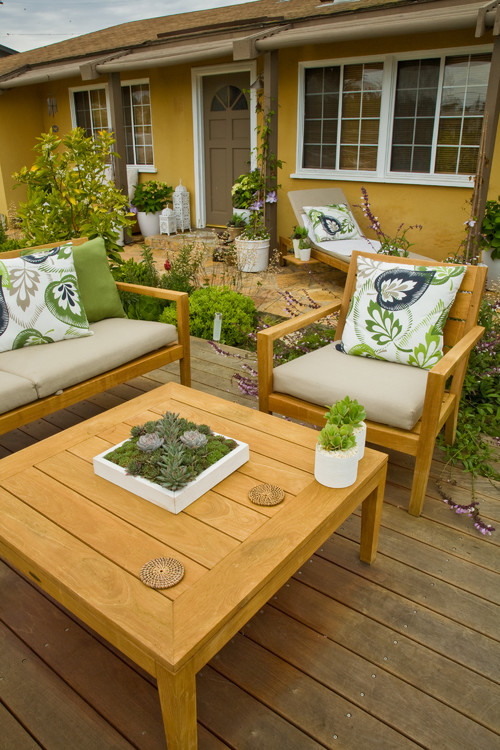
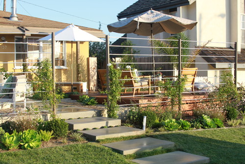
When you live in a Southern California beach town and an ocean view is right outside your door, it makes sense to turn your front yard into a gathering spot. That was the thinking of Sacha McCrae, homeowner and principal of Living Gardens Landscape Design. "The front is where friends and neighbors gather. The back of the house is a more intimate family space," she says.
Yard at a Glance Who lives here: Sacha McCrae; her husband, Rob; and their son, Josh Location: San Clemente, California Size: 4,600 square feet (427 square meters) combined front and backyards
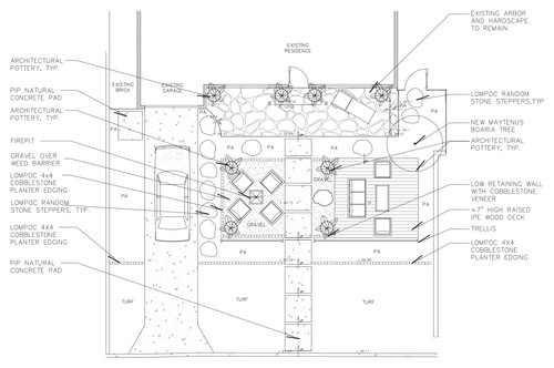
The Front Yard
The front yard is divided into separate zones -- a stone patio, a raised deck and a seating area around a fire pit -- giving each area the feel of a destination. When McCrae started her yard renovation four years ago, the patio against the house was existing, but the deck and fire pit areas were an overgrown hodgepodge.
To capture the view of the Pacific, McCrae built an ipe wood deck that sits 6 inches off the ground. For furnishings she played off the soft color of the existing patio.
McCrae designed an eight-foot-high trellis (her husband didn't want a solid front fence), using treated and painted 2-by-4s and conduit pipe. This photo was taken when the bower vines (Pandorea jasminoides) were just getting a foothold.
After several seasons of growth, the mature vines now provide a lush, green backdrop. Everything is on a drip system, says McCrae, but rather than use a timer, she prefers to turn the irrigation on manually to water only when necessary.
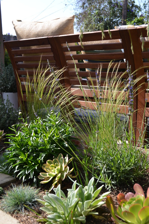
The seating area around the fire pit is a favorite spot for kids. "They like the little bit of separation," says McCrae. The gravel surface is very forgiving of drips and spills, so no one has to fret about dripping s'mores.
Stepping stones edge the driveway, with elfin thyme (Thymus serpyllum 'Elfin') providing soft tufting in the pockets between the stones. The summertime bloomer tolerates drought as well as light foot traffic.
The backyard is also zoned, with an area for lounging, a cooking and dining patio, a hot tub, a veggie garden and a workspace for McCrae. More of her succulent pots line the table. Succulents and grasses surround the lounge area.
The shade structure over the patio already existed, but McCrae added a striking vertical planter on one side to screen the space even more. It's built of painted cedar 2-by-8s and lined with a waterproof pond liner that has drainage holes.
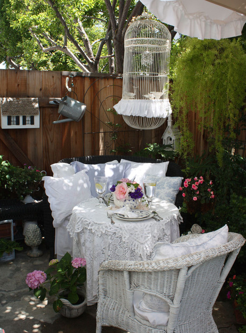
What do flea markets, thrift stores and antiques shops have in common? You are likely to find the most fabulous stuff buried under piles of blankets or sitting in a dark corner. This is the kind of stuff that brings story and humor and a bit of quirkiness to your interior -- and that's just the kind of decor a cottage loves.
If your decorating bent is toward old handmade rugs and quilts, chairs with messy slipcovers and a personal array of accessories, flea market style is just right for you and your cottage.
Vintage pieces are often painted -- sometimes with multiple coats of peeling and distressed paint. These kinds of furnishings tell the same story as the cottage itself. Age is good, and a little wear and tear not only are to be expected but are desirable. (Keep peeling paint away from toddlers, though, as it could contain lead.)
Look what this whimsical cupboard brings to this space, and imagine what the space would lose if it weren't there. Note, too, that the scale of the older linen-covered chairs is just right. And even though the table is long, its profile is not in any way bulky -- helpful when you're dealing with small spaces.
Long, narrow farm tables are so appropriate for cottage living. Whether used for dining or doing a project or homework, their skinny dimensions and family-friendly finish make them a key ingredient in flea market style and a multipurpose tool. They are also readily available -- either vintage or created from old wood.
Vintage furniture (or, in this case, reproduction vintage furniture) tends to be smaller than its contemporary counterparts, which makes it perfect for decorating your cottage. In spaces where every inch counts, smaller is definitely better.
The old benches that are common at flea markets also totally work for a cottage. Like the farm table, they are long and narrow, and adapt readily to many uses. From beings the consummate cottage coffee table to providing extra seating, to allowing dining in front of the TV, the bench answers the call.
Mixing is inherent to the success of flea market decorating, and cottages totally embrace that. The varied chairs pulled up to this drop-leaf table are utterly charming, as is the mix of wood and caned pieces in the living area. Drop-leaf tables are, by the way, another great friend in decorating a cottage.
As the housing market's recovery continues, there are some trends in design for this year's high season.
1. Open: The biggest change in home design of the past quarter century is most likely the open concept kitchen. While traditionally the kitchen was hidden away and disconnected from the rest of the house, we now use kitchens as an opening to our living space. The focus on entertaining guests may be a source for this trend as open spaces maximize the ability to gather and relax with friends and family even while still preparing refreshments. It looks like this idea is here to stay and the walls will
Spaces are currently being designed for aging consumers.;
continue to come down between rooms of different function.
2. Neutral: Neutral palettes are dominating in the home and replacing the use of bright colors. White, sandy and gray tones are popular among the main features while bold colors pop up in small details, like throw pillows, lighting or backsplash. Subtle glamour is also emphasized through small decor dazzling against the neutral background.
3. Universal: Spaces are currently being designed for aging consumers; more Americans want to age in place. Universal design elements like having the master bedroom on the first floor, low drawer appliances and showers that accommodate benches or bars are growing in popularity to accommodate people who anticipate having less mobility in the future.
4. Quartz: When it comes to kitchens and bathrooms, factory-engineered quartz is taking the market by storm. While granite was the most popular countertop material for more than a decade, it appears it is being replaced. With the same professional look and feel as granite, quartz resists cracking and chipping and is non-porous so it is easier to clean and rarely gets stains.
5. Green: Energy-efficient and water-saving appliances are now standard in new or renovated homes. Touchless faucets, smaller master bathtubs, high-efficiency light fixtures, toilets and dishwashers have become preferred options as energy and financial savings can be significant. These are not only green options, but savings that homeowners can clearly see in their bills.
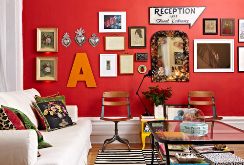
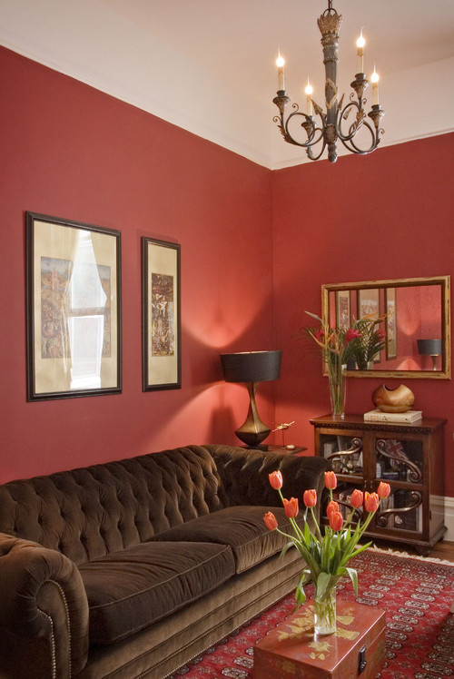
Red walls can be bold, vivacious, classic ... and hard to decorate around! If you loved the idea of red walls when you painted them but now feel at a loss for what else to put in the room, these decorating ideas are here to help.
Gallery wall. Red walls create a striking backdrop for an eclectic collection of artwork. This is also a great way to tone down the red a bit - the frames will cover up some of the surface area, leaving just enough red exposed to be exciting without overwhelming your space.
Black and white. What will go with your red art wall? Try white upholstered furniture, a crisp black and white rug, and simple white curtains. Tie in the wall color by choosing toss pillows covered in interesting textiles with a bit of red in them - perhaps made from pieces of an old kilim rug or sari silk.
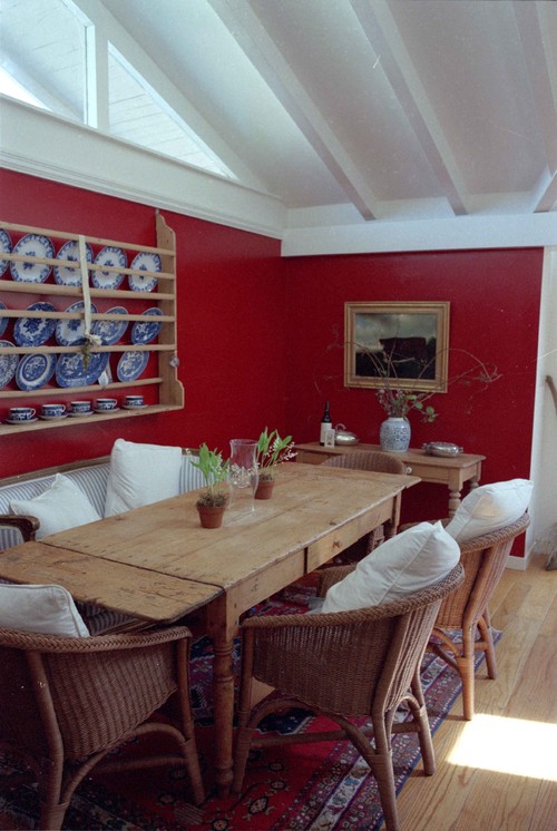
White and blue. Red, white and blue can read as all-American or a nod to the French - either way, this color combo is undeniably chic. Take a cue from the dining space shown here and pair a modern light fixture and chairs in white with red walls and blue cushions.
For a more relaxed take on the red, white and blue scheme, add a weathered farm table, simple wicker chairs and a plate rack filled with blue and white dishes.
Design dilemma: accent wall or all red? As a rule of thumb, large rooms, open floor plans and kids' spaces can benefit from a little more white space. Define a nook or an alcove with red paint and leave the rest crisp white. Small, cozy dining rooms and studies are better able to handle four walls of red.
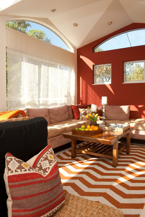
Beige and orange. When a comfortable, cozy look is what you want, turn to natural shades of orange (with a little brown in them), beige and off-white. Pair these warm tones with rich red walls and natural fibers.
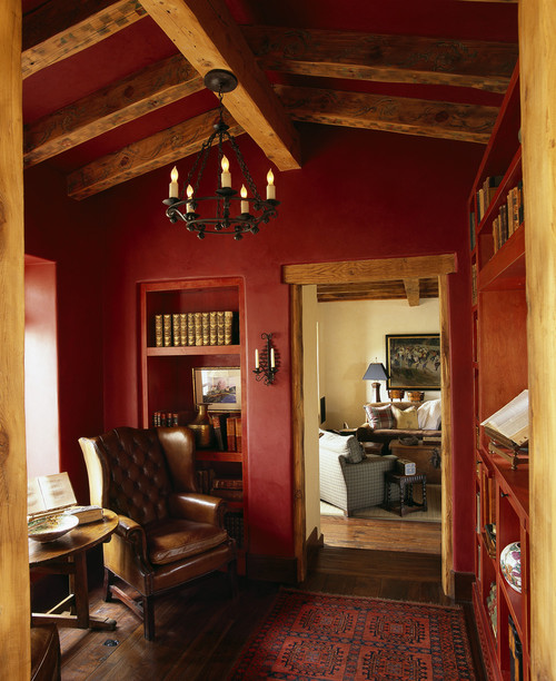
Natural wood, leather and iron. Hunky wooden beams, iron light fixtures, leather upholstery and cranberry walls strike a pleasing balance between rustic and refined. Straight white would have looked too pristine next to this rich mix of textures. If you want to use white paint on trim or in an adjoining room, try parchment or linen white instead.
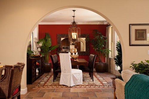
Marble and cream. Red walls in the kitchen are unexpected - and have the potential to be utterly gorgeous. Try them with marble counters, cream cabinets and wood floors for a fancy take on the farmhouse look. Looking to save? A marble-topped island is a more affordable way to include this luxurious material without breaking the bank.
Oriental or kilim rug. These rugs tend to include red, making them a natural choice for a room with painted red walls. Roll out a plush Oriental rug or flat-weave kilim in shades of red and blue or brown, and your red walls will instantly feel more settled in
Wildcard: hot pink and navy. If you like bold colors, push the envelope a bit by pairing red walls with hot pink and navy blue furniture. Like the opulent hues of an Indian sari, red, pink and navy make a vivacious combination.
Dark wood and tile floors. Red walls look classic and refined with warm-toned tile floors and dark wood furniture. Add layers of visual interest with a statement pendant light, a carved wood mirror and lush potted trees.
Blue end chairs and printed curtains temper the warmth of the red walls, rug and tile floors here. This is also good inspiration for changing the look of your space down the road, simply by adding new seat cushions and window treatments.
Chocolate, black and gold. Try a plush chocolate-colored sofa, lamps with black parchment shades, and picture frames and mirrors in either black or gold (or a mix). On the floor you could go with either a traditional rug in red tones (as seen here) or keep it simple with a natural-fiber rug.
Wyman Meinzer, Architectural DigestBluebonnets and Indian paintbrush flowers brighten the grounds of Prairie Chapel Ranch, Laura and George W. Bush's residence in Crawford, Texas;APLaura and George W. BushBy Mitchell Owens
Central Texas, especially that sweet spot halfway between Dallas and Austin where small swaths of the legendary old prairies remain, is an earthly paradise. Blowsy live oaks spread their heavy limbs beneath cloud-spattered skies, while creeks and rivers -- most prominently the meandering Brazos -- ripple alongside gently rolling pastures gilded with waving grasses. These natural glories are precisely what led Laura and George W. Bush to choose the area for their Prairie Chapel Ranch, the retreat they completed in 2001, just after he became the 43rd president of the United States. Occupying some 1,600 acres near the flyspeck town of Crawford, about 25 miles west of Waco, the property is anchored by a strong but relatively modest home that quietly honors its location.
During the eight years Bush was in office, the ranch served as the Western White House and welcomed numerous heads of state -- from Russian president Vladimir Putin to Saudi king Abdullah bin Abdulaziz -- some of whom were coaxed to join the leader of the free world as he raced along the property's 40-mile network of bike trails. And, of course, there are the well-known stories of the president spending his vacations clearing brush, often in searing heat, sometimes encouraging aides to join him.
These days the Bushes live in Dallas, also home to the George W. Bush Presidential Center, which opened last year on the campus of Southern Methodist University. But they regularly make the trip south to Crawford, where the former president is just as likely to be found handling a fishing rod or paintbrush as he is a chain saw. The ranch remains an essential getaway for the couple, a place to unwind and spend time with their daughters, Barbara Bush and Jenna Bush Hager, as well as Jenna's family, and to entertain close friends like Deedie and Rusty Rose, prominent cultural leaders in Dallas.
In fact, it was Deedie Rose who helped the Bushes find their architect, David Heymann, a professor at the University of Texas at Austin's School of Architecture. "Deedie and Rusty love the way David sites buildings," says Mrs. Bush, relaxing on a shady terrace that overlooks a shimmering lake where her husband often casts lines for bass. (The largest caught to date, the former president reports, was a 10-pounder.) "So when we bought this property, Deedie told me, 'I have your architect,' and, of course," she jokes, with a slightly arched eyebrow, "I always do what Deedie says." (Rose was a member of the committee that selected Robert A.M. Stern to design the Bush center.)
The former first lady notes that when she was growing up in Midland, Texas, her father built spec houses -- "one story and low to the ground, a style you saw a lot in the '50s and '60s." She and her husband had a similar type of residence in mind for Crawford, mainly, she explains, "because we wanted the house to fit into the landscape." And she means fit literally. Heymann's design carefully nestled a single-level, three-bedroom limestone structure and an adjacent two-suite guesthouse into an almost imperceptible rise amid an existing grove of live oaks and cedar elms.
Wrapped by deep roof overhangs -- some up to 10 feet wide -- that serve to deflect the region's broiling sunlight and torrential downpours, the dwelling features tall windows that add a romantic transparency to its unpretentious countenance. "We wanted to see and enjoy the beauty as much as possible," says the former president. To answer the couple's desire for indoor-outdoor living, many of the windows are also doors that open to covered terraces and walks, buffalo-grass lawns, and the tree-shaded swimming pool. When the doors are flung wide, the home becomes a veritable pavilion, capturing passing breezes and filled with birdsong. The configuration also reduces the need for internal corridors -- often the Bushes navigate the place by strolling out one door and in through another. "It's slightly motel-ish, but we love that," Laura Bush says lightheartedly.
The former first lady worked closely on the project with Heymann, who found her to be a highly perceptive accomplice. "She has a lot of experience from seeing the carefully organized houses that her dad built, and she has a very, very good eye," he says. Early in the construction process Laura Bush pointed out that the masons' work on the Texas Lueders limestone that clads the exterior (and some interior) walls of the residence was absolutely perfect -- and thoroughly wrong. The Bushes wanted to have a subtly rustic, handcrafted look, and Heymann had deliberately chosen to use the so-called rough-back pieces that were traditionally thrown away in the trimming process rather than smoothly finished blocks. "We had to take away their levels," the architect recalls, adding that the stone was relaid the old-fashioned, slightly irregular way, with taut string and appraising eyes.
An advocate of sustainable design, Heymann incorporated into the compound a number of green features, including a geothermal energy system for heating and cooling. Rainwater runs off the house's standing-seam metal roof and into a gravel-filled moat, where it filters into a 42,000-gallon cistern concealed beneath the rear terrace and is recycled to irrigate the lawns.
There's not much sexiness to a concrete retaining wall. But with a few clever design moves, you can certainly dress one up enough to turn a few heads. That's what the homeowners of this two-level San Francisco hillside house did when faced with an unsightly wall in the basement, which they wanted to turn into a private master suite. They worked with architect Tom McElroy to add stacked-stone tile and a wood-topped display shelf. Before, the wall cast a dark, imposing presence in the former storage room. Now it's a celebrated focal point illuminated by three of its own downlights.
The existing basement was dark and dingy, but did have a 15-foot-high ceiling that would provide the volume needed for expanding living space and creating a new master suite. The door in the rear corner led to the yard.
AFTER: McElroy opened the exterior wall with 11-foot glass sliding doors that lead to a new private garden. He then walled up the original exit door to create a garden closet accessed from outside.
Highlighting the large retaining wall instead of fighting it was a key design decision. Stacked-stone tiles cover the wall that continues from the bedroom into the adjacent bathroom. "We didn't want anything too shiny," says McElroy. "So we choose stone that has a rough, unfinished texture and color that is reminiscent of the actual concrete."
The architect and homeowners selected sapele wood with a walnut stain for the bedroom's flooring. "If we went with concrete, it might have been too close of a memory of what was there before," he says.
The wall behind the bed acts as a room divider that separates the bedroom from the bathroom. McElroy kept the wall from going all the way to the ceiling, instead installing glass panels that wrap around the left side and on top to bring natural light into the bathroom. "Unlike most walls that are needed for structural reasons, we had the freedom to peel away at it," he says.
A wood-slat fence and bamboo plants were added to the outside area, which was once a windy corridor without plantings. A semirecessed trough houses automatic shades that rise and fall for privacy.
These "before" and "after" floor plans show the improvements to the lower level of the home, including the new laundry room (previously on the upper level), now located next to the master bedroom suite in a less prominent and more convenient location.
"With this master bedroom suite, we have created an entirely private and separate space on a different level of the house," says McElroy. "It allows you to get away from the house and almost feel like you're on vacation."
BrightNestKazia mixed high-end pieces with more affordable ones from Craigslist and IKEA, but is always seeking new finds.
In the heart of Denver, nestled in the Whittier neighborhood, is Kazia and Eli's bright and colorful row house. While their design taste skews midcentury modern, their home was built at least a century ago, so the row house is a mix of 1950s clean lines and turn-of-the-century high ceilings and natural light.
When Kazia and Eli moved in, Kazia knew she wanted a dark blue fireplace. So, she started with that and then built the rest of the color scheme around that gorgeous focal point. After hours at the Behr paint store, she landed on complementary warm colors to harmonize with the cooler tones of the fireplace.
To fill her home, Kazia mixed high-end pieces from places like CB2 and Crate and Barrel with more affordable finds from Craigslist and IKEA. The most important thing she learned when decorating? She never lets her home feel stagnant and is constantly searching for new finds and art to fill the space.
While we shot photos of their beautiful home, we asked Kazia to share a few thoughts about being a homeowner, and if she had any wise words to pass along. We think her monthly budget tip is genius! In her own words, Kazia said:
What's your best advice for new homeowners?
When I first bought my home, I read The Perfectly Imperfect Home by Deborah Needleman. She talked about how your home changes and evolves. It's really true -- and despite reading Needleman's book, it took awhile for that advice to sink in. I thought if I hung a picture, that's where the picture lived. Now, we'll hang something and if we don't like it, we'll move it!
What do you love most about your home?
The colors and light. I had the house painted in cool, warm colors when I moved in, and those colors have really set the tone for how I've decorated since then.
What's your best home cleaning tip?
Keeping a basket of white cloths next to the sink. We use these instead of paper towels. They work better and are much less wasteful!
Do you have any tips or lessons learned when it comes to setting a decorating budget?
I set a budget when I moved in for major changes to the house like painting, taking down walls and redoing our patio garden. I factored this into my overall house budget. I also have a monthly budget of $100-$200 per month for decorating. I love this because it invites me to constantly explore and buy new things, but it keeps me reined in on spending.
Do you love where you live? Show off your house on a BrightNest Home Tour! f you're interested in being featured on BrightNest, contact info@brightnest.com. Now accepting new home tours!
Whether you adore the classic maritime look of New England, the warm and spirited U.S. South, British seaside nostalgia or something else entirely, the coastal style in all its variations is easy, breezy, casual and fun. What's not to love? See if one of these six takes on beachy style resonates with you.
Classic and understated, New England coastal style draws inspiration from the region's rich maritime history. Crisp blue and white dominate the palette in beach destinations like the Hamptons, Martha's Vineyard, Newport and Nantucket, and materials like weathered teak and those made from water hyacinth stand up to the salt air.
This look is all about simplicity, so keep things pared back with slipcovered furniture, bare floors or natural-fiber rugs, and woven accent pieces. For decor, think authentic - a Nantucket basket, glass buoy or vintage seaside painting would work.
Southern Charm
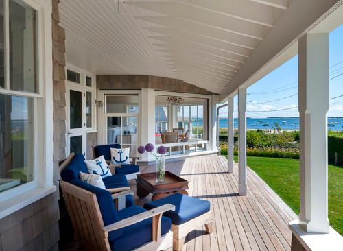
Southern coastal style is equal parts relaxed and stately - think of enjoying a cocktail at a fabulous party in a grand home, where it's OK if someone ends up dipping their toes in the fountain at the end of the night. Grand porches, historic details, graceful entertaining and treasured heirlooms on display are all part of the set for a richly lived life.
Far from an afterthought, a Southern-style porch is well furnished, preferably with a slowly turning fan, painted shutters and plenty of comfy seating. Of course, it's not just well furnished, it's well used - for catching up with friends and family, entertaining, reading and even napping or (with screening) as a summer spot for overnight guests.
Warm, modern, organic and easygoing, California coastal style is all about indoor-outdoor living, all year long. Midcentury pieces mix with colorful, eclectic textiles and natural elements.
Coastal California cottages tend to feature sunny, cheerful hues, like lemon yellow, chartreuse and aqua, alongside plenty of white and natural wood. The decor focuses on unique handmade and vintage finds.
When it comes to furniture, think easy and casual - canvas, cotton or linen upholstery, reclaimed wood and tough indoor-outdoor materials take center stage. Maximizing light is a priority as well, with large windows left bare or simply covered, not swamped in heavy drapes.
Beachy Glam
Popular in both Southern California and the coastal South, this version of beach style is colorful and playful. Think of a soothing aqua and white palette, jazzed up with a zebra print and a blingy chandelier. Or a beautiful lamp with an organic shape but done in slick white porcelain.
Color is used confidently but not overdone - focus on one main hue (try sunshine yellow, kelly green or aqua) and surround it with plenty of classic neutrals.
A good balance includes around 80 to 90 percent classic beach-style elements (like weathered wood, seaside paintings or rope accents) and 10 to 20 percent glam.
Other less expected elements to glam up your beach abode include leather (or hide) director chairs, sleek modern light fixtures and statement-making oversize artwork.
With all of its whitewashed surfaces and faded fabrics, the British seaside look is like a postcard from a very charming other time. Gallons of white paint are the main ingredient - you'll need to cover walls, ceilings, floors and furniture with a fresh, milky white coat. Weathered vintage wood and tin, beachcombing finds and faded pastel fabrics stand in relief against the crisp, clean background.
The charm comes partly from the simplicity, so the trick is to keep things spare, not overstuffed - think seaside hut with just the essentials, not prissy tea shop.
Like the American sister of British seaside style, country coastal relies heartily on antiques and thrifted finds but in classic red, white and blue. Think of enamel pitchers filled with flowers, ticking stripe mattresses and American flags.
Try repurposing common items to make your own decor. For instance, spare plates can become a wall display, a big wicker basket can be put to work as a table, and vintage feed sacks can be turned into pillows.
Tell us: Do you love coastal style? Which variation is your favorite?
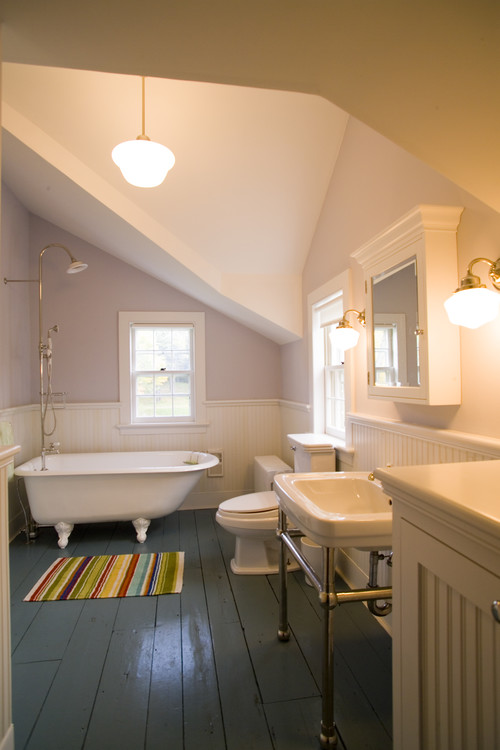
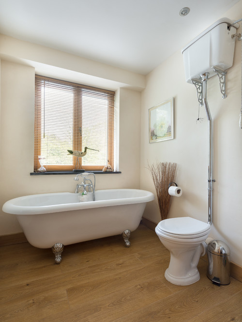
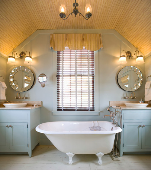
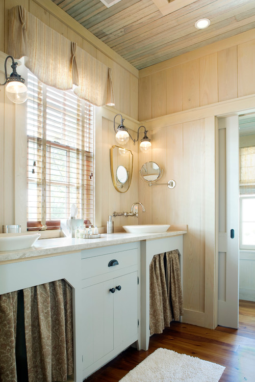
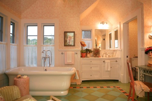
The American "farmhouse bathroom" is a bit of an oxymoron. Most original farmhouses were built at a time when the only bathroom was an outhouse. And when farmhouse owners did eventually bring plumbing inside, they didn't actually build a bathroom; they took over a spare bedroom or other room and put a toilet, sink and stand alone tub in the space. This focus on practicality and function continues to drive the style's popularity today.
Here are eight elements of a modern-day bath with farmhouse style.
1. Make it look like a spare room. Again, think back to the time when farmhouse owners switched from an outhouse to an indoor bathroom: Most people ran their new plumbing into a spare bedroom or an attic space. So the new bathrooms were generally spacious and had odd ceiling angles. Plus, it meant that the orientation of the bathtub, sink and toilet didn't always line up like you see today. Following this approach is a good first step to nailing the style.
Architect James Dixon used the spare-room concept with this New York bathroom, which is actually part of a newly built home. He intentionally made the ceiling pitch down at odd angles to make it feel like the bathtub, sink and toilet were plunked down in an old attic space or extra bedroom. "I live in an 18th-century farmhouse that was once a lot of small bedrooms. Some were converted to bathrooms," he says. "They tend to be very quirky, so making a new bathroom look this way makes them look more believable."
Painted antique wood flooring helps convey the style as well.
2. Minimal accessories. "To me a farmhouse is kind of the simplest early house built for practical reasons," says interior designer Alison Kandler. "You built a porch because sitting outside in Oklahoma was hot. You picked hexagon tile because it was cheap and practical. You built a pitched roof so rain would fall off and you wouldn't get leaks. There was always a practical side to everything. It's not ornate. It's not overdecorated."
Indeed, most of the people who built farmhouses were interested only in providing four walls and a roof over their head. They didn't have the time, interest or cash to focus on ornament or details in the wood or construction, so they just kept it simple. Make sure your farmhouse bathroom champions function and repurposing, rather than ornament.
3. Stand-alone bathtub. A claw-foot tub is almost a requirement in a farmhouse bathroom. It's what you would have seen in original farmhouses when built-ins weren't around or practical.
Of course, when we talk about farmhouse style, we're actually talking about modern farmhouse style. "And that's a good thing," says interior designer Kelly Mittleman, who channeled farmhouse style in the bathroom seen here. "You don't want to replicate the rusticity of yesteryear and have it look clunky or silly like a set piece."
And farmhouses differ around the world and even regionally in the United States. A New England farmhouse from the 18th century looks and feels different than something in the Midwest, for example. But the general spirit is universal. "When most people think of a farmhouse, they think of simple, no-nonsense details and sturdy construction," says Dixon.
4. Repurposed furniture. In the early days, when spare rooms were converted into bathrooms, it wasn't like farmers loaded up the family in the minivan and hit up the local home design store to furnish their new space. Typically, they dragged in whatever storage pieces weren't being used elsewhere in the house. So repurposed dressers and storage cabinets are good candidates for a farmhouse-style bathroom. "A vanity that has a cabinet under the counter immediately starts to look like less of something you would find in a farmhouse," Dixon says. "If you've got a nice old dresser, stick that in the room and fill it with towels and toiletries. It helps that feeling of the bathroom looking like it was a small converted bedroom."
"Repurposing an old first-aid kit as a medicine cabinet, using reclaimed wood for a vanity, vintage lights - it all helps create that style," says interior designer Kress Jack.
In the bathroom here, interior designer Charlotte Cooney of Domestic Arts and her partner, Kevin Fischer of Alice Design, brought in their client's vintage kitchen storage cabinet to complete the look. V-groove pine paneling on the walls gives it a "cozy, homey farmhouse" feel, Cooney says. "It makes it seem like walls that could be in a barn."
To make the paneling look like it had been left outside and bleached in the sun, she covered it with a watered-down white paint and a flat polyurethane finish. Meanwhile, the homeowner had found a bunch of old radiators in the backyard and wanted to incorporate those into the interiors. Cooney had them all converted to hot-water radiant heat instead of steam. "They're beautiful and feel like they belong in an old farmhouse," she says.
5. Wood. Reclaimed or distressed wood completes the farmhouse look and, like a claw-foot tub, is practically a prerequisite for the style. It even works for floors, says Suzanne Stern of Our Town Plans, despite the fact that many of her clients initially express concern about water damage. "You're not swimming in there," she says. "Wood is actually a lot tougher than it gets credit for."
The floors here were painted with latex white paint cut in half with water. "The raw wood just soaks it up, and you can still see the wood grain, and the little bit of pigment dampens the yellow of the wood," she says. "It gives it that distressed look."
6. Patinated finishes. When you're imagining what you might see in an old farmhouse, shiny stainless steel shouldn't come to mind. Instead, finishes with an aged look are hallmarks.
Dixon likes to use nickel for faucets when possible, which gives the space a more antique feel. "It patinates and starts to look less refined over time," he says.
Jack had the vanity seen here built new, but then painted it a charming blue that she distressed. "I try not to do anything too contrived," she says. "Just subtle touches of everything so it doesn't look like it's trying too hard.
7. Vintage lighting. Fixtures made from repurposed pieces or old gas versions that have been electrified, or anything that looks like it might have come from a barn is key to lighting a farmhouse bathroom. "In a small space, everything you put in is important," Stern says. "For fixtures I either don't want to see it at all or want it to be something that's pleasing. The lights can be like little jewels. That's very important."
8. Avoid clichés. As with with most styles, the trick is how to get a look without making it hokey. That's what Kandler sought to do in this new Los Angeles bathroom.
To give the space some character, she played with traditional elements you might find in a farmhouse, like checkered floors, incorporating them in a new way. "It's a checkered floor, but it's made out of concrete and not in traditional colors," she says. "I didn't want it to feel too much like a cow could just wander in at any moment. It had to be a little more sophisticated."
Notice how she, too, played with the ceiling lines to make it look like an allocated spare room. "That ceiling pitch above the sink isn't really the actual roofline," she says. "I just wanted it to feel more like a dormer to give it that farm feeling. Little things like that go a long way."
Leather chairs, sofas and ottomans tend to be big, comfy and classic -- no wonder they're a popular choice for living room furniture. But too much bulky leather upholstery can make a space look dark, heavy or just ... boring. Wondering what to put with all of that brown or black leather? These ideas should help.
1. Rich painted walls and a Moroccan rug. Peacock blue is a bold (but highly livable) choice for walls, especially in a smaller room - the intense hue enhances and uplifts dark leather pieces. Pair it with a goes-with-anything Moroccan rug, an organic wood table and a gallery wall.
If you have wood bookcases or cabinetry in the room, consider painting these pieces to match the walls. Or, for a subtler effect, paint only the backs of the bookcases or the interiors of the cabinets.
Wildcard: Peacock blue and orange. Take rich peacock-blue walls up a notch by adding contrasting Hermès-orange accents. Try a pair of footstools or X-benches, or furnish a window seat with bold orange cushions, as shown here.
2. Black, gray and texture. To keep things interesting in a neutral space, it helps to really play up texture and shine. Try smoky mirrored or reflective furniture (or a mirror on the wall); a soft, low-pile rug; and a plush faux-fur throw. Shades of gray, black and white make easy partners for a brown leather sofa.
3. Kilim rug. The warm colors and rich pattern of a flat-weave kilim rug helps a leather piece settle into the room. Kilims make an especially dynamic pair for modern pieces, like the leather chair shown here.
4. Charcoal and wood. A deep, dark charcoal-hued natural-fiber rug makes a caramel-colored leather sofa look even more rich and luxurious. Play up a rustic-modern mood with woodsy side tables, wood-framed mirrors and nubby burlap, canvas or wool pillows.
5. Light neutrals. Lighten up a leather sofa or furniture set by surrounding it with soft, warm neutrals, like ivory, cream, sand, beige, wheat and gold. Try crisp white walls, a faded traditional or pale natural-fiber rug, woven shades and creamy linen throw pillows.
6. Rough linen, tweed and velvet. Leather looks stunning alongside rich, autumnal fabrics like tweed, velvet and rustic, nubby linen. If you have a full set of leather furniture, consider breaking it up and using just one or two of the leather pieces, paired with something upholstered in one of these delicious fabrics - the leather will look the richer for it.
7. Bright, bold pillows. The great thing about black or brown leather is that just about any-color throw pillows can work. Try changing the colors up seasonally, with fresh blues and greens in spring and summer, and warm cinnamon, cranberry and persimmon in fall and winter.
More often than not, bed frames are a neutral color -- they have white, black or wood finishes that coordinate with nearly everything but can lack charisma. Instead, consider using a bright color to add personality and vitality to what is presumably the most frequently used piece of furniture you own. Here are some examples of beds in every color of the rainbow -- and how to get one of your own.
Red
Red is easy to see, which is why it's the color of stoplights and fire engines. While it signifies danger, it is also considered a passionate color and is associated with love. Valentine's Day just wouldn't be right with salmon-colored roses or sage-colored hearts. "Painting the town red" sums up the amorous nature of this spicy color.
The bold red platform bed is the focus of this bedroom design by Hilit. An integrated shelf complements the linear bed. Designer Hilit Karsh says she used a high-gloss, abrasion-resistant paint for this striking project.
For a similar hue, try Exotic Red by Benjamin Moore.
Orange
Orange is known as a power color and is often associated with creativity and cheer. It is optimistic and uplifting - a perfect color to wake up next to if you suffer from early-morning grogginess.
This pair of beds by StudioBaron Design is painted a subdued orange color reminiscent of a summertime Creamsicle. It is still bright enough to convey orange, but with the right amount of milky softness to dampen any harshness inherent in a brighter, more intense orange. Surrounded primarily by neutrals on the walls and floor, the solid orange color also highlights the voluptuous form and carved motifs of the bed frames.
For a similar hue, try Kumquat SW 6648 by Sherwin-Williams.
The color yellow is associated with sunshine, making it probably the happiest of hues. This intensely pure yellow cottage-style bed adds freshness and a lively vibe to this girl's bedroom by Haisma Design. Although bright colors are often stereotyped as being for kids or ubercontemporary spaces only, this palette of yellow with pink and turquoise accents is at home in this traditional Michigan vacation home, and would be equally welcoming in a bedroom for grown-ups.
For a similar hue, try Lemon Twist SW 6909 by Sherwin-Williams.
Green
Green is often associated with good luck and money, as well as the universal signal for "go." The predominant color of plant life, it evokes freshness and vitality while instilling a sense of calm.
This brilliant green painted wrought iron bed is the lifeline of this Australian farmhouse bedroom. Imagine if it were painted a standard white - the bedroom wouldn't have nearly the same charm.
The color of the sky, blue is cited globally as the most popular color. Blue is associated with adventure (going "into the wild blue yonder"), cleanliness and optimism, expressed in the song "Blue Skies Smiling at Me."
It's no wonder this cooling, serene color makes its way into many bedrooms. This blue bobbin four-poster bed turns heads in this tropical-themed Charleston, South Carolina, home. Surrounded by ethereal whites on the walls, floor and bedding, the blue visually pops.
For a similar hue, try Surfer by Sherwin-Williams.
Indigo
Dark blues, such as indigo, are affiliated with intuition and perception and are considered reserved and dignified.
Marisol Roman of Roman Interior Design shares that this indigo-hued sculptural headboard is actually a painted wall panel. The paneling wraps up to the ceiling to mirror the form of the bed below to give the perception of a canopy effect.
For a similar hue, try Indigo by Sherwin-Williams.
Violet
The color purple historically symbolized nobility and opulence, because the dye was so rare and costly to extract - it was made by crushing the shells of thousands of shellfish. In 1856 the first synthetic purple dye, called mauveine, was created in a failed experiment to synthesize quinine. It became immediately popular.
Purple today still evokes a sense of luxury ... and perhaps a touch of mystery. The boudoir is a befitting space for this magical color. A monochromatic look, such as with the bed in this bedroom by Buckingham Interiors + Design, doesn't need to be boring or overly matchy. The bed successfully includes a spectrum of purples - from the bluish violet of the bedskirt to the redder tones of the quilt and the brighter, more intense hue for the upholstered headboard.
1. It's best to paint your bed before it's already assembled and in your bedroom with the mattress on top. Otherwise, you'll want to ask for help in removing the mattress, disassembling the bed frame and moving it to a good spot for painting. The time required for this project will vary depending on how fast you work, the intricacy of your bed frame, what look you're trying to achieve and how much prep work, if any, your frame requires. Three days is a solid time estimate, so plan on spending a few nights on the floor on your mattress.
If painting isn't your strong suit, don't worry, this project shouldn't be too complicated; it's an undertaking most will be able to handle. However, if this is not something you want to dive into or you don't have any workspace, you could enlist a crafty friend or relative. Also, some professional painters do offer furniture painting services. The advantages of doing it yourself are that it will be economical and you'll have a hand (yours, in fact) in determining how quickly the job is completed - not to mention the fun! A friend, relative or professional painter will likely do a quality job, but the turnaround time may not be as fast as you'd like.
2. For furniture it's recommended to use a paint with a medium- to high-gloss sheen, depending on the look you are trying to achieve. It deters fingerprints, increases durability and allows for a cleanable and wipeable surface. High-gloss sheens are typically appropriate on contemporary furniture, whereas a semigloss is a safe go-to sheen for most other pieces.
3. For a distressed look, try milk or chalk paint, which doesn't require any surface prep other than making sure it's clean. If you are looking for an even, nondistressed application of paint, lightly sanding the surface with a medium- to fine-grit sandpaper, then priming it and sanding it again will create a good base for latex or emulsion paint. Be sure to remove any dust from sanding with a tack cloth after each step. Also, fill any holes or cracks before you start. Be sure to remove any decorative hardware first. No, you won't be able to paint around it without its looking terrible!
4. If you're considering painting a wrought iron bed, consider having it professionally sandblasted, primed and then powder coated versus having it painted with conventional paint. Powder coating uses fine particles of resin mixed with pigment and is applied with a spray gun with an electrostatic charge. The charged powder adheres to the metal and then is melted at 400 degrees Fahrenheit in an industrial oven. The result is a finish that is much more durable than conventional paint. To boot, powder coating is much more environmentally friendly than painting, because there are no solvent emissions.
5. Wood beds can be painted using a sprayer, a brush or a roller. A roller is a good choice if your bed has a lot of flat planes. Beds with more intricate carving and spindles may be easier to paint with a brush; just brush the paint on with the grain, otherwise brush marks may show. Commercial sprayers, which can be rented at hardware stores, deliver an even coat that doesn't show brush marks. However, they can create paint drips if too much paint is applied, so it's good to do a practice run first. A dedicated painting space free from wind and separate from everything else is a requirement for spray painting.
6. Darker paint colors will likely need two or perhaps three coats of paint. Lighter colors will probably require only two coats.
7. Be sure to allow ample drying time between coats of paint and check the paint manufacturer's recommended duration. Twenty-four hours for each coat is ideal; that's especially important for the last coat of paint. Also take into consideration the temperature and humidity. Paint dries more slowly in cold temperatures and high humidity. Avoid painting in intense sunlight, as the paint will dry too quickly and the paint color may appear inconsistent when it's dry, especially for darker colors. After the last coat of paint has dried, apply a clear sealant and allow it to dry for 24 hours as well. It will add some sheen and will help protect against nicks and scratches.
Dramatic walls and windows made of glass can give a home a never-ending, open feeling while taking advantage of amazing views. Check out these sleek homes across the nation featuring floor-to-ceiling glass and panoramic views of water, city skylines and more.
Roger Davies/Architectural DigestThe outdoor dining space of actor Patrick Dempsey and his wife, Jillian, at their home in Malibu, California.By Kristen Flanagan
Tour the outdoor living rooms and terrace dining areas of celebrities featured in AD.
Been gazing out at your backyard, wishing you could spruce up your hangout space? You don't need to spend a lot to make a big difference in the way your outdoor rooms look and feel; you can whip up furnishings and decor, hunt for vintage bargains and make smart choices about new purchases. Here are 10 ideas for updating your space on a dime.
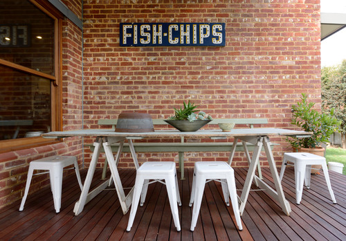
1. Hang a vintage sign. One big, statement-making piece is enough to bring an outdoor room into focus. Hunt through the stalls at local flea markets or search online to find a sign that speaks to you. Spending a little more than you're used to on this one item can actually be worth it, because it will make everything around it look instantly cooler.
2. Rig up a sawhorse table. Need a table fast? Head to the hardware store. A pair of sturdy sawhorses topped with a door slab makes a quick dining table that can be taken down and stored when not in use. Paint the sawhorses and tabletop, or simply cover the whole thing with a giant tablecloth.
3. Cover an imperfect patio with a colorful rug. Cheap and cheerful plastic outdoor rugs are perfect for covering up less-than-perfect brickwork or cracked cement.
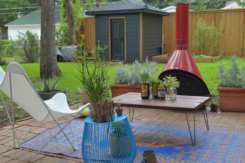
4. Hunt down a used outdoor fireplace. These homeowners found the cool outdoor fireplace shown here for $100 on Craigslist. Keep an eye out - you might get lucky! Also try searching for used fire bowls, patio furniture and big planters. You won't know what's out there unless you look.
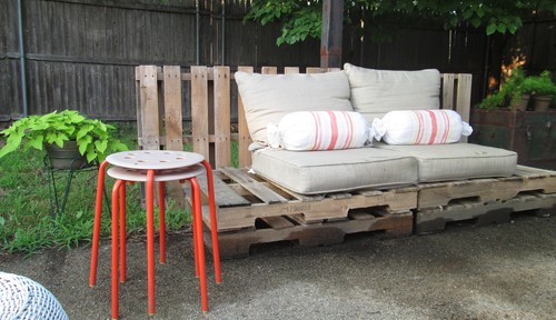
5. Make some furniture with salvaged pallets. Stacked wood pallets can make an almost-instant outdoor bench, love seat or daybed. You can buy salvaged pallets, find them on Craigslist or see if local stores have any they want to get rid of. Paint them first if you want, then top them with thick cushions and toss pillows.
6. Hang outdoor curtains. Look beyond the catalogs to find ideas for whipping up your own outdoor curtains on a budget - painter's drop cloths, cute shower curtains and tablecloths can all work. If you don't want to sew, purchase a grommet-making kit and pop in grommets along the top side of your fabric, then simply hang it from any curtain rod.
7. Use a coffee table and poufs in your backyard hangout. Poufs on sale can be quite a bit cheaper than dining chairs, and they make for a fun twist when entertaining. Less formal than a dining table and chairs, and more convivial than an outdoor living room, the intimate setup here encourages chatting, snacking and sipping.
8. Choose gravel instead of stone. Gravel costs far less to install than pavers or other hardscaping, and can look just as chic. For a beach-inspired twist, try spreading crushed oyster shells instead of gravel - if you live on the coast, it may be cheaper than gravel, too.
9. Make a table from tree stumps. Four solid trunk sections make a sturdy table base when trimmed to the same height. Set an old wooden door or scrap-wood slab on top, no nailing required.
10. Never underestimate the power of café lights. A strand or two of outdoor café lights (the kind with large bulbs and exposed filaments) is a can't-miss way to bring life to an outdoor seating area. If you do not have access to outlets, hang solar-powered string lights instead.
Tell us: How have you saved money on your outdoor spaces? Share a photo in the Comments.
Spaces that are neither indoors nor completely outdoors are often among the most trafficked spaces in a home. And they make for good design: We use them to negotiate changes in elevation between inside and outside, for entertaining, to reduce the apparent scale of our structures, to temper weather extremes and for visual screening.
By using the most basic architectural devices -- columns, rafters, walls and floor planes -- these indoor-outdoor buffer zones can be designed to feel every bit a part of the architecture. The examples here range from the tightly enclosed and controlled to the minimal. Let's take a look at a few approaches to designing transition spaces that successfully unite inside and out.
This home overlooks a bluff but sits on a very narrow lot that's constrained by neighboring homes on either side. This led to the incorporation of a protected outdoor room that acts as a buffer, preserving privacy for both properties while still permitting an outdoor-focused space for the residents.
To mitigate the proximity issues, the architect simply continued the exterior wall of the house to create a cloistered terrace space. The pivoting shutters open toward the view but act as blinders, screening any sense that the neighboring house is only a few feet away.
The bedroom space at the top of the image shares a connection to the room as well, and the pivoting-shutter idea was borrowed for its outside window. In this transition space, thrifty use has been made of simple architectural elements, walls, pivoting doors and an understated ground plane to create a gathering space where one might not have otherwise been possible.
In this view from the living room of the same home, one can appreciate that the interior space benefits equally from the exterior connection, borrowing light and a view to the sky without peering into the neighboring residence.
The kitchen connects directly to the outdoor room (behind the fireplace) allowing for outdoor cooking and eating, and the outdoor room mediates the vertical transition to the rooftop deck. The simple addition of one changeable wall lends great architectural diversity to the plan.
This outdoor room is another example of how a simple transition space can support multiple functions. The linear structure serves as a guesthouse, an outdoor dining area and a screen between the driveway and pool. The solidity of the copper-clad enclosed space dissolves into its component architectural parts -- columns, walls and rafters -- to define the poolside outdoor dining area.
The large opening in the screening-wall element visually connects the approach to the property via the driveway to the view while maintaining privacy for the dining and pool space.
The trellis overhead defines a place for gathering without the correlating weight of a solid roof.
A version of outdoor rooms, courtyards generally feel more inwardly focused and enclosed, bound by the walls of the surrounding architecture. They're an especially popular strategy in warm climates where the interior courtyard mediates temperature changes, providing shade and acting as a natural ventilation chimney of sorts for the spaces opening onto it. Of course it shares features with the other examples here too: walls, floor plates and even porches, combining them into one large permeable buffer zone. With its glazed walls that slide open, it's difficult to tell where the interior of this house ends and the exterior begins.
Courtyards are excellent devices to use when privacy is hard to come by, and they're a great way of introducing natural light into tight sites.
It's apparent just how strong an organizing device the courtyard can be when viewed from inside this home. In urban areas where typical views are to other structures, a courtyard can provide a vegetated counterpoint. I also like how the architect here has used a brick wall to capture and reflect sunlight back into the interior spaces.
Courtyards bound by neighboring architecture, which we can't control, can benefit from the introduction of plantings to provide some level of privacy and soften hard edges.
Porches
Another common architectural device used to mediate transitions is the porch. Porches can be fully or partially enclosed or much more porous and open, as in this example. They offer shelter from the sun and elements while framing views to the site beyond and a way of navigating the grade difference between the terrace and the house proper.
The gauze-like scrim above abstracts the tree canopy here, while the thin columns appears as tree trunks. Note that although the architect used simple rectangular elements, the look doesn't suffer. These simple shapes are overlapped -- the pool edge, the overhead scrim and the terrace seating -- to make the design visually complex and dynamic. Even the transition zones overlap from the covered porch to the shaded seating area.
Lighter, more permeable and less protective than typical porches, pergolas make excellent transition elements between interior and exterior. Here one reduces the perceived scale of the two-story home while filtering the sunlight entering the large glazed openings. A solid roofed porch would've blocked the light and felt much heavier, but the pergola marks an appropriately sized single-story gathering spot next to an otherwise tall wall.
The overhead plane is an important scale element that establishes how comfortable we feel in an indoor-outdoor space. Here's it's aligned naturally with the top of the door, an element whose size we're familiar and inherently at ease with.
This pergola serves a host of functions. It's equal parts sunshade, wall screen and scale device. Breaking up the tall wall, it offers a nicely proportioned place to sit on the deck and modulates the sunlight striking the facade. Paired with the deck below, the two elements thoughtfully span the grade difference between inside and out.
The versatility of it doesn't end there; the architect has also created a vertical rhythm of support columns in discreet places. Here the wall screening provides privacy for an outdoor shower; a lack of slats in the overhead plane permits light into the shower area. The simple modular system used for this pergola transition zone is infinitely adaptable based on the requirements of the nearby spaces.
As seen here, walls don't need to be full height to make great transition spaces. These low walls hold back the grade on the site and provide ample seating for gathering. There's a reason for them being sized and shaped the way they are, and their terraced design makes for a diverse experience in this outdoor transition space. Site walls such as this can help us to utilize the full vertical space on a lot and markedly enhance privacy. The bridge above adds interest, definition and sense of enclosure as well.
Below-Grade Transitions (Light Wells)
Taking the previous idea one step further, this project proves that even the most private of spaces can benefit from the blurring of interior and exterior space and vertical site development. Here we see an outdoor shower area adjacent to the bathroom. The architect has cleverly used etched glass to handle the privacy concerns while maximizing the vertical space on the site as well as the amount of natural light available to the bathing space.
Viewed from the nearby bedroom, the outdoor space is bound by a variety of simple elements; the walls are by far the strongest elements defining the space. The stairs appear carved from the earth at the lowest level and become lighter (and wider) as one moves upward. The layering of these simple elements makes this transition zone so successful. Note that the scale of the space at the lowest and most private zone is appropriately small and intimate.
Here's another light well and outdoor room used on a steeply sloping site to permit daylight in the lower-level bedroom and create a private outdoor sitting space. Transition zones that admit daylight can make small quarters feel much larger.
Another means of marking a sheltered transition zone is seen here; it uses a large cantilevered roof plane. It provides protection from the sun or rain when necessary and a frame of reference for the building scale, but also appears weightless and simple, like the brim of a hat. The guardrail wall helps to subtly suggest enclosure and protection too.
Here the overhead plane doubles as a deck area above to offer varying levels of privacy on a tight lot. Much like the earlier wall example, level changes were manipulated here to enhance privacy and visual separation by changing the horizon line and field of view.
This project has an overhead ceiling plane that transitions the arrival area as well as relaxation areas of the site. It's echoed in the hovering floor plane and the minimal column supports, achieving a weightlessness and simplicity of form fitting of the architecture.
Perhaps the simplest of all transition gestures is manipulating the ground plane. The decking here marks the change from lawn to pool seating. It's every bit as architecturally crisp as the dry-laid stacked stone retaining wall and the sharp lines of the pool.
Simple deck transitions alone work best when the building isn't too big or tall.
Here the orthogonal geometry of the wood deck plays off the organic site, which brushes up against it. The deck carefully delineates an intimate place for sitting in the forested site and offers a simple means of entering the master bedroom cottage.
The theme of simple architectural elements continues in this image. Straddling the line between enclosed and open, the pavilion can be deployed almost anywhere in the landscape.
This image reminds us that transitions happen in all aspects of our living environments, not only those used for repose. Carports and porte cocheres are good examples of pavilion transition elements that often act as gateways to arrival. Using them as screens against less desirable views or noisy areas of the site is particularly useful and appropriate.