Quantcast
Channel: AOL Real Estate - Blog
Viewing all 430 articles
Browse latest View live

Getting the Midcentury Modern Look Today

$
0
0

Filed under: , , ,

By Laura Gaskill

Midcentury modern style has only continued to gain fans in recent years, and the trend shows no signs of slowing anytime soon. If you are drawn to midcentury style and would love to know more about it, this ideabook can help. Here we'll cover a brief history of the style, touch on key designers and finish with some tips on shopping for vintage or reproduction pieces.

Jeni LeeMidcentury living room
Materials: Some breakthroughs in design happened during this era -- Charles and Ray Eames produced the first molded plywood chairs and the first molded fiberglass chairs, which allowed ergonomic shapes like never before. Engineered, high-tech materials like fiberglass, Bakelite, Plexiglas and Lucite were used alongside warm, natural woods, like teak, walnut and rosewood.

Color palette: Colors tend to be bright and optimistic: pure red, yellow, blue, green or pink. Although color provides the pop, the palette is usually tempered by plenty of natural wood and white.

James Wagman Architect, LLCModern Dining Room by New York Architects & Building Designers, James Wagman Architect, LLC
Key midcentury modern designers to know:

  • Ray and Charles Eames: American. Key pieces include the molded plywood chair, Shell Chair, lounge chair and elliptical table. The Eames name has become almost synonymous with midcentury design.
  • Isamu Noguchi: Japanese American. Key pieces: the iconic glass and wood Noguchi coffee table and handmade Japanese paper lamps.
  • Jens Risom: Danish born, Risom immigrated to the U.S. in 1939 to study design. Key piece: the Risom Lounge Chair, which was originally had surplus parachute straps used as webbing.
  • George Nelson: American. Key pieces: Platform Bench, Ball Clock, Eye Clock, Coconut Chair, pendant lamps.
  • Eero Saarinen: Born in Finland, Saarinen immigrated to the U.S. in 1923 with his architect father and textile designer mother. Key pieces include the Tulip Chair, Tulip Table, andWomb Chair.
  • Hans Wegner: Danish. Key pieces: the Wishbone Chair and the Wing Chair.
  • Arne Jacobsen: Danish. Key pieces: the Ant Chair, Swan Chair, Swan Sofa, AJ Lamp and Egg Chair.
  • Of course there are many, many more, but this group is a solid sampling of the work being done at the time.
Hilary WalkerContemporary Dining Room by Fort Worth Media & Bloggers, Hilary Walker
Buying Midcentury Modern Furniture Now: You basically have three options when it comes to buying midcentury-modern-style furniture: buy original vintage pieces, buy new designer pieces or buy current pieces inspired by the midcentury aesthetic. Let's explore the options.

1. Hunt down vintage (original) pieces. This can be a surprisingly affordable way to build up a nice collection of midcentury furniture. Since many iconic pieces have remained in production continuously since the day they were designed (see No. 2, next), the period originals do not cost as much as you might expect. There are exceptions, of course, but if you want the real deal, vintage is a great way to get a designer piece often at a lower price.

UPinteriorsModern Home Office by Other Metro Furniture & Accessories, UPinteriors
2. Buy new. Many of the key pieces mentioned earlier have been in production continuously since they were first created. If you want a Saarinen Tulip Table or an Eames rocker, you can order one up in a variety of colors and finishes from a retailer like Design Within Reach, which sells pieces made by licensed manufacturers like Knoll and Herman Miller. You can also find pieces in the Houzz Products section. Except in the case of some new color and finish options that were not available at the time, what's available today is exactly the same as what rolled out of factories in the 1950s.

3. Seek out new furniture inspired by midcentury design. There are direct knockoffs -- for instance, a chair that looks exactly like an Eames Shell Chair but is not made by Herman Miller (the licensed manufacturer of Eames products); these have their detractors in the design world. Then there are new designs that are inspired by the midcentury aesthetic without being copies. Many retailers (from West Elm to Target) offer fresh twists on midcentury modern styles in a range of prices.
Embracing midcentury modern style today. Instead of trying to re-create a midcentury home exactly, today's take on midcentury modern style is open to interpretation. Don't be afraid to mix in a few iconic midcentury pieces with those in other styles you love, or to revive vintage midcentury finds with new.


Permalink | Email this | Comments


For Sale: Frank Lloyd Wright Design Saved From Wrecking Ball

$
0
0

Filed under: , , ,

thaxton home by frank lloyd wright
ZillowThe current owner bought the 1,800-square-foot home and meticulously restored it to its original design.
By Emily Heffter

The money grabbers almost got this Frank Lloyd Wright house in Houston, Texas. The 1955 home lost its design religion in the 1980s, when a previous owner added columns, painted the original redwood walls white and put decorative pineapples on the corners of the roof. Modern-architecture purists were appalled, and developers started talking about tearing down the home at 12020 Tall Oaks St.

Insurance executive William Thaxton, who commissioned the home in 1954, told The New York Times in defeat: "I guess I do kind of hope that someone will buy it and restore it, though I don't think anyone will. The money grabbers will get it, I'm afraid."

But in 1991, the current owner bought the 1,800-square-foot home and meticulously restored it to its original design. Then he worked with an architect to make the L-shaped house into an U, quadrupling the square footage. It's now for sale: $3.195 million.


"It is definitely a retro house," said Karen Harburg, the listing agent from Martha Turner Sotheby's International Realty. "It's a fabulous house, and it's well-designed. The addition tried to keep with the same elements of Frank Lloyd Wright's style."

The original living room and galley kitchen carry Wright's signature elements: stained concrete floors, concrete-block walls, large windows and natural wood, with built-in bookshelves designed in place and fixed along the walls. The addition houses a second, larger kitchen, a wing of kids' bedrooms and a master suite.

Wright was famously uninterested in collaborating with clients, but The New York Times reported that Thaxton talked the architect out of having the swimming pool run under the wall into the master bedroom. (The pool abuts the master, instead).

Thaxton paid the architect $25,000, and Wright designed the house with minimal input. "It was sort of a bring your toothbrush kind of situation," Harburg said.

The home, which is in Houston's swanky Bunker Hills Village, is one of only three Wright-designed private residences in Texas. The others are in Dallas and Amarillo. The modern architect also designed the Dallas Theater Center.

The home has been on the market at least twice before, most recently in 2011 for $2.9 million.


Read | Permalink | Email this | Comments

Before and After: Kitchen Gets a Craftily Organic Update

$
0
0

Filed under: , ,

By Becky Harris

This Seattle homeowner was ready for a radical change. Her architect, Nils Finne, described her approximately 85-year-old home as Tudor-ish," with a separate kitchen and dining room. After persuading the homeowner to remove the wall between the two rooms, the architect needed to turn the resulting 34-foot-long kitchen into something warm and wonderful.

Now it was time for him to get radical. So Finne invoked his love of "crafted modernism," as he calls it, and custom designed everything: the space plan, the island, even the pendant lights. Mixing natural and engineered materials, straight and organic lines, and dark and light tones, he created a kitchen that feels contemporary and fresh yet is well integrated with the rest of the home.


The previous kitchen was not an inviting space, and it didn't have room where people could gather or hang out. The room beyond it is the former dining room.


AFTER: Now the room -- 34 feet long and about 15 feet wide -- runs from the east side of the house to the west. To complement the linear space, Finne added two custom surfaces: an island and a dining table. The doors at the west end of the room offer views of Puget Sound.

Finne custom designed and fabricated the island and the dining table, as well as the stools and light fixture brackets. The island and the dining table were milled from the same elm tree; the owner likes to stand at this end of the island and say that she can see all the way up the tree.

The dining table has a reclaimed, live-edge elm top that floats above a blued-steel base. The top is stained dark espresso. The table legs have a bronze overlay that's been laser cut with a leaf pattern. The straight machine-cut lines have nature-inspired patterns; the live-edge wood is supported by lines of steel. There's tension and balance between these engineered and nature-inspired details throughout the home.

"I love to get into a design to this level," Finne says of custom designing pieces like this. "It gives my projects a depth that they simply wouldn't have without it."


This photo shows the size of the trough sink in the island and how much can be stored on the shelf below. The custom sink is 41 by 12 inches and made of stainless steel. "The sink allows two people to work side by side, and it is also great for parties -- you put ice in the trough and fill it with bottled drinks," Finne says.

On the island the slot between the two pieces of elm wood is filled with limestone. On the dining table, this slot has been left open.
To play against the linearity of the space, Finne dotted the pendant lights in a haphazard pattern across the long room. "I wanted them to look like candles floating in the air," he says. He chose inexpensive off-the-shelf pendants, then crafted custom brackets in blackened steel.

At the east end of the space are views out to a garden.


The client's son is a potter who worked in Japan for a Japanese "living national treasure," Finne says. Most of the pottery displayed in the kitchen is the son's work. "There was definitely some Japanese inspiration in here," Finne says. "The dark countertops paired with the light wood cabinets and bamboo is very Japanese."

The light wood is indigenous Alaskan yellow cedar, which has a tight, straight grain. The inset panels are bamboo. The countertops are dark limestone.

The backsplash creates a connection between the light wood cabinets and the dark limestone countertops. The stone mosaic has a dynamic pattern that feels organic. "It's all about textural interplay," Finne says. More of the work of the homeowner's son decorates the countertop. His and the architect's passions for excellent craftsmanship suit the kitchen well.

"Because of the level of craft, because it is not overwhelmed by modernity, because of the respect for materials, the touch of the human hand and the care that went into making it, this kitchen transcends time," Finne says. The new space has an organic feeling and a level of detail that makes it feel at home in the 85-plus-year-old house.

See more of this house


Permalink | Email this | Comments

Guide for Renting to Vacationers: From Remodel to House Rules

$
0
0

Filed under: , , ,

By Mary Jo Bowling

As a writer who specializes in interior design and architecture, I look at a lot of properties, and I'm seeing something interesting: Homeowners are remodeling and building with short-term or vacation rentals in mind. I stumbled across an urban two-flat home where the owner kept the lower unit separate to rent it to business travelers; I met an architect who designed her suburban house from the ground up to include an apartment with a separate entrance with an eye to renting to vacationers. The list goes on. A quick Internet search will prove the point: Now that technology has made the process easier, more people are dipping into the hospitality business.
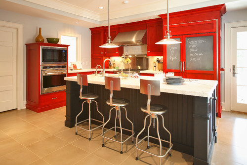

Contemporary Other

As with most societal shifts, the sharing economy (the act of renting out what you are not using) is experiencing growing pains. Around the globe, municipalities are parsing how to handle taxes (San Francisco and Portland, Oregon, will be the first cities in the United States to collect tax on Airbnb income) and what to do about neighbors who don't want to live next to short-term rental properties; dealing with the fear that short-term rentals will take housing off the market and drive up the cost of long-term rentals; and more.

If history is an indicator, as long as there is money to be made through some activity, people will do it. And, now that there's money to be made in short-term rentals, people are considering new ideas about design and the act of sharing their spaces with visitors.

Renovating for the Sophisticated Traveler

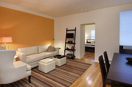
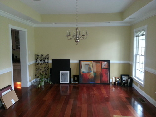
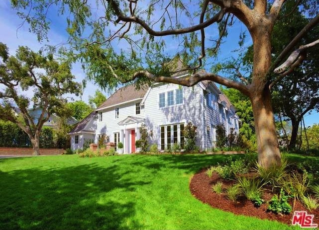
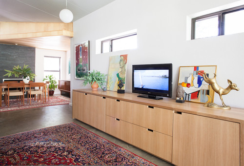
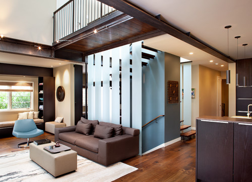
The owner of the California apartment seen here got into the vacation rental business in a roundabout way. When she bought the property, a classic Victorian dwelling, it came with an existing tenant in the lower-level apartment. When that renter moved on, she renovated the space to attract business travelers and style hounds who visit her area.

She hired Jonathan Rachman -- an interior designer who has worked in the hospitality industry and has designed several high-style boutique hotels -- to make the space appealing. "I'm a firm believer in investing in design," she says. "What I put into the space came back to me, because people are attracted to beautiful environments and beautiful things."

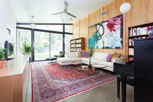
Rachman treated the space like his larger hotel projects, and he started by learning more about his client and her future guests. "I wanted the space to reflect her personality, which is warm and fun, as well as the Victorian architecture of the house," he says. "We felt sophisticated travelers would enjoy this kind of environment."

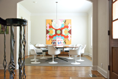
Rachman started by giving the space - a modern unit added later in the home's life -some classic lines. He borrowed patterns from the home's exterior and applied molding to the unadorned walls as well as base and crown molding. He chose a similar pattern for the living room rug. "I felt that people would appreciate rooms that reflected the architecture of the house and neighborhood," he says.

The dark wall color was the client's idea. "My mother loved interior design, and when I was a teenager, she painted the walls of my room black and the trim stark white. She put in a white shag rug and red furniture," the owner says. "Everyone who came to our house remarked on and remembered that room. I suppose that was in the back of my mind when I requested dark gray walls. I knew it would be memorable - and I knew it would stand out when people are searching for a place on the web."

Rachman added his own accent color, a bright green. "It's a strong color," he says. "It's not one everyone could live with, but many would love to try it out during a vacation."

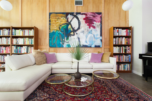
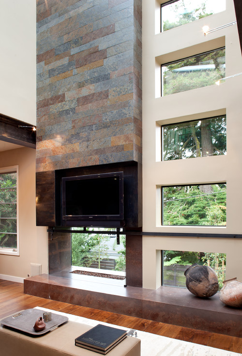
The designer had heavy use in mind when he selected the fabrics and finishes. Most of the fabrics are meant for outdoors and are easily cleanable. The ottomans that serve as coffee tables are covered with wipeable white vinyl. The kitchen floor is tile. "Not everyone is as careful as you would like them to be," says Rachman. "We had to make sure everything was durable and easy to maintain. In some cases we chose materials that weather beautifully, such as a dark floor that will develop a nice patina over time."

"We knew that guests sometimes choose this kind of rental because they like to entertain, so we made it home-like with furniture that can be easily moved around to accommodate a small gathering," Rachman says. He also opted for furniture you can see through to make the space feel bigger.

Anticipating that guests would appreciate a less corporate look, Rachman added several one-of-a-kind elements, like this light fixture he had crafted out of a vintage silver-colored bowl.


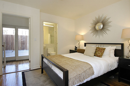
The bedroom has the least amount of natural light in the apartment. Rachman used that as an opportunity to create a cozy but bold space.

He stretched the walls to their limits by building a series of shelves recessed into the walls.

"The idea was to make the tight space as pretty as possible. The wallpaper and the green color distract the eye and make the space seem full and rich," Rachman says.

The bedding is pretty but tough, washable and commercial grade.

Rachman believes that accessories help enhance the experience and sell the space; he selected things that can withstand use and can be replaced.

As for the homeowner, who rents on Airbnb and hires housekeepers to clean the space, she has no regrets about the money she has invested in the venture. "The unit is always booked," she says.

When asked what advice she would give to homeowners who want to do something similar, she says it's too early to tell. "I'm going to have to pass along the taxes in the cost of the room, just like hotels do," she says. "I want to do everything right and pay my taxes, but time will tell if it remains profitable."

She also harbors no regrets about societal growing pains. "This unit brings people to the neighborhood, and they in turn spend their dollars at the local shops and restaurants, which helps everyone," she says.

Short-term rentals have been hot news in New York, where state laws prohibit rentals of less than 30 days unless a permanent resident is onsite. According to a recent New York Times article, Airbnb was required to hand over anonymous data about their hosts to the state attorney general, who is using it to identify people running what he calls "illegal hotels."

It's a struggle that Steve Saide, Furnished Quarters executive vice president of design, has watched carefully. For more than 20 years, the company has managed hundreds of properties (mostly in New York City, like the one seen here) for owners who want to legally rent to visitors. Regardless of whether owners are renting a room in their personal home for a couple of nights or whether an absent owner wants to lease a condo for months at a time, Saide says there are things to consider.


Getting Help

As executives at Furnished Quarters, it's not surprising that Saide and his colleague, Craig Partin, director of sales, stress the importance of choosing a management company to take care of short-term rentals. "Owners sometimes purchase a home or an apartment with the idea of renting it and making money," Partin says. "But many individual owners don't have the marketing knowledge, the client base or time to make it happen. What they don't realize is that managing a short-term rental can be a full-time job and that there are a lot of hidden costs, such as wear and tear and repairs, that can eat up profits. We have a staff of 22 that addresses all these issues. It would be tough to do on your own."

Saide notes that owners have to pay a fee to management agencies, but that it's a fee they earn. "People don't consider that you have to let the guests in and attend to their needs if there is a problem," he says. "For safety we also do background checks, something an individual might not have the resources or time to do."

One of the services Furnished Quarters provides is design. The team typically furnishes the units completely with things they know attract visitors. "You want a great first impression when you open that door," Saide says. "It should be inviting, clean, comfortable. There should be nothing personal, like photographs. Design choices should be as universally appealing as possible and upmarket."

Saide also echoes Rachman's thoughts on durability. "We shy away from delicate fabrics. We always opt for glass over Plexiglas, which can scratch. If we use wallpaper, we use vinyl," he says. Saide also finds that investing in well-made, solid furniture cuts down on breakage and replacement costs.

Partin notes that a pleasing neutral palette works for their customers. "But we do add pops of color to make it feel more homey," he says. "Our guests appreciate an upmarket blank slate."


That's not to say the slate is completely blank. "We avoid art that is what you would derogatorily call 'hotel' art," he says. "Black and white photography seems to appeal to a wide range of people. You want art and accessories to elicit a smile, not a laugh."

Checking in With the Neighbors

Stacey and Shellie Seering of Duluth, Minnesota, take a totally different approach when renting the guest house behind their home.

They stumbled into the business after buying their house. At that time the building that is about 100 yards from their back door was billed as an artist's studio. "It really wasn't habitable," says Shellie. "We have college-age sons, and we started fixing it up, thinking it would be a fun place for them and their friends to stay when they visit."

But halfway through the project, Stacey broached the subject of making it nicer and using it as a vacation rental. "Honestly, I had just had knee surgery and was taking painkillers, so I went along with it much more easily than I normally would have," says Shellie. "But I told him he would have to do all the legwork."

Because they live in an area that is strictly residential and not zoned for vacation rentals, that legwork entailed a lot of research and visiting the neighbors. "He had to go and talk to all the neighbors within a mile radius. They all got to voice their concerns and ask questions. Then we had to go before the township board, and all the yay- and naysayers got to voice their opinion," Shellie says. "In the end we were awarded a conditional-use permit that will last two years, and after that we will go before the board again for evaluation."

"I really didn't expect it to happen," says Shellie. "I expected to get stopped along the way, but whenever concerns arose, we addressed them and kept moving forward."

As the project moved forward, the budget moved upward. "Originally, we were thinking we'd put $10,000 into the project," Shellie says. "But we were planning to put in a coffeemaker and a microwave on a table for a kitchen. To attract guests we put in a full kitchen, and that raised the budget by $3,000."

Shellie works as an accountant with a local company, and her husband is in sales. Although they had never done anything like this before, they did most of the work themselves, using a contractor, an electrician and a plumber for the jobs they couldn't handle alone.

The couple named the place Singing Waters Guest House. "We started advertising it on on VRBO and Craigslist in March, and we opened for business in June. Except for five days, we've been booked solid," says Shellie. "Now it's looking good for September."

To outfit the last-minute kitchen, the couple went to The Home Depot for standard cabinets and a laminate countertop. "We went for things that were nice but not superexpensive," Shellie says. She wanted to get a modern and fun look, and found a lot of craft projects online "to make it warm and homey and different from the rustic rental cabins you find in this area," she says. "I love to do this kind of thing, but I also figured it would appeal to women. Studies show that when it comes to vacations, women are making most of the decisions. I tried to appeal to women between 30 and 50, because we are looking for responsible and respectful families to rent this property."

Shellie believes it's the fun design elements she chose that draw people to the property. "Aesthetics are second only to price," she says.


That philosophy led to creative design decisions. "The table cost $25 at Goodwill," says Shellie. "Stacey routered out the top, and I laid in a mosaic of bottle caps and covered them with resin." She then surrounded the piece with six mismatched chairs she unified with a common color. "I think personality appeals to people," she says.

Other fun touches: In a larger vestibule that's been decorated as a game room, Shellie painted a single slat on each chair red. She decoupaged the wall in front of the table with sheet music. A vinyl decal of a hopscotch grid decorates the concrete floor and leads to the living room. She also gave an armoire (a find at a local school's auction) a coat of red paint and stacked a collection of yellow, red and black Café Bustelo coffee cans on top of it. "We love this coffee, but you can't get it here," she says. "You have to order in bulk, so we have a lot of cans."

At the other end of the space is the only victim of the vacation rental project: an inflatable Bozo the Clown punching bag, which was popped after a family with kids stayed one weekend. "For us there have been almost no problems," says Shellie. "We work at home, and we have somewhat flexible schedules. It takes both of us about an hour to clean up after guests leave. Between us it takes a couple of hours a week to respond to emails and phone calls." They have set up an email account and a Facebook page (where Shellie has promoted the guest cottage) for the property and have special ringtones on their phones to indicate a potential guest call.

"We have met some really great people, and they have all been very nice and respectful," says Shellie. "So far we haven't had anything taken from the property or any significant damage. No one has left as much as a dirty dish in the sink."

She says there was just one unpleasant incident. "We had a group of nice young men in their 20s come and stay," she says. "They spent the day at the river hanging out and drinking. After they left, everything was in order, but we discovered someone had vomited behind a rock cairn near the front door. Luckily, it was outside, so it was an easy cleanup."

When they decided to rent the space, the Seerings took out extra insurance. "We got an umbrella policy and short-term rental insurance. We had to switch insurance providers, because the one we had didn't have that service," Shellie says.

A story about a pair of brothers who took advantage of the owner of a short-term rental in Palm Springs, California, made headlines recently. Shellie isn't worried about these kinds of guests. "Although technology allows you to book these rooms without talking to the host, I like to speak to the guests first," she says. "You can learn a lot about someone by taking a moment to talk to them. I think they are reassured talking to me, too. They want to know I'm a real and decent person. We treat our guests the way we would want to be treated, and they have been great. There are some guests who are a little needier, and they come to the house to ask questions or make requests -- but overall it's been a really great experience."

Shellie tries to ensure good behavior by laying out the rules. "We have a notebook in the guesthouse that goes over everything," she says. "Not only does it have maps and a little scavenger hunt we devised for the kids, it has the rules. You can't smoke in the house; you have to respect the speed limit in the neighborhood; we ask people to recycle and have separated bins to make it easy. VRBO has a community page that has a lot of tips from people who have been doing it a long time, and I took a lot of their advice when making guidelines."

The Seerings' hard work is paying off. "We charge $175 per night during the week and $200 on the weekends," Shellie says, noting that for special events they have occasionally raised the price. "Our permit limits our rentals to 140 nights per year. If we do that, we stand to make $25,000 per year. That covers the mortgage and helps with our kids' education."

Shellie's advice for people who want to do the same thing is to start with research. "Before you invest money, get your ducks in a row. Every city is different, so find out what your city will and will not allow," she says. "I do think that this can be a booming business for people, but it pays to do the legwork first."

She adds that along with the work of setting up and maintaining a rental comes some fun. "People stay for two to five days, and they start to feel like family," she says. "When some of them leave, I hug them goodbye, and they promise to add me to their Christmas card list."

Tell us: Have you renovated or redecorated your house with a vacation rental in mind?

More: Supermodel Homes and Why Creatives Rent Them


Permalink | Email this | Comments

Outfitting an Art-Filled Penthouse in New York City

$
0
0

Filed under: , ,

By Brad Goldfarb

Along with the High Line, Frank Gehry's IAC headquarters, and the Renzo Piano-designed Whitney Museum slated to open next spring, a parade of striking residential buildings by an all-star cast of architects, including Jean Nouvel, Richard Meier, and Shigeru Ban, has completely transformed the complexion of New York City's West Side in the past decade or so. One of these structures -- the tower known as 200 Eleventh Ave., devised by Annabelle Selldorf in the heart of Chelsea's gallery district-offers a state-of-the-art amenity no other high-rise in the city can match: apartment-level parking, made possible by an elevator that deposits occupants and their cars directly at their own doors. Add enticing features like double-height ceilings and panoramic views, and it's easy to understand why the address has become so desirable.

For one couple, who live primarily in Paris and Aspen, Colorado, with their two children, a spur-of-the-moment visit to a duplex penthouse in the building was all it took to end a nascent search for the

"In the living room the decorator created "the impression that the room was floating like a helium balloon," he says, "with the Hudson River below and clouds above."

perfect pied-à-terre. "Our decision to take it was pretty instant," says the wife.

Just a few years earlier the pair had sold what many would consider the ultimate Manhattan trophy home -- a sprawling apartment on Fifth Avenue. "We wanted to be downtown, in a smaller and more contemporary space," explains the husband. And the move to Chelsea, with many of the city's leading galleries just steps away, would put the duo in the center of the art scene, a world in which both are active. They envisioned the residence not only as a place to call home in New York but also as a glamorous setting for entertaining. To tailor the developer-outfitted unit into the inviting showplace they pictured, the couple turned to Paris-based interior designer Jean-Louis Deniot, whom they'd worked with before. "My husband wanted something less traditional than our other homes," says the wife. "I am all about warmth, ease and comfort, especially for our children. Jean-Louis understands that balance."


Deniot also grasped that to make the apartment function as his clients wished, a few structural modifications would be necessary. Carried out in collaboration with Peter Pelsinski of the New York firm SPAN Architecture, these changes ranged from the cosmetic -- adding ceiling coves to conceal lighting, ductwork and wiring -- to the more ambitious, such as enclosing one of the two outdoor terraces to form a double-height family room (which can also serve as a dining room, thanks to a Deniot -- designed cocktail table that rises to dining level at the touch of a button).

When it came to the decor, Deniot selected a variety of statement pieces, among them a backlit brass sunburst sculpture by C. Jeré in the powder room and an Hervé van der Straeten bronze-and-lacquer bar cabinet in the living room. The emphasis on high-impact furnishings was an approach the homeowners readily embraced, and their contributions to the mix included a curvy chrome-and-ebony dining table with matching consoles by Guy de Rougemont. These, in turn, inspired the sleek kitchen island, which Deniot fronted with a Mondrianesque arrangement of stainless-steel and wood panels.

Not surprisingly, views were central to Deniot's design, with the sky, river, and cityscape informing many of his choices. In the living room the decorator created "the impression that the room was floating like a helium balloon," he says, "with the Hudson River below and clouds above." Floor-to-ceiling curtains custom embroidered with patterns suggestive of watery reflections line the 24-foot-tall windows, while a silk carpet in pale blues and grays underscores the ethereal mood. Anchoring the room is a vintage Steinway piano, lacquered blue by Deniot. "Jean-Louis struggled with having a brown or a black piano," says the wife. "So we compromised."

In the master bedroom, where a bronze Paul Evans lamp from the 1970s resides harmoniously atop a bespoke lacquer bookcase, Deniot's penchant for combining old and new is on vivid display. "I try to mix things so you can't tell what's vintage and what's recent," he says. Throughout the home, walls are clad in compelling textiles, such as the evocative print of rolling hills in the guest room, chosen for the way it echoes the distant landscape across the Hudson.

Of course, art plays a major role as well. Among the pieces acquired for the space is the Antony Gormley sculpture on the second-floor landing. Another high-light is the arresting multicolor wall sculpture by Mauro Perucchetti commissioned for the spot above the living room fireplace. Still, "it's not an ideal apartment for art," concedes the husband. "With all the windows there's limited space for hanging anything. It's the classic trade-off." But then, those New York City views are their own kind of masterpiece.

Tour the Jean-Louis Deniot-devised Chelsea apartment.

Also at ArchDigest.com:
Tommy Hilfiger's Incredible Miami Home


Permalink | Email this | Comments

Room of the Day: A Breezy Midcentury Style That Travels Well

$
0
0

Filed under: , , ,

By Mary Jo Bowling
Photos by David Duncan Livingston


Blye Faust wanted some of Southern California's relaxed, beach-centric style to migrate north with her when she moved from Santa Barbara to Belvedere, a small island in Marin County, California. She and her family (husband Aaron and a 2-year-old son) found a Midcentury ranch-style home to rent that was perfect for them at the moment. Although a move could be in the future, Faust gave the home a dose of style for the here and now.


Contemporary Living Room by San Francisco Interior Designers & Decorators ByBlye Interiors


"We love this house," says Faust, of ByBlye Interiors. "And although we don't own it, we wanted to make it our own."

Located at the front door, the long, narrow living room is the hub of the household, and this is where family and friends gather. "We have 10 chairs in the dining room off this space, so we wanted to put seating for that many people in this room," says Faust. "After dinner people just migrate to the living room."

The sun-filled space has an atomic-era vibe that reminded Faust of her life in Los Angeles and Santa Barbara, and she wanted to play up that style. First step: Paint the pastel yellow walls white. "I love white walls; they are the nicest clean slate to work with," she says. "My idea was to make a neutral base and add color in the furnishings and art."

Paint: Coconut, C2


A bouquet of color comes from a vivid floral painting by her great-grandmother Katherine Dunne Pagon. The rug's watery hues pick up the blue in the painting.

"We were on a budget, so on a whim I searched Etsy for a rug," she says. "That's where I found this piece."

Faust chose to invest in the chairs, sofa and coffee table -- pieces she plans to take with her should the family outgrow this space.

"We love this architecture and this neighborhood, and there are several homes like this one nearby," she says. "It's not inconceivable that we would end up in something similar. Regardless, I think I'd like the furniture anywhere."

(Chairs: Lawson-Fenning; coffee table base: James Devlin Studio; coffee table top: Fox Marble.)

The blue and white palette takes an edgy turn with dashes of black -- such as the black leather sofa Faust designed for the space. "I love these colors together in fashion," says the designer. "If these shades were in an outfit, I'd be delighted to wear it."

Wanting to add some design diversity to the room, Faust created the sofa in a style that's more contemporary than pure Midcentury. The black leather fabric has a rock 'n' roll look but a family-friendly attitude. "I think that kids can jump and play on it, and it will weather nicely," she says. "And the dark color hides a lot of marks and stains."


When it came to the art, Faust wanted something that would make a big impact in the room but a little dent in the wallet. She searched for "black and white art" on Etsy and discovered Cindy Robinson.

The striking table, smooth on the outside and jagged on the inside, came with its "teeth" painted white. Faust had it stripped and refinished in a natural wood color. Now the white wall allows the table's lines to shine.

The rattan chairs are vintage. Faust liked their California-in-the-1960s look and their portability, a plus for gatherings.

(Table: Noir; art: Cindy Robinson>)


Permalink | Email this | Comments

Are These on Your Dream-House Wish List?

$
0
0

Filed under: , , ,

By Jo Froude

Ever had the feeling that your life could be so much better, easier or more glamorous if only you had a specific feature in your home? It's a common complaint. But when you can't flick through design photos or peer over the neighbor's fence without feeling a pang of envy, it's time to admit it: You are suffering from a case of Interiors FOMO (Fear of Missing Out). Here are some of the most common envy inducers. You have been warned ...

Bifold doors. Whether you're on a mission to bring the outside in or vice versa, your success, er, hinges on these beauties. Fold them right back and you effectively remove a wall, opening up the living area and increasing the sense of space. Make sure the floor levels in the house and garden are the same to create a seamless transition between the two.

A special shed. As if abandoning the daily commute weren't reason enough to whoop for joy, a heavenly home office should tip you over the celebratory edge. Make it remarkably spacious, with ample shelving, plenty of natural light and outlets.


Contemporary Patio


A cool wine cellar. Outgrown your wine rack? A subterranean cellar like the one above could be just the ticket, allowing you to store a substantial number of bottles in an otherwise redundant space. Sleek, stylish and featuring a spiral staircase, an ingenious addition like this would surely make you the star of the dinner-party circuit.

An outdoor screen. For the ultimate summer-evening entertainment, bring the home cinema experience outside and project your favorite film on to a perfectly positioned retractable screen. A strong statement color behind it can make it an appealing feature all year round. If guests overstay their welcome on those balmy evenings, you can always start showing your family's home videos ...


A dedicated game room. Wouldn't life with teenagers be a breeze if they had their own space?


Permalink | Email this | Comments

After-School Special: How to Zone Your Home for Learning

$
0
0

Filed under: ,

By Catherine Funkhouser

As children head back to school, it's back to reality for parents too. Now is the time to organize our homes for the homework that's soon to come. Advance planning and a few simple strategies, the experts say, can help boost productivity and reduce the frenzy. Parents out there know what I'm talking about -- there's that special time of day when you're monitoring homework, making dinner and maybe trying to entertain a rambunctious younger sibling, all before rushing off to sports practice or dance class. So take a deep breath and try these expert-approved tips at home.


1. Create multiple homework zones. Here's the good news: You don't need to have one designated homework space that's fully tricked out with all the bells and whistles. In fact, education expert Ann Dolin, author of Homework Made Simple: Tips, Tools and Solutions for Stress-Free Homework, says it's

"The thing that matters most is that there aren't a lot of distractions in the room."

best to have two to three spots in the home where children can work. "Moving around to different places can actually improve productivity," she says.

Divide homework time between the kitchen table and the home office, for example. And Dolin says parents don't need to spend a lot preparing a space. "It doesn't have to be spectacular. The thing that matters most is that there aren't a lot of distractions in the room," she says.

To ease mobility among the various spaces, organize school supplies (pens, highlighters, scissors and such) in a portable container. Dolin suggests a plastic shower caddy from Bed, Bath & Beyond. Here the supplies are cleverly positioned on a rotating lazy Susan. Corralling all the supplies in one place before the child sits down also helps avoid unnecessary interruptions later. A portable supply caddy or bag is also great if younger siblings often do homework from the soccer field sidelines.


2. Change up the chairs. Judy Shincarick, director of the Occupational and Physical Therapy departments at The Lab School of Washington agrees that a change of scenery can boost productivity, but believes a change in chairs can help too. She recommends different chairs (or no chair at all) for different homework activities. Because most children can't sit still in one spot, like a chair, for too long, breaking up the monotony is important. "A solid chair, pushed in at a solid tabletop, is a good place to start," she says. But it's only one scenario.

Some children are able to focus better sitting on a ball chair, gently bouncing as they work. The subtle movement engages core muscles and allows for increased alertness. "Ball chairs can help with focus or be a distraction, depending on the child," says Shincarick, who advises parents to consider their child's individual needs and adapt as necessary.


If it's a solid chair for science and a ball chair for math, try a cozy beanbag or club chair for reading time. "Many children like that snug feeling of closeness to read a book. The cocoon feeling can ground them," says Shincarick. Of course, if you notice your child getting a little too comfortable and drifting off, then it's probably time for a move. Another option is to stand up for certain tasks, maybe at the kitchen counter to review vocabulary words.

3. Select homework spots based on children's ages and development. Younger children require more monitoring and support, so keep them close. The kitchen, dining room or a first-floor home office would work well. While my kids have done a lot of homework sitting at our kitchen stools, I love the designated homework space in this kitchen and the built-in chalkboard and shelves. With a setup like this, your child can work close by while you cook, but will be removed from the hustle and bustle of food prep.

Here an unclaimed space off the kitchen has been converted to a homework area. The simple countertop desk is made from painted MDF. If your child works in or around the kitchen, make sure the tantalizing smells of dinner cooking aren't a distraction.


Transitional Kitchen by Seattle Architects & Building Designers MAKE Design Studio

Consider setting up a homework space in the family room. The advantage is that the kids will be nearby, so you can check in easily. Of course, you'll need to make sure there aren't too many other activities going on in the room at homework time. Some children can tolerate background noise better than others. In fact, some work best with music playing.


Consider setting up a homework space in the family room. The advantage is that the kids will be nearby, so you can check in easily. Of course, you'll need to make sure there aren't too many other activities going on in the room at homework time. Some children can tolerate background noise better than others. In fact, some work best with music playing.

Older children and teenagers can venture a little further, although Dolin thinks most still do better choosing a spot for homework other than the bedroom, where distractions exist at every turn. A basement is, of course, one option. I would have loved this arrangement when my kids were younger --

"Gaming devices zap their attention. They're not a good idea during breaks, because they suck you in to the next level."

a workstation with a computer for the oldest and a table and chairs for the little ones. (I can see us here, all happily coexisting; me folding laundry while they peacefully work and color for hours. Well, a mom can dream, can't she?) Still, a crafts table is a great addition to the homework zone for those larger projects, such as science fair boards.

If your teenager opts to work in the basement or den, limit the distractions as much as possible. Today's students rely on technology for their homework, so it isn't often feasible to ban electronic devices altogether. But Dolin suggests setting some guidelines. Silencing the cell phone and putting it out of reach on the other side of the room can help prevent temptation. Children of all ages need frequent breaks during homework, so decide if they can check texts during a break. But Shincarick recommends keeping video gaming devices off limits until after homework. "Gaming devices zap their attention," she says. "They're not a good idea during breaks, because they suck you in to the next level."

If you do decide that your older child is ready to work in the bedroom, be sure to create a separate work zone -- the bed may be too relaxed for optimum productivity. Remember, though, the space doesn't need to be grand.

4. Don't forget the essentials, and consider some special tools. Good task lighting is key for any workspace, and these hanging fixtures offer form as well as function. A homework station tucked out of the way in an upstairs hall is another great option for older kids -- it will keep them away from distracting family interactions but still within earshot when you want to check in.


Of course, when you're planning or choosing any homework zone, be sure to factor in the need for multiple electrical outlets for all the high-tech devices permanently attached to our children (and ourselves) these days. This space also offers great storage options to keep the work counter clutter free. Identify a permanent resting place for device chargers so they're always available when you and the kids need them. The blue mason jars are creative vessels for storing smaller supplies, such as paper clips and pushpins for the fun corkboard squares.

But here's the thing: Once everything is lovingly in place, your child actually will have to sit and work. Remember that famous line from "Field of Dreams," "If you build it, he will come"? It's not always that smooth. Often, the hardest part for kids is beginning. Dolin is a big fan of timers (she especially likes the visual Time Timer tool). She recommends setting the timer for five or 10 minutes of concentrated work effort, what she dubs "5 Minutes of Fury" or "The Tolerable 10." The strategy helps kids over that initial resistance: "They need to get over the hurdle of just getting started, and then they can keep going," she says.

5. Engage your child in the space-planning process. Shincarick recommends giving your child a vested interest in the homework space(s). "It should be a joint effort between the child and parent," she says. If your child has a dedicated homework area, make the space his or her own by adding homemade artwork and other personal touches. Of course, there is a delicate balance -- too many personal items may be distracting.

If your children work in the home office or a common area, they can still get involved in organizing the space. Task them with stocking the portable supply caddy. Shop together for colorful containers, printed file folders and other supplies.

Your turn: Got any tips for creating a successful homework station? Share them in the Comments.

More: One parent's DIY quiet homework station


Permalink | Email this | Comments


Media Room Design Is About More Than the Technology

$
0
0

Filed under: , ,

By Christine Tusher

Technology is only one aspect of media room design. The right furnishings also are key to creating a space in which family members will want to gather to enjoy TV, music, video games and digital media together.

A media room can be the hub of the house, "so it's important to make sure it's comfortable and that nothing is too precious," says interior designer Julia Buckingham of Buckingham Interiors + Design. Whether you're opting for a full home theater setup with a projection TV, or a more low-key approach that simply allows you to enjoy multimedia devices as a family, you'll want to create a versatile space that will function well even as technology evolves.


To break up the bulk of a sofa or sectional, Buckingham likes upholstering the piece in two fabrics, as she did in this space.

"I'll usually cover the back of the sectional in one fabric -- maybe the fabric has some sort of fun pattern -- and then I'll do the seat cushions in a complementary pattern," Buckingham says.


Contemporary Home Theater by Seattle Architects & Building Designers Paul Moon Design

It's also a good idea to use a piece with an accessible storage area so you can keep the top surface clear of remotes, magazines and coasters.

"I've been using a lot of coffee tables with two levels, so there will be the top level and there will also be a lower shelf," Buckingham says.


Permalink | Email this | Comments

Frank Lloyd Wright School May Lose Degree Program

$
0
0

Filed under: ,

Wright School Accreditation
The Associated PressIn this May 1960 file photo, Mrs. Olgivanna Wright, wife of architect Frank Lloyd Wright, stands by one of the architecture school buildings at Taliesen West in Scottsdale, Arizona.
By Terry Tang

PHOENIX -- The future of the Frank Lloyd Wright School of Architecture has divided the institution named for the iconic designer. The quest to keep its accreditation status has some school board members concerned the degree program will end, while its foundation denied the school is in danger of closing.

The Scottsdale-based Frank Lloyd Wright Foundation, which operates the school, announced last week that it would not independently incorporate the school as a way to stay accredited. The Chicago-based Higher Learning Commission, which accredits degree-granting colleges and universities in 19 states, changed its bylaws two years ago to prohibit accreditation for schools that operate as divisions of a larger organization.

Without accreditation, the school would be unable to offer a Master of Architecture degree, which offers students the chance to learn from those who once worked with the legendary architect.
The foundation's decision has shaken the school's Board of Governors, who say the program may have to shut down when its accreditation expires in 2017.

"The school could continue but it would not train architects that could become licensed. I'm not sure what value it would bring to them or to the profession," said Maura Grogan, board chairwoman.
Foundation President and CEO Sean Malone disagreed, saying the possibility of the school closing in the future was not "grounded in fact or reality."

He said he understood the board's desire to try separating the school from the foundation to meet the new accreditation criteria, but it wouldn't have been feasible.

"It was determined that it just wasn't appropriate to do that and simultaneously be committing long-term funding at well over $1 million a year," Malone said of the foundation's financial support.
Wright, who died in 1959, designed 1,141 architectural works. More than one-third of his buildings are listed on the National Register of Historic Places or are in a National Historic District. His Taliesin estate in Spring Green, Wisconsin, and one in Scottsdale, dubbed Taliesin West, became laboratories of sorts for student apprentices.

Approximately 20 students are enrolled at the Wright School, which was initiated in 1932. They divide their time between Scottsdale and Wisconsin. Besides education programs, the foundation also oversees preservation, restoration and tourism related to Wright-designed buildings.

Since 2012, Wright officials have considered other options to keep its accreditation, such as jointly partnering with another institution.

"It's my understanding the foundation has looked into this in the past and has not found suitable partners," Grogan said. "I'm unclear what has changed at this point."

Malone said the school has already received "significant interest" from a number of institutions nationwide.

"I've heard suggestions that partnering with somebody else is in essence the definition of closing the school -- which is completely inaccurate," Malone said. "There are no plans, intentions or willingness whatsoever to close the Frank Lloyd Wright School of Architecture."

Grogan said she is hopeful that the board and the foundation can come to a resolution. Now, the sides agree that the school provides a unique learning environment. "To sit in a dining room and overhear conversations from four or five generations of people all debating, arguing, sharing and laughing -- it's a very, very special place," Grogan said.


Permalink | Email this | Comments

Climbing Walls Hit the Heights of Creative Home Design

$
0
0

Filed under: , ,

By Annie Thorton

Home climbing walls rank with bowling alleys, arcades and home elevators as objects of home fantasy. What kid, or adult for that matter, hasn't checked off "climbing wall" when dreaming about his or her ultimate fun house? But unlike many other dreamy home features, climbing walls can live beyond our imaginations. Though they require an investment of time, money and space, you won't have to win the lottery to afford one. Here's what you need to know to give your home a little slice of rock wall heaven.


Eclectic Home Gym by Hopkins Architects & Building Designers Kuhl Design Build LLC

Project: Adding a home climbing wall.

Why: Climbing walls give homeowners of all ages and levels of climbing experience a new way to navigate and play in their homes. Whether families add modular climbing panels to a playroom wall or build a room around a custom feature, they can enjoy the thrill of rock climbing at home.

Questions to Ask Before You Build

Where can you add a climbing wall? A full-height wall anchored at bottom and top is prime real estate for a climbing wall. Climbing gyms typically feature tall walls, but a standard-height wall is perfectly suitable -- just have fun navigating horizontally. Indoor walls in playrooms, bedrooms and basements are all popular climbing spots, as are exterior walls in backyards or near play areas. Architect Ian Wagner suggests thinking about the social aspect of where you put your climbing wall. Do you want to be able to close a door to the area with the climbing wall, or do you want it to be integrated with the rest of the house? Where are you most likely to use it?

Choose a wall that has open floor space around it for a fall zone. Jerad Wells, CEO of Eldorado Climbing Walls, recommends keeping an area free of furnishings at least 6 feet out from the climbing wall surface -- whether the wall is vertical or angled outward. You might want to consider adding some kind of floor padding in this area as well.

When siting a climbing wall outside, think about climate and your home's orientation. Wagner built his wood-framed climbing wall on a south-facing side of his house so that he can climb year-round in Steamboat Springs, Colorado, even in the snow. In hotter climates he suggests building an exterior climbing wall on the north side for shade and coolness.

Be sure the wall can support the load. For existing walls Wells suggests showing drawings of your house to an architect or engineer, who can determine whether you'll need to add structural support. "Walls need to hold 10 to 50 pounds per square foot lateral load existing on the wall, depending on the product you select," he says. For new construction let your homebuilder know as soon as possible that you'd like to include a climbing wall, and he or she can include the necessary structural work in the wall's construction.

Who are your climbers? Will children or adults be using the wall? How much supervision do you want to provide? How challenging do you want the climb to be? Just like you don't need to invest in a restaurant-grade kitchen if you're interested in cooking dinner only once in a while, you also don't want to be stuck with something you won't use.


Do you want to free climb or climb with ropes? Walls can be navigated with or without harnesses and ropes. Climbing walls that are shorter and don't use ropes and harnesses are called bouldering walls. Wells recommends bouldering walls for climbs shorter than 12 or 14 feet. "Roped climbing walls require height (which is typically at a premium) in most houses and also typically require more structural infrastructure to support the belay systems," he adds. In addition, roped climbing walls require a partner, and Wells says children must be supervised at all times.

Do you want to build this yourself or hire a professional? Handy homeowners may choose to tackle a climbing wall on their own, while others will prefer the expertise of an experienced building professional. A quick online search reveals countless links to instructions on building home climbing walls for indoor recreation and off-season rock climbing. Constructing these "woodies" -- climbing walls constructed from plywood panels and simple wood framing -- as a DIY project is less costly than hiring a professional but also requires more homeowner construction expertise. Professionals, on the other hand, can advise you on what walls in your home will work and what type of climbing wall to install, and then design and install the wall. Going this route will cost more but can still be done in an affordable way.

What's your budget? As you move into more complex and custom projects, the price is naturally going to go up.

Homemade woodies will cost you hundreds of dollars, Wagner says, not including the cost of structural retrofitting to the walls, which will vary. "Could be as simple as a few hundred dollars or several thousand," Wells says. Wagner estimates that the wall he built on his house (shown here) cost $3,000, including labor but excluding climbing holds, which come in a variety of shapes, sizes, colors and materials and are bolted or screwed to the climbing wall. Any structural retrofitting to the walls is also extra.

Wells' company provides products ranging from off-the-shelf modular climbing tiles to fully custom climbing walls for commercial gyms. He says costs for its products can range from $17 per square foot up to $200 per square foot. At those prices a 9-foot-high wall that's 20 feet wide can cost between $3,060 and $36,000 -- not including the structural work required to get the wall in shape for climbing. Most climbing walls don't include holds or grips either, which can cost $3 to $50 apiece and are sold individually or in kits.

What do you want the wall to look like? Do you want your wall to be flat or cantilevered, finished in realistic rock or smooth and clean? Answering those questions will help you determine which type of wall is for you and how much you should expect to pay.


Basic Climbing Wall Types

Woodies. Plywood climbing walls, or woodies, are what you most often see in homes. They're framed like a wall and require little more than 2-by-4s and plywood panels. After framing, the climbing wall is attached to the wall with self-drilling deck screws. Because of their construction, these climbing walls are reversible, making it easy to turn a home climbing wall into a standard interior wall later. Though handy homeowners might not need the help of a design professional, consulting an engineer is always advisable.

This climbing wall in a child's bedroom in Los Angeles was part of a complex built-in loft project. A skylight tops the loft above the climbing wall. Architect Linda Brettler used a ⅝-inch plywood shear for the climbing wall, which is anchored to shear walls.


Modular walls. Modular climbing panels are great entry points into climbing walls, Wells says. They're affordable and easy to install. A variety of available textures and colors on wall-mounted panels to freestanding towers gives homeowners options. And since they come in pieces, you can add on to your wall as you go.

Fully customized construction projects. For a climbing wall designed to your preferences, a custom wall is the way to go. It can be finished to resemble real rocks and may be commissioned more as a design element than as play equipment. In some cases homeowners build rooms around custom climbing wall features. Unlike the other climbing walls, these are not as easily reversed, Wells says. These walls can run from the tens of thousands to the hundreds of thousands of dollars.

More DIY options. Sometimes homeowners or designers will add holds directly to existing walls, as in the concrete climbing wall shown here. Wells says this method is fine as long are you are confident in your building knowledge and your knowledge of the wall: how deep it is, what it's made of and what there is to anchor to.

Climbing walls have general construction requirements, but there is a lot of opportunity for personalization, both in the wall's configuration and in its finish.

Sascha Zarins added this climbing ramp for his 4- and 5-year-old sons as a fun way for them to get from the floor up to the 9-foot-high loft. He used a 2-by-4 frame with a plywood covering that he painted the same color as surrounding walls. The ramp is bolted to the wall and floor using an angle bracket.


Other Considerations

When to build one: A climbing wall can be incorporated into new builds or on existing walls. With new projects Wells advises getting professionals involved as early as possible so that you can incorporate the structural needs of the wall into your construction. Indoor climbing walls can be built year-round. If you build one outside, plan to accomplish it during your region's building season.

Who to hire: You'll first want to have an architect or engineer evaluate the strength of your walls. If your climbing wall is going into an existing home, a carpenter or contractor can frame the climbing wall. For new homes, remodels or additions, the architect can incorporate it into the home's design. A company that specializes in climbing walls for homes and gyms can be a valuable resource, since this is its primary work. It will be able to direct you to the proper wall for your needs, tell you if your existing wall will support the load and oversee the wall's construction.

During construction of the home shown here, the homeowners at one point said they would like an elevator. "So in our plans we built the shaft as we built the home based on specifications for an elevator car for later in life, says builder Scott Skiermanski. "When I was speaking with the homeowners one day, they let me know of their passion for climbing mountains - Mount Kilimanjaro and such." Skiermanski suggested that until the homeowners wanted a working elevator in their house, the shaft could be used as a climbing wall. "We mounted ¾-inch plywood sheathing, and the homeowner purchased all the threaded slots and hand mounts that were needed." The holds can be rearranged to diversify the climb.


Permalink | Email this | Comments

Before and After: Dining Room Sets a Dramatic Tone

$
0
0

Filed under: ,

By Jeannie Matteucci

First impressions are everything. So for this dining room, the first room seen upon entering this traditional waterfront home in Baltimore, the homeowners wanted something that would really grab attention. They asked designer Elizabeth Reich to help them create a cozy, sophisticated and warm place that would set the tone for the rest of the house. Reich brought in a bold color for the walls, an inviting round dining table with contrasting chairs and smart lighting to make an unforgettable first encounter.


Before Photos

BEFORE: A custom homebuilder had built this house for his own family, but they never moved in. As the first owners, the couple wanted to put their own stamp on the home.

The existing 13- by-13-foot dining room had pale yellow and gold walls and was used as a storage space before the makeover. The goal was to use color and character to create a room that greets visitors and sets the tone for the rest of the house.


"After" photos by Jamie Sentz

Wall paint: Newburg Green; ceiling and trim paint: White Dove, both by Benjamin Moore; dining table: Noir; rug: Alex Cooper


AFTER: A large Tibetan area rug inspired the room's palette. "The rug has a combination of blues and greens to it, in an almost watercolor effect," Reich says. "It feels organic, beautiful and soft, and I just fell in love with it."

But the bold teal walls are what really make the room come together. "I like the dark, rich color because it's intimate," says Reich. She went with a lighter trim and ceiling color for contrast.

The round birch table with a distressed brown finish felt like a natural selection. A square room, Reich says, lends itself to a round table that softens the lines of the space and encourages conversation. The drapes have a large pattern with bold colors that also inspired the strong hue on the walls.

Drapery fabric: Vervain, J. Lambeth & Company


The designer and homeowners didn't want to make the room too traditional. A statement chandelier helped hit the right tone. "It has strings of wood beads and is accented with mother-of-pearl and horn," says Reich. "It felt like the perfect eclectic addition to this room."

Meanwhile, adjustable recessed lights on dimmers highlight artwork, and a pair of candle wall sconces adds needed weight to the bold walls.

The framed drawings depict various attractions in Rome, including St. Peter's Basilica and Piazza Colonna. "My clients love to travel, and since they visited there, they felt a special connection to them," says Reich.

Chandelier: Noir; candle wall sconces: Ballard Designs

The mahogany chairs have a hand-rubbed black finish and a cream-colored linen seat. The chairs are based on the iconic Loop Chair from American designer Frances Elkins, and help take the room slightly away from its traditional roots.

Chairs: Jenkins Baer Associates


A muted landscape painting purchased at High Point Market had just the right look and size for the space, capping off a stylish room the family uses to host dinner parties.

"I feel like I was able to create a space that's beautiful, but there's nothing too precious that they can't enjoy it," says Reich.


Permalink | Email this | Comments

Elements of an Unforgettable Garden

$
0
0

Filed under: ,

By Jay Sifford

What do people see when they come over for a visit? Your garden, as does your house, makes an impression on every one of them. Is the impression good or bad? Memorable or forgettable? If the mere thought of this question makes you cringe, don't worry; help is on the way.

As a garden designer, I am on a mission to inspire people to stop seeing their yards as decoration for the house and to begin seeing their outdoor spaces as living things that want to come into their own. I

Fall planting season is just around the corner, so the timing is perfect for thinking and planning.

urge you to look past the generic foundation plantings and manicured turf. Look instead for possibilities, meaning and identity. You don't need an unlimited budget. What you do need is the ability to look past your present reality and allow your space to speak to you about what it wants to become.

For many of us, fall planting season is just around the corner, so the timing is perfect for thinking and planning. Let's see how to plan a memorable garden.

Take stock of what you have. An appropriate starting point is to do an objective evaluation of your space. Every piece of land has its unique set of strong and weak points.

A recent visit to Innisfree Garden in Millbrook, New York, drove this point home to me. This spectacular garden has an abundance of natural boulders.

Embrace what you have. Instead of removing these boulders and leveling the land, as is frequently done, Lester Collins, the landscape architect who designed Innisfree, embraced them. Collins not only used them for terracing and constructing ponds, but saw their potential as sculptural elements, moving them front and center.

I believe that good design helps our brains process natural beauty, because good design adds order and helps us make a meaningful connection to our surroundings.


Contemporary Landscape by Winchester Landscape Architects & Landscape Designers Matthew Cunningham Landscape Design LLC

Open your mind to the possibilities. You may be saying to yourself: "But I don't have an abundance of boulders. All I have is a small urban lot." All gardens can develop their own sense of place, one that resonates with visitors and creates a deep sense of peace and satisfaction.

You can begin with your sidewalk, as this photo shows. Instead of the utilitarian poured concrete slab that moves visitors from point A to point B in a predictably mundane manner, this sidewalk moves people with style and meaning. Bands of pavers extend into the surrounding garden, making a connection with it as the garden politely returns the favor. Those who travel down this sidewalk connect with the garden in a profound way that is not easily forgotten.


Perhaps you have a square, flat backyard with a nondescript fence. By thinking outside the box, the designer of this space created meaning by turning the seating area diagonally. The space now has a sense of journey with a defined destination that is reinforced by the horizontal timber screen. Running the lumber horizontally instead of vertically spread out the garden visually, making it seem larger. You might never notice that the fence enclosing the garden is chain link.

Additionally, by turning the paved area on axis, the designer created planting pockets so that visitors have a meaningful interaction with the garden. The square pavers also create a sense of rhythm that captivates the mind.

If you have an existing patio, consider reinventing it. By removing portions of hardscaping, you can create pockets that are easily filled with ground covers or small sculptural shrubs. The patio shown here gives the impression that the designer thoughtfully invited nature into the space to give visitors the opportunity to meaningfully interact with it.


Maybe you are dealing with a sloped lot. Instead of bisecting the space with the typical brick or concrete steps, the designers at Stephen Stimson Associates employed steel risers that deliberately and profoundly extend into the garden. By contrasting naturalistic prairie-style plants with well-manicured turf, the designers added unexpected interest, creating a case study in texture, structure and color.

If your property has many changes in grade, perhaps the less conventional answer is to tread lightly on it and create a boardwalk to carry visitors over and through it. Such a solution creates a sense of adventure that isn't easily forgotten.


Consider new twists on old favorites. Water features provide a focal point in the garden while exerting a calming effect on the mind. We have all seen a plethora of naturalistic waterfalls and formal tiered fountains. They can be wonderful, but why not try something different to make your garden more memorable? This photo shows a contemporary basin where we would all expect a continuation of the waterfall constructed of natural stone. Subtleties and attention to detail, with an appropriate element of surprise, will set your garden apart from the norm.


Consider this moodier water feature that both embraces and contrasts the surrounding naturalistic garden while celebrating flat, uneventful terrain. This pool conjures up images of a portal into another time; it's a unique and memorable departure from the typical goldfish pond.

Rethinking sculptural accents is an excellent way to create a memorable garden experience. Good garden art is a worthwhile investment. Let me just say that the resin tabby cat or gnome found at the local thrift store will not create the memory that you want your guests to take away from your garden.

Art can generate emotions and create continuity in your garden. The piece shown in this photo generates feelings of solitude, strength and even self-esteem. The sculpture is a close match in color and texture to the stone wall, creating a homogenous vibe.

A rusted and weathered steel sculpture can complement a naturalized planting scheme, since the oxidation is a result of a natural process. The shape of this piece captures the imagination while still being somewhat organic. When choosing sculpture, carefully consider its size in relation to your space. Slightly larger is generally better than smaller; its impact will find a place in the minds of garden visitors long after their departure. Isn't that what we all want?


Permalink | Email this | Comments

8 Houseplants That Give You a Breath of Fresh Air

$
0
0

Filed under: , , ,

You may not realize that the indoor air you're breathing right now is laden with formaldehyde, benzene and other chemicals that could kill you. They're called Volatile Organic Compounds, or VOCs, which are emitted by carpet, air fresheners, paints, cosmetics, even newspapers. They can cause serious health problems, including asthma and cancer, and are responsible for more than 1.6 million deaths each year, according to a World Health Organization report.

Luckily, common house plants absorb VOCs in indoor air -- some better than others. Both NASA and the University of Georgia have experimented with dozens of house plants to determine which is the best at scrubbing VOCs from the air you breathe.

We've culled the lists to find the top eight that provide a breath of fresh air to your home:


Permalink | Email this | Comments

These Kitchens Cook With Fresh, Bold Mixes of Color

$
0
0

Filed under: , ,

By Vanessa Brunner

Vibrant reds, bold oranges and electric greens all have their place in the kitchen today -- it's just a matter of finding the right tone and using it correctly. Are you ready to get cooking with color? Take a look at some of Houzz's best kitchen color guides, complete with suggested paint picks and color palettes, and start sampling some fresh new hues on your kitchen cabinets, island and backsplash.


Permalink | Email this | Comments


For Sale: 'Ozzie and Harriet' House Gets a Modern Makeover

$
0
0

Filed under: , ,

ozzie and harriet house exterior
ZillowWhen it last changed hands in 2013, the home still had the same kitchen layout as depicted on television.
By Emily Heffter

Rehabbed from top to bottom, this house will always be remembered as the home of Ozzie and Harriet, America's first real television family between 1952 and 1966. It also served as Ari Gold's home on "Entourage."

When the Los Angeles home last changed hands in 2013 for $3.025 million, the house still had the same kitchen layout as it did on television, and Ozzie's wood-paneled "pub room" stood frozen in time. Owners since Ozzie's death say they would sometimes find a kitchen drawer open beside the sink, presumably because his ghost wanted a bowl of ice cream in the middle of the night.


The developer who bought the house has redone it, bringing the 1916 Hollywood Hills home into the modern age. Selling agent Eric Lowry of Coldwell Banker Residential Brokerage-Sunset Strip says the home is not even haunted anymore.

He has listed it for just under $5 million.

"Everything about the house is perfect," he said. "The house looks like an East Hampton, very light and airy beach house."

The remodel of the five-bedroom, seven-bath, 5,283-square-foot home replaced linoleum with hardwood floors and windows with French doors to the backyard. The pub room off the kitchen has been replaced with a more modern family sitting area.

The new kitchen is all marble with Viking appliances. The remodel did preserve some of the history: The front of the house has been re-sided, but looks the same, with the iconic red door. And two doors with son Ricky's name etched in them were framed and hung in the hallway.

"You won't shed the history, because the house is exactly that," Lowry said. "That was their home."


Read | Permalink | Email this | Comments

The Right Height for Your Bathroom Sinks, Mirrors and More

$
0
0

Filed under: ,

By Yanic Simard

A bathroom layout is mostly a pretty easy decision. If the plumbing is already in place and you're using standard-size pieces, like a typical 60-inch bathtub, there aren't a whole lot of options for rearranging that floor plan. However, when bringing your dream design into the real world, you have to consider the third dimension and figure out what height is right for everything you bring into your room. Consider this your guide to hanging, installing and aligning the many small features of your bathroom.

Sinks

The counter height is typically 32 to 34 inches, but what's actually more important is your sink height.


Transitional Bathroom by Decatur Architects & Building Designers TerraCotta Properties


An above-counter vessel sink will naturally sit much higher than an inset below-counter sink, and so a vessel should be placed on a lowered cabinet to compensate. Ultimately, you should try a few different sinks (in store or in bathrooms you like) and figure out the height that feels most comfortable for you.


Mirrors

Likewise, the height of mirrors should be based on your own height. Find an average eyeline for everyone using the mirrors and make sure this height is well within the upper and lower borders of the mirror (5 feet, 6 inches is average, but your household may vary).


Permalink | Email this | Comments

House of the Day: Family Made This Dome a Free-Spirited Home

$
0
0

Filed under: , ,

exterior 8656 NE 170th St, Kenmore, WA
ZillowThis house is on the Sammamish River in Seattle's northern suburbs, with a dock and direct access to Lake Washington by boat.
By Emily Heffter

When it came time to re-do the kitchen floor in their geodesic dome house, the Lawrence family bought a bunch of glass tiles and went to work on a replica of the solar system, complete with all four kids' astrological signs and a spaceship fashioned over the heating duct. In a real estate world where "personal touches" can mean colorful curtains, this free-spirited waterfront dome priced at $790,000 in Kenmore, Washington, stands out as a progressive work of art.

The original owner built the home at 8656 N.E. 170th St. from recycled materials in 1974. He was a TV repairman and used old television screens for the round windows. The house is on the Sammamish River in Seattle's northern suburbs, with a dock and direct access to Lake Washington by boat.

As the story goes, when the U.S. Army Corps of Engineers came through to dredge the river in front of the home, the owner lay down in front of the bulldozers to stop them. As a result, the home is the only one on this stretch of the river with a beach, said Amy Lawrence, who is selling the home.

Lawrence and her husband, David, bought the dome house for $259,000 in 1996, when their four children were young. They expanded it and gave it a contemporary look, perpetuating a spacecraft theme. The home is full of their handiwork, including an oak ceiling that brightens the home and makes it unique among dome houses.


It was the family's mothership, the site of countless Christmas and birthday parties, including one where a nun was paid $100 to slide down the fire pole, according to Lawrence. Now that their kids have grown, the Lawrences have moved to Arizona and are ready to pass on their work of art. Harmony Lawrence made a video about growing up in the home.

"It was wonderful growing up in a house imbued with so much creativity," she said, adding that she and her siblings will miss the house. "We're hoping that a new family can move into it and appreciate it as much as we did when we were kids."

Christine Zahn of Coldwell Banker Bain is the listing agent.


Read | Permalink | Email this | Comments

Space Planner Makes Room for a New Life in a Modern Home

$
0
0

Filed under: , ,

By Mitchell Parker

While undergoing radiation treatment for breast cancer, interior designer Sarah Stacey's mother-in-law made a decision to edit down her life and get more enjoyment out of her home. "She had been living with boxes for years after downsizing and realized she wasn't going to live forever, so she wanted to surround herself with the things she loved," Stacey says.

After recovering from successful treatments, she approached her daughter-in-law for help revamping her living space, which was piled high with boxes and cookbooks. Stacey's space planning proved the most beneficial, creating a bright and open layout filled with her mother-in-law's original midcentury furnishings.


Midcentury Living Room by Austin Interior Designers & Decorators Sarah Stacey Interior Design

After Stacey's mother-in-law downsized from a 3,000-square-foot home in Houston to her new 1,300-square-foot home in Austin, the living room had been filled with stacks of possessions that made it hard to use the space.

Stacey helped clear out the room and edit her mother-in-law's stuff to create a open and airy space filled only with the pieces that mattered. "My mother-in-law has incredible taste," Stacey says.


Stacey created a half wall so the piano wouldn't have to sit against an exterior wall, where moisture and temperature changes might have caused tuning problems. "It's more applicable to older homes, but just to be safe," she says.


Permalink | Email this | Comments

Room of the Day: Warming to a Contemporary Family Space

$
0
0

Filed under: , ,

By Jeannie Matteucci

Photos by Paul Dyer

Family rooms are where you go to relax, play or visit with friends. But when you have a contemporary home, it can be challenging to create that level of warmth and comfort. That was the situation facing designer SoYoung Mack, who wanted to give the family in this San Francisco home an inviting place in which to gather while still respecting the sleek lines and architecture of the renovated home. She struck the right balance with a soothing color palette of browns, neutrals and slate blue that mix with flexible modern furnishings and Asian artifacts.


Contemporary Family Room by Mill Valley Interior Designers & Decorators SoYoung Mack Design, Assoc. AIA


The homeowners, a professional couple with two school-age sons, wanted a flexible room where the boys could play and the family could watch TV, enjoy the fireplace and visit with friends.

The new contemporary family room was part of a larger renovation that included a 1,200-square-foot addition to this former Mediterranean-style home, which previously felt chopped up and dark. Mack raised the ceiling and removed walls to create a well-lit, loft-like family room that opened to the kitchen and breakfast area.

Cabinetry: walnut with espresso finish, custom, OnViu; wood veneers: FSC-certified curly koa, Exotic Hardwoods; flooring: hand-scraped walnut, Restoration Timber; shades: Conrad, Kneedler Fauchere


Since the goal was to keep things versatile, the designer chose furnishings that were light and easy to move around (like the faux-leather box ottomans that are soft and kid friendly, and the pair of light blue swivel chairs). The inviting brown sofa is deep and comfortable, finished in a practical, soft, synthetic textured material with a slight sheen. A large area rug adds warmth to the wood floors.

A library window seat with built-in shelves on both sides at the far end of the family room features a padded bench and plenty of pillows for comfort. It's a cozy spot in a space that feels very open and airy.

Wall-mounted lights: Tech Lighting; window seat pillows (with Galbrath and Paul fabric) and window seat bench (with Bart Halpen fabric): Graziella Interiors; ottomans: custom, Lisa Kampmeyer Upholstery; rug: custom, Sloan Miyasato; sofa: Design Within Reach; swivel chairs: Italian, Khrome Studios; gong: Chinese antique, Sloan Miyasato


Light blue panels of tempered and frosted glass separate the family room from the adjacent stairwell. "It provides a nice backdrop for the main seating sofa," says Mack. "It's really a buffer, a space break and a beautiful sculptural element in this family room."

This photo also shows the proximity of the kitchen (on the right side of the photo), and the good flow that encourages interaction between the spaces.

Family room wall paint: Tapestry Beige; stairwell paint: Knoxville Gray, both by Benjamin Moore; Poltec FJ-Piper Pendants: Policelli Lighting


The glass gas fireplace with a two-story slate wall picks up the tones used in the room's color palette. The flat-screen TV above was recessed into the wall so it didn't disrupt the flow of the structure. An operable bronze door on the left hides electrical work and components.

Fireplace tile: Indian multicolor slate, Etheguren Slate; vessels: Brazilian terra-cotta, Living Green; TV: Samsung

A skylight ceiling adds natural light, while a bronze Buddha presides over everything. The Buddha sits on a two-tone dark brown and blue platform that doubles as the core of the stairwell.


Buddha: Living Green; tile mural on wall: Ann Sacks

See more Rooms of the Day


Permalink | Email this | Comments

Viewing all 430 articles
Browse latest View live


Latest Images