Quantcast
Channel: AOL Real Estate - Blog
Viewing all 430 articles
Browse latest View live

Ultimate Lakeside Getaway Keeps a Naturally Low Profile

$
0
0

Filed under:

By Mitchell Parker

Lake Pend Oreille, in northern Idaho, is quite a sight. It's the 13th-largest freshwater body on the planet and the fifth-deepest lake in the United States. So deep that the U.S. Navy still conducts acoustic submarine research there. National forests surround the lake, and its shorelines are sparsely populated. It's here that Chuck and Pamela Hulbert chose to retire from their lives in Texas.


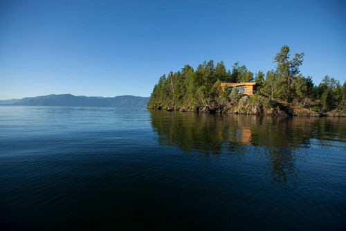
But while they reside in a home that's a 20-minute walk from the lake, they wanted something closer to the water too. So they bought a piece of land on Picard Point, smack dab in the middle of the lake, and built a 700-square-foot cabin where they could have "an afternoon cocktail and marvel at the beauty of the lake and its surroundings," Chuck says. After the sun goes down, they can walk the mile back to their home, take a five-minute ATV ride or just build a fire and crawl into bed at the cabin.

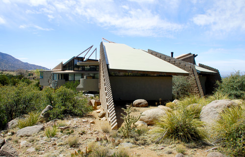
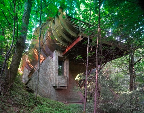
The Hulberts worked with architect Jon Sayler to design the cabin. Because many local residents, including Sayler, had grown up passing Picard Point on the lake and felt very protective of it, the Hulberts wanted to design something that blended into the landscape. "It is a well known part of the local landscape and a beautiful one as well," says Chuck. "So it is not surprising that people might prefer that the site be undeveloped. We did factor this into our thinking, and we instructed Sayler to do all he could to keep the profile low."

They settled on a slightly sloping green roof covered in four varieties of sedum and grasses. "That was part of the solution and quite expensive," Chuck says.

See more on green roofs


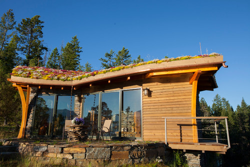
Sayler hired a surveyor to figure out where they could build on the point, and after the surveyor had staked out the setbacks, they were left with a 10-sided shape. Sayler thought it would make for a perfect layout. "I said to Chuck and Pam, 'You see these stakes? That's your floor plan,'" he says. "I wanted to make it not be recognizable as a house, something that didn't have any clues, where people would see it and say, 'What is that? Is it a roof?'"

Sayler wanted to keep the cabin's location as secluded as possible, so he made the only parking area 200 feet away from the home so that visitors would have to take a stroll through the woods along a pebble pathway.

You arrive at this stone and moss patio, where a tabletop can be lifted off to reveal a fire pit. The front door is seen here on the left in the shade of the roof eave.

The front door was made by local artist Myles Hougen from various woods found on the property, including birch, cedar, alder and fir. The design depicts an osprey.

The left closet is for coats and the right one holds pantry items.

The entry leads to the kitchen, which has a full-size refrigerator, range and microwave but doesn't include a dishwasher. All the cabinets are vertical-grain fir.

Local craftspeople made the table; the chairs are Danish.


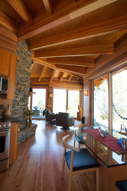
The glulam fir rafters are laid out like veins of a maple leaf, Sayler says. The floor is knotty fir; the ceiling is knotty cedar.

See more on the use of knotty wood


There are technically only two rooms inside the cabin -- a bathroom, located on the other side of this fireplace, and the combined dining, kitchen, living and bedroom spaces.

Clothes hang in built-in cabinets on either side of the bed. The cabinet at the foot of the bed conceals a flat-screen TV.

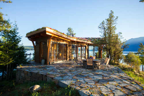
A sitting area takes up the tip of the triangular layout, offering views up and down the lake."You can see 20 miles up the lake each way," says Sayler. Most of the stone, known as Cabinet Mountain rock, was quarried on the site while the parking area was being created.

A walkway wraps around the house, mainly so that the homeowners can clean the large sliding glass doors.

See more cabins, from modern to traditional

General contractor: Jesse Watson, Golden Rule Construction
Landscaping (roof, walkway, lighting): Travis Liermann, Outdoors by Design
Custom cabinets and furniture: Dave Collins, Whistling Elk Woodworks


Permalink | Email this | Comments


Sold: Star Designer's Opulent, Historic Hollywood House

$
0
0

Filed under: , ,

LM Pagano's hollywood house
ZillowLM Pagano's just-sold 1930 mansion was once home to musical star Deanna Durbin and later Lynda Carter of "Wonder Woman" fame.
2013 Golden Heart Awards Gala
APLynda Carter
By Emily Heffter

Decorator-to-the-stars LM Pagano has sold her historic Colonial Greek Revival mansion for the $3.1 million asking price. The home, at 7922 Hollywood Blvd. in Los Angeles, sold Sept. 5 after about six months on the market. The 1930 mansion was once home to musical film actress Deanna Durbin. Later, Lynda Carter lived there after her acting career took off with her portrayal of Wonder Woman in the 1970s.

Eventually, the home became a hippie art colony and had been converted to a triplex when Pagano and her husband bought it for just $475,000 in 1994, according to the L.A. Times. The home sits on a large lot that could be developed into more units in the now-trendy neighborhood.

Over the past two decades, Pagano, who has done work for Johnny Depp and Nicolas Cage, redecorated the home into an opulent five-bedroom work of art. The home's stately proportions and historic elements, such as original molding and marble fireplaces, anchor designer details spun off Pagano's treasures. More than two dozen Chinese lanterns flicker above a covered patio overlooking the back garden. Persimmon paint brightens the heavy furniture in the formal dining room.


Ian Brooks and George Salazar of Berkshire Hathaway Home Services acted as both the buyers' and sellers' agents.


Read | Permalink | Email this | Comments

For an Energy Efficient Remodel, Start With a Dream Team

$
0
0

Filed under: , ,

  1. unfinished building interior ...
ShutterstockThinking about what goes in the walls can take far more planning than deciding what goes on the walls.

In April we moved our family of four plus dogs into our 1,950 square foot fixer-upper. We started our remodel planning immediately, with the goal of beginning construction in July. We are targeting net-zero energy, a definite stretch goal for a residential remodel on a budget.

We quickly realized that this is a complex process, with numerous variables to consider (like crawlspaces, insulation and sun angles -- oh my). And there isn't a clear roadmap to follow, since remodels must deal with their unique existing constraints. That's why assembling a dream team of support professionals is the single most important decision you will make. Even a modest remodel project benefits from different viewpoints, so don't be afraid to call in expert help.

It's important to find:
1. an architect who understands your goals.
2. a contractor with knowledge of green building technologies.
3. a lender who can explain your financing options and help you determine your budget.
4. an energy consultant or other professional who can model your home and conduct a cost-benefit analysis of various technology options.

As much as I wanted to start with a Houzz page of cute kitchens, Nick was the voice of reason in this case. He pushed us to consider the whole house, and map out an approach where form truly follows function -- that thinking about what goes in the walls takes far more planning than deciding what goes on the walls. Without tackling both, you might be putting lipstick on a pig.

This is where the dream team comes in. Together we leveraged work relationships; conducted internet research; talked to our utility company; met with our city's sustainability office; asked friends for referrals; and ultimately identified professionals to help us solve our central questions:

o. Can we affordably retrofit our house to produce as much energy as we consume?
o. Can we use the minimum amount of water responsibly, lower our overall electricity needs, and still be comfortable?

Once we had our team, we got everyone together early to discuss goals, budget and our ambitious wish list. At our meeting, the contractor raised concerns about unvented attics and crawlspaces. The energy consultant encouraged us to consider several different heating and cooling options for our climate zone. We also discovered some of the financial incentives available for projects like ours.

We spent a little money getting all of these professionals in one room, but it was definitely worthwhile.

As we continue to map out our remodel, things are a little rocky at times. Let's be honest, remodeling isn't for the squeamish. It requires a certain tenacity, flexibility, and optimism -- especially when you have limited time and money.

With each roadblock there have been moments of soul searching: Do we really want to do this now? Can we afford it? Will our kids disown us? Will our house deliver the comfort and energy savings we want? Will the process be repeatable for others?

Our dream team has helped us stay focused, suggesting materials we weren't aware of, reminding us of our budget, and helping us avoid mistakes. As for starting construction in July ... well, let's just say it is September now and we are still living in the "before."

Nick and Holland Brown with members of their dream team
Nick and Holland BrownNick Brown (at far right) meets with members of his remodeling "dream team."


Permalink | Email this | Comments

Sophisticated Painting: How to Brush on a Little Structure

$
0
0

Filed under: ,

Orlando's finished bedroom
Sean Gin/Homepolish

By Orlando Soria

I recently decided it was time for a bedroom update. The paint had seen better days and I just wanted a refresh, but I loved the color of my bedroom too much to change it dramatically. I've always preferred to add color with art and objects rather than relying on a crazy wall paint (though I do love a dramatic color from time to time, don't get me wrong). I live in a bright, happy apartment nestled against the Hollywood Hills and my favorite thing about it is the sunlight that streams through the windows all day.

This room makeover takes a full day or two because you need to wait for the paint to dry but it's definitely worth the time. Click through the images for my step-by-step instructions!


P.S. You can see more of Orlando Soria's bedroom makeover on Style By Emily Henderson.

Whether it's a total renovation or finding the perfect finishing touches, Homepolish designers work by the hour to create balanced spaces that just work. For more design inspiration, follow @Homepolish.


Permalink | Email this | Comments

A Dozen Ways to Give Your Home a Crisp New Look for Fall

$
0
0

Filed under: ,

By Laura Gaskill

With the crisp fall air comes a natural desire to cozy up at home with warm drinks, fluffy throws and the glow of candlelight. It's also a time of year when you might want to entertain more. By making a few smart purchases and, if you're feeling crafty, doing a project or two, you can perk up your home and stay within your budget. From elegant art walls to creative ways with paint, here are a dozen ways to spruce up your nest this fall.


Permalink | Email this | Comments

Room of the Day: Living Space Balances Comfort and Elegance

$
0
0

Filed under: ,

By Becky Harris

This Philadelphia family room needed to stand up to two adults, four children and a dog tramping through it on their way to the backyard and back staircase. One of the homeowners also wanted it to evoke the serene feeling of her family's favorite vacation spot, Cape Cod. "She's a traditionalist but was completely open to patterns, a wide mix of textiles and funky surprise elements," says interior designer Naomi Stein. The result is a mix of sophistication and resilience.


Traditional Family Room by Bala Cynwyd Design-Build Firms Design Manifest

The family wanted a TV in here but didn't want it to dominate the space over the fireplace. "My client really loved the conversational aspect of two sofas facing each other," says Stein, of Design Manifest. "This room did not need to be all about the TV, and this arrangement works for them."

The oatmeal-colored linen sofas and ottoman have been treated with an ecofriendly stain resister. While the ottoman and sofas are the same fabric, Stein picked a tufted ottoman to make it stand out. The room is balanced, but she threw off the symmetry with a variety of throw pillows in suzani, Greek-key, zebra and chinoiserie patterns. "My client didn't want to 'Noah's ark' the room -- that is to say, matched pairs of everything," she says, "which keeps things more interesting." This rings true down to the smallest details. For example, the ottoman has a neat line of elegant, shiny nailheads, while those on the sofas are more spaced out and rustic.

Sofas: Lee Industries


"This was a big, empty, awkward wall before," Stein says of the new wall of built-ins. She designed them to incorporate storage below and display overhead. "There are six of them living here, and they need a lot of places to hide things," she says.

The ways the shelves are styled is a great example of the collaboration between client and designer. Stein incorporated her client's favorite things, including family photos and the birdhouse, made by one of the children. Next she culled through piles of their favorite books and arranged them in a stylish way. Finally, she picked up a few fill-in objects she knew her client would like, such as the marine float (from a movie-set sale) and the vintage pineapple bookends (from Etsy). The soft blue background on the shelves adds a subtle nod to Cape Cod coastal style. "We wanted it to be just a little bit beachy without getting kitschy," she says.


Stein mixed natural fibers and wood with the luster of metallics, such as in the raised-velvet croc textile she used on the throw pillows and on the benches next to the fireplace. She peppered in luxe finishes like this throughout the room, creating a pleasing tension between glamorous and rustic.

She also balanced saves and splurges, like giving the affordable bergère chairs from Ballard Designs an upgrade with custom upholstery and the velvet croc pillows.


More of the luxe-distressed balance turns up all over the room. The benches and side tables have dark iron bases. The table tops' distressed wood can take on a few more dings. Stein also replaced the existing brick fireplace surround with local Pennsylvania bluestone. Meanwhile, mercury glass lamps and antiqued mirror inlays add dashes of glint.

The owners already had the nautical painting over the mantel and the seascape over the dresser. The little blue lamp on the dresser was the client's grandmother's; this favorite object adds a punch of color to the neutral palette. The family stashes cozy throw blankets in a basket to the right of the dresser, and family photos are dotted throughout the room.

The French doors lead to the backyard, so the room is a high-traffic area. Stein opted not to add window treatments, as the backyard is private and the family goes in and out so much. The jute rug offers durability, and Stein layered in a cowhide near the sofa for softness under bare feet.

The dresser is another mix of posh and primitive, with antiqued mirror details including hexagonal inlays.

"I'm over here all the time for other projects, and every single time, it looks exactly like it does in these photos," Stein says. It's probably the best way for a designer to see that her work was truly a success.

Browse more Rooms of the Day


Permalink | Email this | Comments

New Apps Are Designed to Simplify Home Renovation

$
0
0

Filed under: , ,

Sweeten.com homepage
Sweeten.comA free web app called Sweeten links homeowners to contractors, interior designers and architects to help create their dream house or apartment.

By Natasha Baker

Homeowners and renters looking to redesign or renovate can turn to new apps to help simplify the process and get the job done sooner and more efficiently. Last year Americans spent approximately $130 billion on home remodeling projects, the highest amount since 2007, according the U.S. Census Bureau. As home spending ramps up, apps aim to ease some of the pain and expense.

A free web app called Sweeten links homeowners to contractors, interior designers and architects to help create their dream house or apartment. "Home renovation is a big ticket item that can almost be the same price as purchasing a home. It's intimidating to a lot of people," said Jean Brownhill Lauer, founder of New York-based Sweeten.

After a user posts the project through the app, Sweeten finds experts for projects that can range from simple bathrooms to housing developments.

"There are just so many options when it comes to contractors. You might get recommendations from friends, other people in your building, or search online," Lauer said. "But it's challenging to understand which ones are better suited to your projects."

The company monitors the projects and contractors and gets feedback from the home owners to ensure quality. Sweeten is available in New York City and is expanding throughout the United States.

LikeThat Décor homepage
LikeThat DécorLikeThat Décor uses recognition technology to match items.
Another app, LikeThat Décor, takes the guess work out of finding the right type of furniture and decorations. Users point their smartphones at a piece of furniture, or a particular pattern they like, to find complementary items that might match in the home.

"When you're searching for a piece of furniture like a sofa, you'll usually start by taking a look at what's available in the market. Maybe you'll go to different stores to see what's new and trendy, or try out a site like Pinterest," said Adi Pinhas, founder of the California-based company Superfish, which created the app.

"But at the moment when you're trying to find something similar, or trying to source where to buy an item you saw ... it gets challenging," he added.

The free app for iPhone, iPad and the web, which is available in the United States, uses image recognition technology to search millions of products from more than 4,000 stores, including Zara Home, Gilt and Ikea. It also provides a link for users to purchase the items.

Home decoration app Houzz, free on iOS, Android and the web, lets people search for design ideas using search terms to describe the item and see how people have styled similar pieces. More than 2,000,000 design photos are available within the app.

Houzz (an AOL Real Estate partner) also connects users to a community of local designers, architects and contractors, who are reviewed on the platform.


Permalink | Email this | Comments

How to Prioritize Home Projects

$
0
0

Filed under: , ,

By Alison Hodgson

I recently received a desperate email from a friend. For a variety of reasons, school and work related, she and her husband and two little boys had been bumping around the globe for years. They had just moved back to the States and bought their first home. As excited as she was to be close to family and settled down, she was also exhausted from the move. In her email she wrote, "I am feeling crazy because I need to furnish a house and pick paints and it is all so overwhelming for me. I've been a nomad my entire adult life. Do you have advice?"

Most of us don't know what it's like to change continents with a family. But a big home project can feel like too much for anyone starting out or going through a big life change. Adding to the pressure, in this age of instant everything, it's easy to think that you ought to have a perfectly appointed home within seconds of moving in. I think we've all seen the before-and-after articles in which a designer gives a house a makeover in less time than it takes most of us to buy a can of paint. If you are in my friend's shoes, looking around your place worrying and wondering, this is what I recommend.


Eclectic Kitchen by Wichita Media & Bloggers Keep Smiling Home

Assess conditions. Before you try to do a thing, take a deep breath, look around and then decide what needs to be done. "Everything!" may be the immediate answer, but really think about it. Are there any repairs that need to be made? Is it "just" cosmetics, such as new paint? Whatever it is, can you do the work yourself or do you need to hire it out? What are your skills? (It's OK if you don't seem to have any.)


Permalink | Email this | Comments


Architects' Clever Cat-Shelter Solutions

$
0
0

Filed under: ,

NAC Architecture's Rubber Fishy structure
Grey Crawford/Architectural DigestNAC Architecture's colorful outdoor shelter for cats includes a "green" design feature.
By Rebecca Bates

In Truman Capote's Breakfast at Tiffany's, the enigmatic Holly Golightly says of her beloved nameless cat, "We just sort of took up by the river one day, we don't belong to each other: He's an independent, and so am I." In the novella, Golightly disappears, and the cat is spotted months later, resettled and peering contentedly out of an apartment window.

But not every feline has such luck, and most strays simply wander, more alone than "independent." Knowing this, FixNation, a Los Angeles-based nonprofit that helps reduce the stray-cat population through a safe Trap-Neuter-Return practice, called on Architects for Animals to commission notable L.A. firms to create artful outdoor cat shelters. Displayed during "Giving Shelter," an event hosted earlier this month by Architects for Animals to benefit FixNation, the structures range from adaptable, Brutalist-style hideaways to avant-garde benches with space for humans and cats alike.


See more cat shelters at ArchDigest.com.


Permalink | Email this | Comments

Room of the Day: A Lively Living Space in a Former Church

$
0
0

Filed under: , ,


By Mitchell Parker

In the early 1930s, the story goes, residents of Tamalpais Valley, in the city of Mill Valley, California, got together to hand-build a new one-room nondenominational church. The Methodist Church bought the building and expanded it to include a meeting hall and Sunday-school classrooms in the 1970s. It was converted to a private residence in 2000 and purchased by Jodi Riviera.

In 2013, Riviera, husband Brian Buchanan and their four kids updated the space to reflect some of its original, hand-built charm -- but also give it a more modern feel. Just like with the original church, the awe-inspiring moments happen in the main chambers, where a newly remodeled kitchen and exposed scissor-truss ceiling would make anyone giddy enough to pull on the rope that rings the steeple bell.


This photo, shot in 1939, shows the original church building surrounded by not much else.


AFTER: Today the main chamber remains -- now part of a busy San Francisco Bay Area neighborhood -- and is a combined living, dining and kitchen space. The additions became the bedrooms and bathrooms.


BEFORE: Previous owners had remodeled the interior, adding travertine floors and a dropped ceiling over the kitchen.

AFTER: Riviera, a design executive at a home furnishings company, and Buchanan, a consultant specializing in the health care industry, worked with architect Daniel Castor, interior designer Holly Hollenbeck and Caletti Jungsten Construction for the remodel. The team removed the dropped ceiling to expose gorgeous 2-by-4 scissor trusses. "It made an enormous difference and created one large, unified room," Hollenbeck says.


They then pushed the kitchen back a few feet and removed a wall that separated the kitchen from the entryway.

A back wall hides the kitchen pantry, refrigerator and storage from the main chambers. "Because that's the main living space, there's no separate formal living room. They're looking at the kitchen all the time every day, so we put the range forward as a showpiece and the fridge and food and not-so-attractive stuff behind it," Hollenbeck says. "Luckily, the space was large enough to do that."

[Learn more about different types of trusses]

Hollenbeck had the island built by hand and topped with a hand-hammered pewter counter and an integral sink. The backsplash is made of handmade gray AnnSacks tiles. "We wanted to return the home to something that really felt like it could have been original to the house, but with a modern industrial spin," she says.

(Countertop: pewter, Francois & Co; faucets: R.W. Atlas collection, Waterworks; floors:wood, Francois & Co; stools: Gar Products)


Buchanan is an avid cook and wanted a high-powered range and appliances. He picked a Blustar range and agreed with Hollenbeck's suggestion that it be black.

The small Hick pendants over the island came individually hung, so Hollenbeck created a custom T-bar to hang all three from.

(Pendants: Circa Lighting; T-bar:custom, Omega Lighting Design; crown molding: SF Victoriana; cabinet glass: Paige Glass Company; cabinetry hardware: Folger & Burt; LED lights: Aion; track and track heads: Hampton Bay)

Hollenbeck chose brass fixtures and cabinet hardware to warm up the gray palette.

(Cabinet paint: 490p, satin finish, C2 Paint; wall paint:Cloud White, flat finish, Benjamin Moore; marble range countertops, backsplash and shelves: Integrated Resource Group; countertop fabrication:Fox Marble & Granite; shelf brackets: House of Antique Hardware)


The back side of the range wall is fairly shallow, about 12 inches, but is perfect for a tall pantry for canned goods, cereal and juice. A bar niche has roll-out shelving for bottles.


(Refrigerator, steam oven, wine fridge: Miele)


Italian folding campaign chairs from the 1940s surround an antique wood-topped dining table that rests on a new fabricated steel base.


(Wall paint: Cloud White, flat finish; trim paint: Cloud White, satin finish, both by Benjamin Moore; tabletop, base: Big Daddy Antiques)


The window with the blue cross is original to the building. The rope that hangs near it is used to pull the steeple bell. Though the bell works, it's not original to the church. The couple bought it together on a trip to Italy and had it fitted into the bell tower. The kids and their friends love to ring the bell.

Hollenbeck covered the homeowners' existing sofas in removable, washable fabric slipcovers. "With small, active children, we didn't want to make anything too precious," she says.

That idea is perfectly exemplified by the coffee table, which is a vintage Eastern European gym mat from the 1940s on a steel base. "The kids can jump back and forth from the sofas onto it without damaging it," Hollenbeck says. "It's literally a gym mat, so you can't do to it anything that hasn't been done already."

(Rug: West Elm; slipcover fabric: Romo; slipcover fabricator: Belmar Fine Custom Upholstery; pillows and drapes: custom, Andrea Santana; side tables: Big Daddy Antiques; floor lamp: Restoration Hardware; papier-mâché bulldog: SummerHouse)


The cabinets were there before but the team retrofitted them to conceal a large plasma-screen TV. The team went under the house and dug out a hole to allow the TV to be lowered into a sunken box. "It was really a fabulous solution for having a large-screen TV without looking at it all the time," Hollenbeck says.
A tacked-on shelter over the entryway had blown down during a storm, leaving packages to get soaked on the doorstep when it rained. Castor added a small portico area and established a better front entry. "It was confusing where the front door was," says Hollenbeck. "French doors off to the side attracted the eye more and created confusion as guests walked up from the street."


The team reoriented the access to the front door by removing a tree and adding a garden gate that made the pedestrian entrance more obvious. A few years ago, the exterior had been painted yellow; Hollenbeck strongly recommended they go back to white.

(Exterior paint: Cloud White, Benjamin Moore)


Previously, the awkward entryway had several landings."There were stairs everywhere and no storage," Hollenbeck says. An armoire had been backed up against a wall that divided the entry from the kitchen, but it wasn't enough for all the shoes, backpacks and bags belonging to the couple and their kids.

Again, Castor changed the entrance sequence. Shaker-style cabinets keep with the simple country-church feel, while mesh adds a little industrial edge.


Permalink | Email this | Comments

How to Design a Music Studio in Your Own Home

$
0
0

Filed under: , ,

By Eric Reinholdt

Most musicians will admit to sharing a single core skill necessary for mastering their instrument: control. When it comes to designing spaces for practicing, performing, recording or just jamming, control is equally important to acousticians and architects. We aim to control the sound entering and exiting the studio, the heat and humidity inside and, of course, the acoustics.


While a home music room may not have the demands of a professional recording studio, many spaces can benefit from the sound isolation and acoustic treatment applied to rooms designed for playing music. I've designed spaces for music at all scales, from auditorium halls to private listening rooms, and have learned a few basic sound concepts that can dramatically improve the aural environment of any space.


Planning

Understanding the use of the space is the first priority. A practice space for your garage band and a space used for vocal recording or listening to chamber music will have some obvious differences.

The location of the studio space will greatly affect the degree to which you'll need to isolate it from the rest of your home. Imagine how the sound isolation requirements for a practice room located next to the nursery versus one in the garage might differ. No amount of acoustical caulk is going to make the former practical. Sensibly locating the music room is step one.

See more of this music barn


Spaces

Isolating listening and recording spaces from outside noises -- coming from the street, your neighbors and even mechanical equipment -- is a high priority. So is the actual size of the recording equipment. So interior, lower-level, windowless locations are good starting points, but true recording studios are so nuanced that an experienced professional should be involved from the outset to be sure your goals are being met.

More informal performance and practice spaces are usually more concerned with containing the sound transmitted from them to adjacent spaces, as well as with sound fidelity and instrument housing - and some instruments can be quite large. For these spaces, isolation construction strategies and controlling how the sound behaves in the space are more important.


Room Shape

The next part of planning is defining the actual proportions of the space. There's much debate in the acoustical design community regarding the ideal proportions, and the math gets complicated quickly.

For the casual audiophile, it's generally accepted that the Greek golden mean proportions of 1:1.6:2.6 (height by width by length) will yield an acoustically pleasant room. As an example, if we begin with a typical 8-foot ceiling height as a starting point, we should aim for a room that's roughly 13 feet by 21 feet.

The space shown here makes use of a clever device that can alter the shape of the room and its acoustics. The pivoting panels seen at the rear wall of the stage area can be used to fine-tune the geometry and control the way sound is reflected around the room.


A few other guidelines:
  • Larger volumes are always better than smaller ones.
  • Avoid completely regularized forms. Perfect cubes and long, narrow spaces with parallel walls are poor acoustical performers.
  • Irregular shapes and surfaces (walls, floors, ceilings, bookcases) as well as convex forms allow sound to be diffused in a space, which is desirable.
  • Avoid concave surfaces, which tend to focus sound.
  • Avoid room dimensions that are direct multiples of one another (1:2:3) - for example, a 16-foot by 24-foot room with 8-foot ceilings - because they will amplify resonating frequencies, making for an acoustically muddy and noisy space.
  • Avoid parallel walls and flat ceilings. These are generally considered a bad thing in acoustical design because parallel walls turn a space into a tennis match of sorts, bouncing sound waves back and forth between the wall surfaces and causing echo and flutter. This is one reason performance halls are shaped the way they are with splayed walls, floors and ceilings.If you're repurposing an existing space with less-than-ideal room proportions, don't worry, absorption strategies can help to overcome this shortcoming (more on this later).


Sound Check

When sound waves strike a surface, three things happen:

1. Some of the sound is reflected back into the room.
2. Some of it is absorbed by the material.
3. Some of it is transmitted through the material. These are the three main things we control when designing a space for music.


Reflection

Hard surfaces reflect and disperse the sound energy in a space; soft surfaces absorb it. Much of contemporary architecture is defined by hard lines and surfaces, like concrete, hardwood and drywall.

These are all highly reflective surfaces. The bouncing of sound is known as reverberation. For a live recording environment, a certain amount of it can be desirable. But reflection generally needs to be controlled. This is especially true for smaller music rooms so it doesn't render the sonic nuances of the music unperceivable.
We control reflection primarily in two ways: through diffusion and absorption. Ideally, a music room has surfaces that diffuse or break up the sound waves and scatter them about. Rough surfaces (like the exposed framing seen here), brickwork, rough stone, wood slats and fixed or pivoting panels all aid diffusion. But too much reflection will make music sound muddy in a room. To counteract this most rooms need some means of absorbing or deadening sound waves.


Absorption

To reduce the sound energy in a space, we use absorption. Rugs, drapery, couches and wall hangings all help to absorb sound, especially at higher frequencies, which are usually perceived as unpleasant.

Absorption in a room controls reverberation and reduces ambient noise. In spaces without a lot of furniture or drapes and many hard surfaces, special acoustic absorbers (foam, acoustical plaster) can be used to deaden a room.
You've probably seen egg-crate acoustic foam absorbers. Obviously, absorbers can look strange in the home environment. But there are creative ways to cover them, as with this colored fabric applied to a special acoustically absorptive surface. There are also acoustically porous plaster finishes available, which look no different than standard drywall but absorb rather than reflect sound energy.

Absorption shouldn't be confused with our next control point: isolation. Adding absorbers in your garage won't keep the sound from being transmitted to your neighbors; it will only improve the way the space inside sounds.


Transmission and isolation

To keep the peace with your neighbors, you'll need to focus on isolation. Because sound is transmitted by vibration, it makes sense that to minimize sound transfer between spaces, we should minimize their points of contact. In standard wall construction, walls that separate spaces typically share framing members -- the studs. To truly isolate a space acoustically, you want to keep the perimeter framing of each space independent from the adjacent spaces as well as from the surrounding structure. This includes the floor and ceiling.

Many acoustical designers refer to sound isolation in construction as decoupling. The goal of it is to keep the sound waves from touching the structure of a home and allowing it to vibrate.
There are various means of decoupling:
  • Use floating walls that are framed independently and isolated from the surrounding structure with special padded isolation clips and hangers
  • Isolate the mounting of materials using resilient channels and wall clips to hang drywall
  • Isolate the vibrations induced by building systems like plumbing pipes, electrical appliances and mechanical equipment
  • Add an air space between walls to create a sound-isolating medium
  • Seal all the joints, including electrical outlets, studs, drywall doors, windows and trim
  • Use specialty acoustical products like membranes, mass-loaded vinyl, underlayments and acoustical insulation
  • Use special insulated duct treatments and grilles to minimize air noise

Think of your room as being like a fish tank: Any openings, even small ones, that aren't sealed will leak. It's these leaks that can undermine all of your hard (and expensive) soundproofing efforts.

This means larger openings, like doors and windows, need special care. For the best sound isolation, an airlock consisting of two back-to-back doors is ideal. The door bottoms should have self-actuating bottom gaskets that seal when closed. For windows, you'll want insulated units with at least one of the panes made of laminated glass.


Resonance in Construction

Most residential walls are constructed using 2-by-4 studs with ½-inch drywall as a finished surface. Think of a wall as a giant speaker. It will have a frequency at which it resonates - acousticians call this the room mode. For a recording environment, resonating walls can muddy the sound of the room. This is especially true of small rooms, because there's less room for the sound to dissipate.

By simply varying the thickness of standard materials on the walls, we can decrease the chance that resonating materials will be a problem. For example, alternating ½-inchdrywall on one side and ⅝-inch on the other will ensure that the resonant frequencies aren't the same.


Retrofitting

So, now you know a lot about how sound moves and how you can control and contain it, which is great information if you're designing from the ground up, but many of us don't have that luxury.

Converting an existing space can essentially be done in two ways. The first is by adding acoustical treatments to an existing room. You can modify the absorption and diffusion fairly easily in this way; even altering the room shape is possible with freestanding panels or objects. This option is most appropriate for renters, because it's less permanent. However, it's also less successful, because acoustically isolating a space is a difficult and more intrusive process.

See how to cut noise pollution at home


The second way is by designing your studio to be a room within a room. If you have the room and a plan to stay put long-term, this is the better solution. The more you're able to isolate your studio from the surrounding structure, the better. If you're able to construct floating walls, use a gasketed door, double the layers of Sheetrock and add some absorptive materials, you're well on your way to creating a dramaticallyimproved acoustical environment.
For a garage space, consider adjustable features, like large swinging or sliding doors, which can help to both contain transmitted sound and act as diffusers. Add coverings or drapes to any existing windows to help minimize unwanted reflections and increase absorption.

Open framing in a garage is actually acoustically quite nice, but an uninsulated garage can make for some tense neighborly relations. By adopting the room-within-a-room approach, you'll greatly reduce the amount of sound transmitted to the outdoors in a garage space. This interior room lining can be constructed using relatively inexpensive off-the-shelf materials if the concepts discussed are followed. Isolate first, then balance absorption and reflection.


Permalink | Email this | Comments

The 'Passive House' Path to Extreme Energy Efficiency

$
0
0

Filed under: , ,

G O Logic House in Maine exterior
Trent BellThe Go.O Logic Home was the first Passive House to be built in Maine and was among the first constructed in the United States.
With the growing cost of fuel, increasingly stringent home construction codes, and scientific evidence that we must reduce CO2 emissions, many architects, builders and homeowners are turning to "Passive House" or "Passivhaus" specifications to design and build their new homes. Buildings consume approximately 48 percent of the energy used in this country. Passive Houses use 80 to 90 percent less energy to heat and cool.

Demand has increased, in the United States and various countries around the world, to build not only new homes using these Passive House, or PH, specifications but also for commercial structures, schools and for remodeled homes. The Passivhaus standard was developed in Germany in the early

PH energy codes are challenging to achieve, but the rewards go beyond saving money on energy.

1990s by Professors Bo Adamson of Sweden and Wolfgang Feist of Germany, and the first dwellings to be completed to the Passivhaus Standard were constructed in Darmstadt in 1991.

There are currently 30,000 Passive House structures built around the world, including in the United States. The first PH in the U.S. was built in Urbana, Illinois, in 2003 by Katrin Klingenberg, the founder of the PH Institute in the United States. According to the PH website, "The Passivhaus standards' strengths lie in the simplicity of its approach; build a house that has an excellent thermal performance, exceptional airtightness with mechanical ventilation!" (See examples in the slideshow below.)

Energy-efficient structures are achieved meeting PH specs by creating a very efficient building envelope. PHs are so well insulated that they no longer need conventional heating and cooling systems such as forced air furnaces. They rely on keeping in the heat generated by the sun, people, computers and appliances in the winter. Vastly reducing the need for heating and cooling is achieved by substantially increasing the amount of insulation used in the ceiling, floor and walls of the house.

In most cases the walls are built much thicker than the standard house to accommodate the additional insulation. It is also necessary to seal up all of the openings, where wires, vents and pipes come into the house, to avoid air infiltration. One or more blower door tests are performed to make sure that all the openings are sealed.

High performance windows and doors are used to keep the "envelope" of the house tightly insulated. Typically, triple-pane windows are used filled with argon or kyrpton gas to reduce thermal bridges, which allow air infiltration. In order to maintain a cool interior environment in the warmer months, south-facing windows are shaded or shuttered to eliminate solar gain; natural cross ventilation is used for cooling, along with some other creative strategies.

Most PHs need a small backup heating or air conditioning system such as a mini split heat pump for extremes in hot and cold weather. PHs require that buildings use no more than 15 kilowatt hours per square meter of living space per year for heating and cooling. (Fifteen kilowatts is similar to the amount of energy used by a hairdryer or small space heater.) This energy efficiency is achieved by using energy modeling software. The Passive House Planning Package, or PHPP, an Excel-based software, is used to size ventilation systems and determine the energy effects of substituting any product or design change.

PHs focus on saving energy rather than creating energy with fossil fuel. However, in order for homeowners to achieve "0" energy homes they can include photovoltaic panels and/or hot water panels to make the home potentially independent of the grid or able to give energy back to the grid.

PH energy codes are challenging to achieve, but the rewards go beyond saving money on energy. PHs are very comfortable and healthy to live in. Because they are so tightly insulated, ventilation is required to keep the air fresh in the house. Energy or heat recovery systems continuously exchange the interior stale air in the PH with exterior fresh air, while also exchanging the heat and "cool" already created in the home.

Many additional strategies have been used to make PHs very comfortable and efficient, by the creative architects designing PHs. Stone floors are often used as thermal mass, which absorbs heat during the day and releases it in the evening when the sun is down. Interior and exterior blinds are commonly used and some retract into the structure so they are not seen when not in use. Many PHs have radiant heating with geothermal or solar panels.

One house in France uses cooling ponds to cool the air before if enters the house in the summer. All use energy-efficient appliances and low-energy bulbs to minimize energy loads.

When people decide to build a house, they need to consider the long-term cost of running their homes. Mortgages might be slightly higher on a PH home, but energy costs will be lower -- creating a "wash" in monthly expenses. However at the end of the mortgage, energy costs will continue to be low for the PH.

Dr. Wolfgang Feist, founder of the Passivhaus institute in Germany, says of Passive Homes, "It's a development of a kind of liberation, because now you can build your energy future; you do not depend on the oil, you do not depend on the nuclear energy, you just depend on your own knowledge and your work. We have seen that it is possible."

All of the following Passive Houses are in one of the two books published by Abrams, Prefabulous World : Energy-Efficient and Sustainable Homes Around the World (2014) and Prefabulous + Almost Off the Grid: Your Pathto Building an Energy-Independent Home (2012).


Permalink | Email this | Comments

Reese Witherspoon's Home Becomes a Design Inspiration

$
0
0

Filed under: , , ,

By Erika Riggs

Where do you find ideas for your home? For one couple, inspiration came from A-lister Reese Witherspoon's living room in her former home in Ojai, California.

Celeb interior designer Kathryn Ireland decorated the actress' ranch, which was featured in magazine spreads in "House Beautiful" and "Elle Decor." Orlando Soria, an interior designer and West Coast creative director for Homepolish, wanted to give the clients the same feeling of Witherspoon's Spanish Revival-style home, but in a way that would work for their two small children.

"I wanted the space to feel sophisticated and grand while being approachable and cozy," Soria explained.


Read | Permalink | Email this | Comments

Organic Architecture Thrives (Might Make You Healthier Too)

$
0
0

Filed under: , ,


We know that our environments affect our moods, and that buildings play a major role in that, but how can we change the way we build our homes to help improve our sense of well-being? There is growing evidence that suggests being cooped up in buildings is bad for our health and that having connections to the exterior environment has positive health outcomes. Studies have found that views of nature from the home provide a significant improvement in general well-being.

Improving the connection between the interior and the exterior of a building is the driving force behind the organic architecture movement started by Frank Lloyd Wright in the early 1900s. And that connection is integral to designs by contemporary organic architects. Take a closer look at how this style of architecture might work for you.


It's all in the geometry. Organic architecture is almost always governed by a strict set of geometric patterns consistent in every scale of the building, from the overall plan down to the cabinetry and door handles.

Patterns help us understand the world. They allow us to predict the weather, anticipate a valley over a mountain and know when the next train is to arrive. People understand their environment when it is governed by patterns. A home built on patterns will be comprehensible and comfortable.

Below, Bart Prince's Scherger/Kolberg residence in Albuquerque, New Mexico, is arranged around a radial floor plan. Walls and roof framing members extend to a central point, helping to create a comprehensible pattern.


Materials from nature. To blend an interior space with the external environment, organic architecture utilizes local natural materials to finish the home. Organic homes usually incorporate local stone and timber. Where large, artificially smooth surfaces are used, they are usually broken up with patterns to introduce textures that give the building a natural feel.

Above, Bruce Goff's Ford residence in Aurora, Illinois, uses local materials, including coal, which was quarried nearby. Coal stones in the interior and exterior connect the house to the area's geology.


Harmonizing the masses. Organic architecture usually incorporates a combination of heavy, massive objects and more ephemeral, lightweight structures.The mass objects are used to tie a building to its site like a trunk does for a tree, while a lightweight canopy often provides shelter that does not feel constrained by massive walls and is free and open.

Robert Oshatz's Chenequa residence, above, consists of separate roof forms that pinwheel around a central stone-clad elevator core. The core anchors the roof to the ground, while the roof appears to float in the air. The roof also extends into the glass, helping to bring the outside in.

See the rest of this house


Using glass for flow. Glass is a critical medium for organic architecture. Carefully designed windows allow interior and external spaces to flow freely between one another, with the enclosure of the space being prominent. To achieve this, organic architects usually ensure that window frames are hidden and that materials run unhindered through the glass.

Discover ways to connect indoor and outdoor areas


Working within the site. Tying a building to its site is critical in ensuring that it belongs in its location. Frank Lloyd Wright said that a building should be "of the hill and not on the hill," and so organic architecture should appear to grow from its site. When the distinction between the site and the building is eliminated, the outdoor environment is invited into the home.

For example, Bruce Goff's Eugene Bavinger house (above) in Norman, Oklahoma, emerges from the earth as a stone wall that spirals inward and upward. As the house reaches toward the sky, the roof appears to lift off and begin to fly on its own. The stone wall, which was constructed from locally sourced stone, is built in a dry-stacked arrangement to ensure it appears as a natural element. This spiral wall moves in and out of glazing lines and runs through the interior.


Today architects such as Robert Oshatz and Bart Prince create buildings in the organic tradition that forge a harmony with their environments. Their work is idiosyncratic and highly individualized, but so too are their sites and their clients. By following the concepts developed by organic architects, contemporary designers are developing homes that allow their inhabitants to connect with the environment around them. In an increasingly urbanized world, and one with challenges to well-being and mental health, organic architecture provides a road map for healthier buildings.


Permalink | Email this | Comments

'Right-Sizing': Can We Really Live in a Smaller House?

$
0
0

Filed under: , ,

a row of white and green houses ...
Shutterstock"Right-sizing" is all about how you live in a house and maybe how much time you are willing to spend cleaning it.

Holland & Nick Brown are on a quest for a Net Zero Nest: remodeling a house (on a mainstream budget) into a home that is energy- and water-efficient.

Part of our Net Zero Nest journey is to figure out how much space our family really needs. Our new house is about 1,950 square feet -- 800 square feet smaller than our previous home and 450 square feet smaller than the average American single family home. With growing kids, this may seem a little counter-intuitive. Our kids take up more space these days, so why would we want to get by with less?

That's why we like the term "right-sizing." For us, it's all about how you live in a house and maybe how much time you are willing to spend cleaning it. In our previous home, we used the downstairs master as a guest suite, because it was really far from the kids' rooms. That meant that despite our square footage, we all basically shared one upstairs bathroom. And when we didn't have guests, that downstairs space was largely unused. We also had a large formal living room that we rarely spent time in. It was lovely, but a space our casual-leaning family can do without.

losing storage space like this
Holland & Nick BrownWe will definitely miss our storage.
Our new house has smarter space for us. In a smaller footprint, we can create a true master suite that offers privacy without feeling like an isolation chamber. We can also give both our kids an adjacent bath, a definite upgrade. And we can create an office with a separate entrance, something that will help us work in peace and allow our kids space to work on group projects with their friends.

Nick calls this room the "slash" room, as in office/homework/den/guest room. Through careful design, we hope to make it a true multipurpose space that is part of our daily lives. That way we maximize our use of space and our square-foot efficiency.

One exciting aspect of a smaller house is that it will be cheaper to operate and maintain over time. Even without our planned energy upgrades, a smaller house costs less to heat and cool, offers lower property taxes, and has lower maintenance costs.

And as our kids grow up and move out, it won't be too big for two people to enjoy. In fact, our architects are already planning for what our daughter's bedroom will be once she is gone (sorry, honey). While we always want her to have a space to come home to, we can use her room as a true guest room, a study, or even a man cave down the line.

Our new home is also one story, so we can hopefully age in place when the time comes. And we weren't kidding about the cleaning. We can clean our new home in half the time, which we thoroughly appreciate.

collage of chid's artwork
Abby BarnesTake pictures of your children's art (here turned into a collage) instead of keeping originals.
As for the biggest challenge? Storage! We will definitely miss our storage. While we have a bigger garage now, our open floorplan maximizes living space. In creating a great room, we are removing walls, which means less space for closets and displaying personal items.

We are having to purge and it isn't easy. We have already sold some furnishings, but now we are sorting through the little things like games, kids' art, stuffed animals, sports gear, books, souvenirs, and all the other things a family accumulates over time.

Figuring out what we really need and want to keep requires discipline and a lot of compromise. A favorite suggestion so far is from our friend Abby Barnes of Paper and Cake: Take pictures of your children's art instead of keeping the originals. She made us some photo collages that are definite keepsakes.


Permalink | Email this | Comments


Bavarian-Style Homes for Sale This Oktoberfest

$
0
0

Filed under: , ,

By Catherine Sherman

It's that time of year when lederhosen- and dirndl-wearing tourists head to Munich for the world's largest funfair: Oktoberfest. But you don't have to leave the U.S. to join in the festivities. From Frankenmuth, Michigan, to Leavenworth, Washington, towns across the country celebrate Bavarian culture, beer and architecture year-round. In celebration of all things Oktoberfest, here's a look at Bavarian-style homes for sale in America.


Read | Permalink | Email this | Comments

Ellen Pompeo's Anatomy of a Home Remodel

$
0
0

Filed under: , , ,

By Mayer Rus

Hanging in the living room of actress Ellen Pompeo's Los Angeles home is an arresting painting by Claire Fontaine: Printed on a cherry-red background is a snippet from remarks that fashion designer Marc Jacobs made about his 2007 collaboration with artist Richard Prince, in which the duo puckishly updated Louis Vuitton's venerable handbags. "When something is so respected, you can turn it into something else, so that you are looking at it anew," the piece reads. "Reinvention is invention."

"That says it all," Pompeo proclaims, standing in front of the painting. "Everything has been done before, so the question becomes, 'How do you take something classic and make it fresh for a new generation?' "

She's not talking about luxury handbags or even "Grey's Anatomy," her phenomenally successful television series, which recently began its 11th season of hospital drama and high jinks. Rather Pompeo

When Pompeo says, "I love a project," she means it.

is referring to the 1930 house she shares with her husband, music producer Chris Ivery, and their two daughters, five-year-old Stella Luna and baby Sienna May. Thanks to a recent top-to-bottom makeover, it's the very soul of reinvention.

Located in the Los Feliz neighborhood, the 16,000-square-foot Mediterranean-style villa was crafted by the architect Paul Revere Williams for Antonio Moreno, a silent-film matinee idol. Williams famously worked in a variety of elegant modes -- from Tudor to Colonial to streamlined modern -- catering to a clientele that also included Frank Sinatra, Tyrone Power, and Lucille Ball and Desi Arnaz.

By the time Pompeo and Ivery acquired the property in 2009, it had lost much of its original charm. Numerous renovations had erased period details, the structure was riddled with asbestos and lead pipes, and parts of the grounds were badly neglected. When Pompeo says, "I love a project," she means it.

To help with the task of "giving the house the attention it desperately needed," as Pompeo puts it, she enlisted L.A. decorator Martyn Lawrence Bullard, with whom she's designed two previous homes. Together they conceived a wholesale metamorphosis attuned not to some nostalgic, satin-draped notion of Hollywood glamour -- despite the dwelling's pedigree -- but to the vibrant spirit of a design-savvy actress at the top of the Tinseltown game today.

Having resolved to take the building down to its studs, Pompeo and Bullard seized the opportunity to rethink everything from room configurations and spatial flow to materials and finishes. Windows were enlarged to enhance light and capture sweeping vistas. Existing floors, mostly polished wood, were swapped out for vintage limestone pavers, reclaimed terra-cotta tiles, and planks of textured French oak. And antiqued moldings were added. "The house was scrubbed of patina over the years, so we went to great lengths to revive a sense of age and dignity," Bullard explains.


For the full story and more photos, subscribe now and get the digital edition immediately.

Tour Ellen Pompeo's Los Angeles family home.


Also see: Gorgeous Fireplaces of Celebs


Permalink | Email this | Comments

Barn Doors: Rustic-Modern Accents for the Home

$
0
0

Filed under: , ,

barn door; home design; kitchen; patio
Photo courtesy of Real Sliding HardwareBarn doors take up less room than many other types of doors since they are nearly flush with the wall.

Barn doors become a design statement and can be a major "art" piece in a room. All one needs is a bit of imagination to make this type of door their own.

There was a great deal of interest in a barn door on a house in East Hampton that was shown in an earlier blog. Barn doors have become increasingly popular on the exterior as well as the interior of homes. They can be bought as antiques, salvaged from old barns or houses, built easily by handy do-it-yourselfers, or can be purchased new.

Barn doors can be used in pairs or individually and hang from a bar with rollers or coasters at the top, that move the door along a rail. Often there is also a rail or guide at the bottom, but some doors do not have that guide and hang one or more inches above the floor.

These doors are generally used more for their decorative nature than their functionality. They can be painted white or be glass and look very contemporary or can have cross molding, be left in their natural wood state and look very rustic. Barn doors are often painted a contrasting color and become a major decorative element in the room. They can be used to close off rooms, hide television sets, as closet doors, divide a room or on the exterior of the house.

Barn doors take up less room than many other types of doors since they are nearly flush with the wall. They can be used in tight spaces where swinging doors would not be possible.


Customized barn hardware and doors can be bought from a variety of suppliers, such as Real Sliding Hardware, NW Artisan Hardware, Rolling Door Designs and Rustica Hardware. Or the hardware can be bought more economically at large hardware stores, such as Lowe's and constructed by do-it-yourselfers using standard hardware that is readily available. There are several websites on the internet that give excellent instructions on building a barn door, such as the one at the diy Network. Sometimes authentic old barn doors are restored or doors from other houses are re-purposed as barn doors for homeowners next home.

[CORRECTION, 7:45 p.m.: An earlier version of the slideshow on this article had incorrect photo credits for images 10 through 16.]


Permalink | Email this | Comments

Kitchen of the Week: Family Friendly and Stored With Secrets

$
0
0

Filed under: , ,

By Becky Harris
Photos by Jeremy Mason McGraw

This kitchen has a clever secret, but we'll get to that in a minute. The family who lives here hired designer Nathan Taylor to turn their kitchen into a more flexible, functional space that all of them could enjoy. They didn't want to abandon the history of their cottage, but they also wanted to put their stamp on it.


The home was built in the 1940s and is what Taylor refers to as refined cottage style. Not so refined, though, was the kitchen, which had next-to-no storage and felt dark and cramped. The floor was linoleum on top of some more linoleum -- and once they were ripped out, rotted wood floors were revealed.

Kitchen at a Glance
Who lives here: A family with 2 sons, ages 5 and 7
Location: Springfield, Missouri
Size: About 15 feet by 15 feet (21 square meters)
Team: Interior design: Nathan Taylor for Obelisk Home; cabinetry: Cabinet Concepts by Design


The cabinetry conceals a handful of secrets. To the left, pocket doors open to reveal a baking center with a granite countertop that can be hidden when guests come over. It also conceals smaller appliances, including a microwave and toaster. Taylor added high upper cabinets with seeded-glass doors to make the 8-foot ceilings appear higher. Their lights help brighten the room, and the seeded glass adds to the period feel.


The bigger secret is a hidden fort. In the original design for the remodel, cabinets covered a door leading to an empty space under the stairs.

The clients' young sons were forlorn about losing their favorite understair hideaway. The boys' father and his brother came up with this clever idea. The new pantry cabinet slides on trundle-bed glides to reveal the entry to the boys' hideout. When the cabinet moves, it also reveals their artwork (left). The glides can support up to 500 pounds.

[Love secret forts? See more here]


The pantry cabinet isn't the only thing that glides. The boys' mother wanted to pass on family cooking traditions to her sons in this kitchen, so Taylor designed a movable island on glides (right) that she can slide out for cooking lessons.

"We decided on glides over wheels because they fit in better with the period look," Taylor says. The butcher block-topped piece is new but was made to look old.

Because the kitchen now has so many efficient cabinets, Taylor was able to install open shelves around the farmhouse sink; the items the couple has collected on the shelves add to the period feel. The cabinets also hide technology; a drawer to the left conceals a charging station for phones and tablets.

The shelves themselves came from a building Taylor's company owns. When it was rehabbed, he hung on to these boards, which were original ceiling joists. "Each one is different from the other," he says. No remilling was necessary; the team simply used very fine-grained steel wool to smooth them a little and then finished them with a paste wax.

The cabinets have a classic, inset style with soft-close features on all the doors, drawers and rollouts, maximizing storage and making retrieving items from the lower cabinets easier. They read as black in photos, but they are a very dark blue that provides a strong contrast to the white wall and tiles.

Taylor found a beveled subway tile for the backsplash, which fit in with the homeowners' wish for a handmade look.


Just off the kitchen is this cozy eat-in area. "Everyone who has a glass of wine in here has to write something on the chalkboard wall," he says. The antique pie safe is a family piece.

The mason jar chandelier adds a homespun feel. The still life was painted by an 86-year-old artist. The table came from a garage sale; the chairs came from a restaurant owned by the kids' grandfather.

Being designed for restaurant use made the chairs perfect for a family kitchen - in fact, one of the homeowners turned one upside down and stood on it to show how strong they are. The grandfather "is very proud that his son's family wanted these chairs," Taylor says.

Have you designed a kitchen to suit family traditions? We'd love to hear about it in the Comments. Even better, please post a photo!


Permalink | Email this | Comments

A Close Look at Vaulted Ceilings' Upsides and Downsides

$
0
0

Filed under: ,

By Joanna Tovia

Soaring ceilings with interesting architectural detail can hold allure for many people looking to buy or build a house. There's no doubt that vaulted ceilings -- also known as cathedral ceilings -- can create a light and airy space and make a room look bigger than it really is, but know what you're getting yourself into before falling head over heels in love. You can weigh the pros and cons here.


The positive: Sky-high ceilings can make way for plenty of glass. If a home faces south (north in Australia), this can be a wondrous thing. Warm in winter, cool in summer -- a room like this is the place to be.

On the flip side: On cold and cloudy days, the vast spaces created by vaulted ceilings can be difficult to heat. Double glazing is the way to go to trap any natural winter warmth inside.


The positive: They make a room far more interesting.

Consider this gorgeous ceiling. The timber adds tonal warmth and unusual detail to this chic bedroom; it's far more exotic than a plain white ceiling.

On the flip side: If you like your bedroom to feel as cozy as a cocoon, the light and airy vibe a vaulted ceiling creates may make it not the right choice for you.


The positive: They give hot air somewhere to go.

Planned well, vaulted ceilings can create an escape route for rising hot air. The louvers in this living room vastly improve the home's airflow in summer, while allowing in plenty of natural light all year round.

On the flip side: High ceilings can make a home less energy efficient in the cooler months, with heat tending to sit uncomfortably out of reach. The best passive solar designs will bring in enough sun from the south (from the north, in Australia) to counter this, however.

The positive: They can give a home serious rustic appeal.

Natural timber, rough-hewn rafters, matching floors and window frames -- all these factors can work together to add charm to any style of home. When there's a fireplace added to the mix, it can be an unbeatable combination.

On the flip side: Dusting fans and changing lightbulbs are more challenging chores when vaulted ceilings come into play. A small thing, perhaps, but if teetering atop a towering ladder is not your idea of a good time -- or you'd rather not risk a fall -- factor this into your decision-making.

The positive: They make the most of the roof space. Why have an empty roof cavity when you can create a vastly more interesting ceiling for the room below?

On the flip side: Ceiling detail is commonly created at the time of building. If you like the idea of adding a vaulted ceiling to your existing home, employing the services of a structural engineer and an architect is a must. Insulation options will need to be carefully considered, too.

The positive: Exposed rafters can add real character.

Vaulted ceilings give you the chance to make rafters a showstopping feature. Whether painted or left in their natural state, rafters can take a room from drab to flat-out fab.

On the flip side: Soaring ceilings can make living spaces feel less warm and intimate. Strategies to visually lower the height of a ceiling will be necessary to avoid this -- tall wall hangings or window treatments and low-hanging pendants are two such tricks of the trade.


The positive: They can give you room to move.

A small space like this could feel cramped without the help of a vaulted ceiling. The extra lift lets in the light and makes this kitchen feel much larger than it actually is.

On the flip side: Small spaces are not necessarily a bad thing. Go easy on clutter, and tighter quarters can be cottage cozy.


The positive: They're a practical option for bathrooms.

If you live in a humid climate -- or even if you don't -- a well-ventilated bathroom made possible by a vaulted ceiling could be a godsend. Mold is never a pretty sight, so the faster your bathroom can dry out after a steamy shower, the better.

On the flip side: If you have an effective exhaust fan and heated flooring, drying out a bathroom with a normal ceiling height post-shower can be done in a flash.

The positive: They add a sense of grandeur.

Few things say grand like a vaulted ceiling, as this living room so admirably demonstrates. Such a ceiling is an invitation to go all-out when it comes to furnishings and accessories. A grand piano sits effortlessly in this magnificent space; whereas in others it might well dominate.

On the flip side: Less grand designs can be just as appealing as those on a larger scale, especially if they're a better fit for your lifestyle and personality.

The positive: They're a great backdrop for dramatic lighting.

Oversize pendant lighting can turn a room from forgettable to spectacular, and a vaulted ceiling makes it easy to suspend just about any design.

On the flip side: Big lighting may not be your thing, but without it vaulted ceilings can appear too high for comfort. Other height-reducing measures may be necessary to prevent the space from looking cavernous.

More: Ceilings That Work: Designs for the Space Above


Permalink | Email this | Comments

Viewing all 430 articles
Browse latest View live


Latest Images