Filed under: Design, News, House of the Day
By Mitchell ParkerWhile undergoing radiation treatment for breast cancer, interior designer Sarah Stacey's mother-in-law made a decision to edit down her life and get more enjoyment out of her home. "She had been living with boxes for years after downsizing and realized she wasn't going to live forever, so she wanted to surround herself with the things she loved," Stacey says.
After recovering from successful treatments, she approached her daughter-in-law for help revamping her living space, which was piled high with boxes and cookbooks. Stacey's space planning proved the most beneficial, creating a bright and open layout filled with her mother-in-law's original midcentury furnishings.
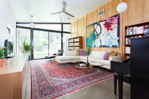
Midcentury Living Room by Austin Interior Designers & Decorators Sarah Stacey Interior Design
After Stacey's mother-in-law downsized from a 3,000-square-foot home in Houston to her new 1,300-square-foot home in Austin, the living room had been filled with stacks of possessions that made it hard to use the space.
Stacey helped clear out the room and edit her mother-in-law's stuff to create a open and airy space filled only with the pieces that mattered. "My mother-in-law has incredible taste," Stacey says.
A previous homeowner had done some sloppy DIY projects. The wood wall, for example, had exposed seams between the pieces of plywood that Stacey had to cover with boards.
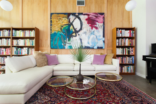
The Thayer Coggin sectional was the first thing her mother-in-law bought. It cost $16,000 but was something she had always wanted, and she thought she'd be able to pass it down to her grandchildren as an heirloom piece. Stacey found the original Milo Baughman coffee table at a thrift store for $60. "Those are going for $2,800 online," she says.
Stacey used one of her mother-in-law's large Persian rugs to anchor the room and soften the raw concrete floors. She selected the pillows to add more of a feminine edge and help break up the all-white sectional.
Art: Elisa Gomez; pillows: West Elm and H&M
An Eames lounge chair and ottoman, which the homeowner had owned since the 1960s, creates a reading nook near the floor-to-ceiling windows. Cookbooks fill teak shelves that the homeowner also bought in the 1960s.
The lighting was added by a previous homeowner. Stacey would have changed it, but the ceiling is what's called a closed envelope and couldn't be opened up.
The lighting was added by a previous homeowner. Stacey would have changed it, but the ceiling is what's called a closed envelope and couldn't be opened up.
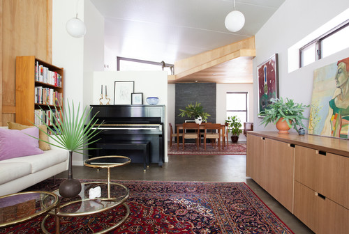
Stacey created a half wall so the piano wouldn't have to sit against an exterior wall, where moisture and temperature changes might have caused tuning problems. "It's more applicable to older homes, but just to be safe," she says.
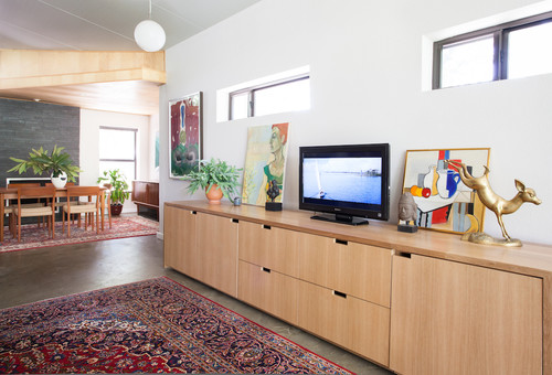
Stacey designed this white oak media cabinet, which helps balance the wood wall opposite.
Cabinet: Honea Woodworks
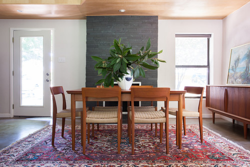
The living room opens to this dining room. Originally, Stacey's mother-in-law wanted the reading nook in the dining space and the dining table near the window by the Eames lounge chair. "It would have looked totally different. She benefited the most from space planning, I think," Stacey says.
Cats had torn up the dining chairs, so Stacey had them re-corded and had the table refinished. "She had some great pieces that I was able to work with," she says. "I just had to finish things off and bring everything together."
See more Rooms of the Day
