Filed under: Design, Home Improvement
By Jeannie MatteucciFirst impressions are everything. So for this dining room, the first room seen upon entering this traditional waterfront home in Baltimore, the homeowners wanted something that would really grab attention. They asked designer Elizabeth Reich to help them create a cozy, sophisticated and warm place that would set the tone for the rest of the house. Reich brought in a bold color for the walls, an inviting round dining table with contrasting chairs and smart lighting to make an unforgettable first encounter.
Before Photos
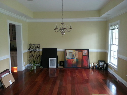
BEFORE: A custom homebuilder had built this house for his own family, but they never moved in. As the first owners, the couple wanted to put their own stamp on the home.
The existing 13- by-13-foot dining room had pale yellow and gold walls and was used as a storage space before the makeover. The goal was to use color and character to create a room that greets visitors and sets the tone for the rest of the house.
"After" photos by Jamie Sentz
Wall paint: Newburg Green; ceiling and trim paint: White Dove, both by Benjamin Moore; dining table: Noir; rug: Alex Cooper
AFTER: A large Tibetan area rug inspired the room's palette. "The rug has a combination of blues and greens to it, in an almost watercolor effect," Reich says. "It feels organic, beautiful and soft, and I just fell in love with it."
But the bold teal walls are what really make the room come together. "I like the dark, rich color because it's intimate," says Reich. She went with a lighter trim and ceiling color for contrast.
The round birch table with a distressed brown finish felt like a natural selection. A square room, Reich says, lends itself to a round table that softens the lines of the space and encourages conversation. The drapes have a large pattern with bold colors that also inspired the strong hue on the walls.
Drapery fabric: Vervain, J. Lambeth & Company
The designer and homeowners didn't want to make the room too traditional. A statement chandelier helped hit the right tone. "It has strings of wood beads and is accented with mother-of-pearl and horn," says Reich. "It felt like the perfect eclectic addition to this room."
Meanwhile, adjustable recessed lights on dimmers highlight artwork, and a pair of candle wall sconces adds needed weight to the bold walls.
The framed drawings depict various attractions in Rome, including St. Peter's Basilica and Piazza Colonna. "My clients love to travel, and since they visited there, they felt a special connection to them," says Reich.
Chandelier: Noir; candle wall sconces: Ballard Designs
The mahogany chairs have a hand-rubbed black finish and a cream-colored linen seat. The chairs are based on the iconic Loop Chair from American designer Frances Elkins, and help take the room slightly away from its traditional roots.
Chairs: Jenkins Baer Associates
A muted landscape painting purchased at High Point Market had just the right look and size for the space, capping off a stylish room the family uses to host dinner parties.
"I feel like I was able to create a space that's beautiful, but there's nothing too precious that they can't enjoy it," says Reich.


